What Beats A Hot Tip? How About Solid Risk Management

In these days of uncertain markets the key to keeping our sanity and keep out accounts from blowing up is MANAGING OUR RISK.  Risk management is always important, but it is even more critical when the markets are unsettled and there is no clear direction.

Risk management is also a way to control an individual trader’s tendency towards either fear, or greed.  For example, consider the investor  who may have on the feeling that the Facebook stock was going to “skyrocket to the moon,”  allocated a large portion of their account on that “sure thing.”  No matter what the facebook stock does in the future, we should never allocate more than 1-2 percent or our account on any one position, because we have to understand that there is no “sure thing!”  I remember when everybody who was anybody had to have a “blackberry” device, until the “iphone” came along, that is.

The key to managing our risk is to manage our position size.  As traders we never should get into a position where we are risking our account on just a couple of trades.  Instead, if we follow the 1% (2% maximum) rule or only risking 1% of our account on any one specific trade, limit the total number of trades to a maximum of 10, or 10% total risk at any one time and use proper stop loss and trailing stop orders when we get into trades, we will be able to sleep at night a whole lot better knowing that we will never be in a “bet the farm” type of position. That is the real KEY to success not the next “hot” IPO.

What Does A “Tweezer” Candlestick Pattern Really Mean?

Hi Everybody,

Bill Poulos here. Now, earlier today, I was running a group coaching session with some of my students, and we were pouring over some charts just to see what we could see.

And when I say “charts” I’m talking about one very specific type of chart: candlestick charts. Now, there are several different types of charts that many traders use, but I really recommend to all my students that they use candlestick charts. Why? Because they make it much easier for you to spot patterns. Patterns like this:

What you see there are two examples of “Tweezer” patterns. The first one is a Tweezer bottom, and the second one is a Tweezer Top.

Great, so what do these mean? Well, they can be very powerful indicators that a reversal is about to happen. When you have two nearly identical sized candlesticks that move in opposite directions like that, then you should automatically be on alert that a reversal is setting up.

And knowing how to spot these patterns can be a real game changer in your trading. Once you master them, you’ll have a solid visual indicator in your trader’s toolbox that can tell you exactly when a transfer of power from the bulls and the bears is likely to happen. It’s a big deal, and is just one more way professional traders separate themselves from the novices.

Of course other technical indicators should be consulted before you put an order in, and it shouldn’t be 100% based on the Tweezer patterns, but still, recognizing them can be that all important first step to profitability.

I’m going to be back soon with a few more of these patterns, but until then, take a look at your charts. Or look at past charts. Do you see any of these Tweezer Patterns? Did the work?

Good Trading!


How To Trade Metals When Prices Are Consolidating

In the market we see times where the price of the instrument we are trading goes through trends and contractions.  These contraction times are where we see the price consolidating in tight ranges.  These consolidations can form various price patterns such as flags and triangles to name a few.  When we see these patterns we want to look for opportunities for entries into a position.

In the above chart you can see a couple of areas where the price is consolidating and where we would be looking to see the price move out of the range and begin to trend up or down.  Consolidations can be small or big and are areas where the price action has decided to take a bit of a breather.

In the chart below we can see an example of where the price is breaking out above the consolidating price area.  In a situation like this you would trade this as the price moves up and out of the sideways price movement.  The stop loss area would be if the price moved back into the consolidating price movement.

One of the advantages of trading these consolidations is that they give clear areas for entering and exiting trades.  You can see where to enter the trade by watching for the price to move above the resistance point which is the top line.  Once in a trade the stop loss area can easily be set by placing it within the channel.  When trading gold or silver take some time to look at these patterns for entering into trades.  You will find them on any time frame you are using.

The Trend Really Is Your Friend

Last time we discussed continuation price patterns such as flags and pennants.  These price patterns indicate a continuation or extension of a bullish or bearish trend.  When trading any market, determining the trend is a big key to success. Today we are going to discuss a simple strategy to help us  determine the trend on our daily charts.

First we will use the direction of a 50 period SMA to determine the general sentiment of the market, “Bullish”, “Bearish” or “Neutral.”  We not only look at the direction of the 50 SMA but also the need to have the price action closing above or below the SMA to further confirm the direction of the trend.  I have illustrated below, by showing the prices closing above the 50 period SMA on the chart while the 50 SMA is moving up over the previous several days. This price pattern identified a “bullish,” sentiment which turned into a nice upside trend over several months.

If we have the 50 SMA moving up but the prices of the security is below the MA we would call this a neutral sentiment until the point that the prices close above the SMA.  The same would go for a downtrend in reverse, the price needs to close below the SMA as it moves down.

Now looking at a Bearish or short side example, notice that on May 14th just last week, the 50 SMA is going down for the previous several days with the price closing below the Moving average and at the same time it also broke down below the short term support.  All these conditions coming together at once made a pretty good case that we are definitely in a bearish trend and the market was likely to move lower, which it has.

We can see the power from these recent examples how using this simple trend finding strategy can help us determine the direction of the market and possible entry points to use to help us succeed in trading the market.

What Can Traders Learn From The Facebook IPO?

Today we’re going to talk about what we can learn from the Facebook IPO. The overriding message here I think is in order to make money trading on the stock market, you just simply cannot be swept up by the media hype or the well-intentioned advice of many a sundry analysts. Because if that was the way to make money, then everyone would be making money because the airwaves are full of stock trading advice, full of excitement around IPOs, hot tips, buy this, sell that. Apparently it doesn’t work very well. Of course if you’ve had your own personal experience trying to trade on the news or on other people’s opinions, you’ve probably been disappointed. Part of the problem is you don’t know what their trading strategy is. If someone tells you to buy Facebook on the open, what they probably don’t tell you is when they are going to sell it, or how long they are going to hold it, why are they going to buy it? Are they a short term trader, long term trader, swing trader, day trader? Now why are they telling you to buy in the first place? Is this part of their entertainment, part of their program? You have to wonder about all those things. So while they may be well intentioned, I don’t find that any of that’s particularly useful.

Now look at what happened with Facebook. They had all this media hype leading up to the IPO. All the conjecture around whether the price would be set at the right level. There is usually a pop on the IPO on opening day. You can count on a ten or fifteen percent pop, so go ahead and buy it on the open, and then if you don’t want to hold it, go ahead and sell it for ten percent pop. Well, that never happened with Facebook. As a matter of fact, a couple days later, it is down hard. The opening price was around $38. Now it’s down around $33 already. So you’re already sitting there with a $5 loss. What is that, about a fifteen percent loss in a couple of days. That is just one of hundreds of examples of why it is not a good idea to trade on the media hype, media news or media well intentioned recommendations.

So what are you left with? Well, you are left to make your own decisions. But in order to do that, you have to have good trading methods. Good means methods that give you an edge in the markets so that over a series of trades, you are going out a net winner. That doesn’t mean you’re going to win on every trade. Thankfully that’s not required to be successful. So you do need good methods. You need good risk management principles and discipline. You have to control your emotions. Right position sizing and trade in a very methodical dispassionate fashion. That’s the way you have the opportunity to do very, very well.

So whenever you’re inclined to act upon something you heard on television or some hot tip or the next IPO, remember Facebook. Remember that example and ask yourself, “Do I really want to do this?”

How To Work Correlated Pairs Into Your Forex Trading

In the forex market you will see specific pairs that run in correlation with each other.  This correlation can be either positive or negative depending up which currency is in which position.  The reason why we need to be aware of currency correlations is that we can become over leveraged in our trading position.

Below is an example of a positively correlated pair.  Notice the movements that occur are in the same direction.

The chart on the left is the 30 min. time frame of the AUDUSD and the one on the right of the EUR USD.  Notice that although the movements are not exact, they are correlated in their moves.


In the two charts below you can see what negative correlated pairs looks like.  In this case, as one moves up, the other moves down.  The chart on the left is the USD CAD and the one one the right is the EUR USD.  Here you can see that they move in an opposite direction.

As someone who trades multiple pairs you will want to make sure you know those pairs that move in either a positively correlated way or a negatively correlated way.  The problem to be aware of is that we can become over leveraged in our positions.  For example, if we are risking 2% of our account in a single trade and get a buy signal on both the AUDUSD and EURUSD we need to realize that it might be like taking one large position of 4% since they essentially move the same direction.  The same is true if the pairs are negatively correlated and we want to buy one and sell the others.


Take some time to review those pairs that are both positively and negatively correlated so you can be prepared to adjust your position sizes when trading.

Were You Thinking About Trading Silver This Week?

Today we will start by looking at the direction Silver has been moving this past week and then we will talk about a price pattern that can help us in looking for trades.

In the chart below we are looking at the daily time frame for Silver.  I want to discuss a couple of things that we will want to take note of.  First, the trend that Silver has been in over the past few months is bearish.  This down trend is key to us identifying the direction we should be trading.  Next, notice the support area where the red line is and how the price is currently bouncing up off of it.  As the price bounce up, we can look for the resistance area to begin to exercise downward pressure on this move up.  This resistance area would be a place to begin looking for some trading opportunities to short this as it begins to move back in the direction of the trend.

Keep this in mind as you look to enter into Silver this upcoming week.

We also want to spend some time talking about the concept of pull backs.  Prices tend to move in specific patterns and one of those patterns is watching for pull backs against a trend.  Because prices move up and down we can use these counter trend moves to look for possible entry points.


The chart below is an hourly chart of Silver.  Notice that the trend in this chart has been moving down.  This down trend gives us the opportunity to look for shorting opportunities after one of these counter trend pull backs.  The chart has 4 areas where the price moved through a counter trend pull back as shown with the 4 red lines.  When looking for shorting opportunities you will first confirm that the trend is moving down.  In this chart we are using the 40 period simple moving average to determine the trend.  Next we will want to look for the price to move in a counter trend direction back up toward an area of resistance.  You can see in the chart below that the price moved up towards this moving average which acted as an area of resistance.  Finally, we will look for the price to begin to move back in the direction of the overall trend to enter a short position.  The opposite would be true when looking to go long in an uptrend.  Take some time to practice this on various time frames to see how it works.

Is Inflation Really A Bad Thing?

It seems a bit counterintuitive to state that inflation is a good thing in a country’s economy because from a consumers standpoint it really isn’t but with regard to the value of a country’s currency and its overall health it can be a very good thing.  When trying to decipher how economists think and what they look for sometimes it becomes a bit of a story problem like we had in grade school math class because often times you need to find an answer to part of a problem before you can go on to the next part of the problem which eventually may lead to an answer for the whole problem.  Determining what is good and what is not good from an economic standpoint is not always the most straight forward topic which brings us back to how can inflation be good for the currency valuation or the health of a particular country.

Keep in mind that the most important piece of economic news there is with regard to the pricing of a country’s currency are its short term interest rates.  The main reason that traders, economic analysts or economists look at economic reports at all is to get a feel for what the central bank of the given country may do with regard to short term interest rates specifically will they rise, fall or remain the same.

A few years ago the economic reports that really moved the markets in the US were the Consumer Price Index and the Producer Price Index; the CPI and the PPI respectively.  The regional manufacturing reports and production reports were very important as well because at the time the economy was moving along quite nicely with healthy but low inflation and interest rates so the important information centered mostly on our economy’s ability to produce and spend.  Since the economic downturn of 2008 we have seen a dramatic shift in what reports have become important, for the last few years the reports that move the markets the most center on housing or real estate and anything having to do with employment or unemployment.  Make no mistake that though interest rates have been about as low as they can go and the interest rate report does not move the market quite like it did in the past, the main reason that we have all been looking at these other reports is to see if we can get an indication of when interest rates are likely to move.

When the nation creates a healthy amount of jobs this means of course that more people are working which means that they will spend more which means that inflation will rise which finally means that the Fed will raise interest rates to compensate for the rise in inflation.  The rise in interest rates leads to a weaker or slower stock market because as interest rates rise investors will gradually move their money out of the stock market and higher risk investments and into higher interest rate investment vehicles which up until the past few years have always been thought of as a safe place to park money.  People typically will move their money out of riskier assets and into interest bearing vehicles gradually as rates rise depending upon their risk aversion.  As rates rise each investor may eventually find the level that is acceptable to them to move assets from a higher risk position to an interest bearing investment.   One of the big questions now is exactly how safe do we really feel when banks and brokerage firms have gone out of business at an accelerated pace over the last few years which leads to the obvious questions around are we more risk averse to stock market fluctuations or to whether or not our money will actually be accessible if the bank or brokerage firm that holds it closes.

Oh yeah I almost forget, the reason that higher inflation is good for a country’s currency value and economy as whole is because as previously stated as inflation rises the way a central bank combats it is to increase interest rates which means that the higher interest rates will attract money out of investors, both foreign and domestic, for investment in businesses and interest driven securities so there is more cash flowing into the country’s economy.  It seems as though there is rarely a direct answer as to why anything happens in a particular way when it comes to economics.

Greece Is Doomed, Is The US Next?

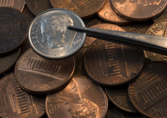
Hey everybody. Today I want to talk to you about the unprecedented debt levels incurred by the sovereign nations around the world, lead by the United States. We hear a lot about Greece and as well we should. Greece is bankrupt, insolvent, and has all the consequences, social unrest, government upheaval and default on the bonds and so on and so on. While the same thing can happen in the United States given the huge debt levels incurred by the government at the federal level, not to mention the state levels and some of the municipalities. So now we have the total public debt in the United States approaching 100 percent of the GDP, at $15-$16 trillion, increased annually now by $1-$1.5 trillion. That’s the annual budget deficit. Something that tax increases can’t even make a dent in.

So we have exponentially increasing debt, which can only end badly. Now there is no way that debt will ever be repaid. It’s impossible. If you just do the arithmetic, you could double tax rates and it wouldn’t help, it wouldn’t really make a dent.

You can cut back on programs, but it’s too late. The debt has run away.

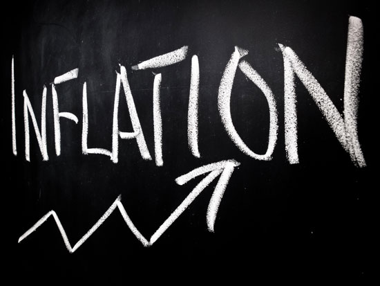
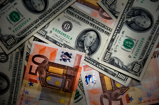
The way the politicians will resolve this as they continue to kick the can down the road, they have no political will, no backbone to act as adults and solve this problem. So their solution is to ignore it. What will happen is a consequence is interest rates will go up, driven by double digit inflation. That is the consequence of this runaway debt. While no one thinks that we’re looking at high interest rates today given the Feds assurance that rates will remain low for the next couple of years, you can bet that the consequence of all of this debt will be extremely high unprecedented inflation which will then drive the interest rates. That means the value of your dollar and Euro are going to continue to collapse, so that the price of milk and bread is going to go up big soon. It’s already going up, but it’s going to accelerate.

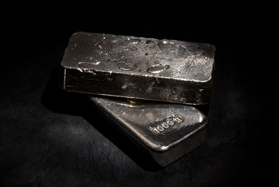
So what do you do to safeguard your portfolio, safeguard the purchasing power of the dollar or the Euro? One hedge is to buy precious metals, silver and gold principally. One of the problems with buying silver and gold is they are very volatile markets. So if you had bought silver at $50 an ounce here not too long ago, it’s now below $30 an ounce, so you’d be looking at a 40 percent loss. Who wants to do that?

Now, I think one of the ways you hedge this inflation risk is yes, with precious metals, but you learn how to trade the precious metals. You don’t just buy them and hold them, because who wants to run the risk of a 40 percent loss? If you learn how to trade them, you can have the potential to ride the trend up when it’s going up like silver when it drove to $50, ride that trend up and then get out, after it peaks and go to cash. Then wait for the new uptrend to begin and get involved again. That way you are hedging the inflation risk in an intelligent way without incurring additional risk by buying and holding the precious metals.

Let’s Learn Some Forex Patterns Here…

In today’s article we are going to look at a few different types of price patterns commonly used in the Forex markets.  When we talk about price patterns we are talking about common patterns that occur when price follows a specific direction or pattern of movements. Price patterns are typically divided into two types -continuation patterns and reversal patterns.  Continuation patterns are patterns that occur during a price movement either up or down.  This price pattern is typically seen as a slowing down of the price movement and occurs prior to the price continuing in the original direction.  A reversal pattern is seen at either the top or the bottom of a move and just prior to the price moving in the opposite direction of the original trend.  See the chart below to identify continuation vs. reversal pattern direction. So if the original trend is up and we saw a continuation patter occur, we would look for the price to continue in that direction after the pattern is complete.  The reverse would be for the down trend.  If we saw a reversal pattern occur, we would look for the price to reverse direction from the original trend. Take a look at the examples below.  On the left you can see a continuation pattern which happens to be a flag pattern.  On the right you can see a reversal pattern.  This one is an example of a double top pattern. There are multiple types of patterns for both the continuation and reversal type. The key is to understand that both continuation and reversal patterns rely on first identifying the trend and then the areas of both support and resistance.  These areas of support and resistance are what make up the pattern that we are looking for.  So don’t become overly concerned about learning the specific names of these patterns, rather focus on identifying the areas of support and resistance.   For the purpose of this article we will simply name some of the commonly used price patterns for both continuation types and reversal types.  In the chart below you can see some of these commonly used price patterns.   As you begin to learn how to recognize these patterns they can help you in knowing whether you should be looking for the price to move up or down in either a continuation or a reversal direction.  Knowing these patterns can also help you identify targets and potential stop losses when entering your trades. In the next few weeks we will spend some additional time identifying the various types of continuation and reversal patterns.  We will look a bit deeper into each of these types of patterns listed above. For now just realize that identifying the trend and where support and resistance are located is just as, if not more important than knowing the names of these patterns. In the meantime, practice drawing trend lines and support and resistance lines on your charts so that you can begin to see some of these patterns a bit clearer.