Longer Time Frames

In today’s article we are going to discuss the process of using longer-term charts in our decision making process. By using longer-term charts we can see the bigger picture of how the market is moving and use that to understand the direction we should be trading on the shorter-term charts.

If we become too myopic in our view of the market we are limiting our potential gains. Being myopic means that we can be nearsighted or shortsighted in our view. Another way to describe this is to say we are not seeing the bigger picture. As we take a “macro” look at what is happening we see this bigger picture and can use that to help us in knowing what to do on the shorter time frames.

As we incorporated longer-time frames into our trades we are simply saying that we want to know where the stronger momentum is taking the pairs we are trading. It should make sense that if we are fighting against this longer-term momentum we are making our jobs more difficult.  Just as trying to swim upstream in a large river can be difficult, so is trying to trade against this stronger trends in the market. Longer-term trends tend to last for weeks and months at a time, so if we can identify where these pairs are moving we can jump in and let them move us in the direction it is headed.

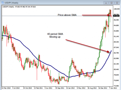
One way to do this is to begin incorporating the weekly charts into our evaluation of the pairs we are trading. In the chart below we are looking at a weekly chart. Notice that we can use just a few things to help us determine this stronger momentum.

In this chart above of the USDJPY, we are looking at the 40 period Simple Moving Average to identify the longer-term trend. If the 40 SMA is moving up while the price is above it we can say that the momentum is more bullish than bearish. Once we have identified this we can use this information to show us the direction to trade on the shorter-term charts.

You can also use the concept of one time frame higher to do the same thing. For example, should you be looking to trade the 15 min. charts, you can use the 30 min. chart to show you the longer-term momentum that is happening. This would hold true for any time frame you were trading. It could be the 5 min. chart with the 15 min. chart as the longer-term chart or any other period you are trading.

Regardless of the time frame you are looking at or the type of strategy you are trading, knowing the direction of the longer time period can help you to better evaluate your trades. Take some time to review how you are using these longer periods and how you might be able to incorporate them better into your current trading plan.

Remember, the longer-term charts can be used to give us the stronger momentum that is happening on the charts. Knowing where they are headed can give us an advantage when we are trading.
What Is The Jobless Claims Report & Why Is It Important?

The Initial Jobless Claims Report is often referred to as an economic indicator because is one way of finding changes in the employment market. The report is used to help identify the weekly employment trends. It is provided by the Employment and Training Administration of the Department of Labor, and the report comes is made public on a weekly basis, each Thursday morning at 8:30 am New York time. The report provides information on the data from the previous week, ending on the Saturday before and also provides a four week moving average to smooth out any outlier week.

The Initial Jobless Claims report provides information on how many individuals have filed for state unemployment benefits during the previous week. This number can be a predictor of what the economy is doing. If there is a significant increase in these claims, it could potentially be pointing to slowing job growth as unemployment rises. On the other hand, when this number decreases significantly, it can be a sign that the economy is accelerating in job growth and therefore is economically sound. Yet, most investors will only consider this in a four week average, as these factors can be volatile. Finally, most investors will tell you that a significant number of changes are a move of at least 30,000 claims up or down. Anything less can be merely normal fluctuations.

Last week’s Unemployment Insurance Weekly Claims Report was released Thursday April 18th for the previous week. The 352,000 new claims number was a 4,000 increase from the previous week’s upwardly revised 348,000. The less volatile and closely watched four-week moving average, which is usually a better indicator of the recent trend, rose by 2,750 to 361,250. Below find the actual official statement from the Department of Labor:

In the week ending April 13, the advance figure for seasonally adjusted initial claims was 352,000, an increase of 4,000 from the previous week’s revised figure of 348,000. The 4-week moving average was 361,250, an increase of 2,750 from the previous week’s revised average of 358,500.

The advance seasonally adjusted insured unemployment rate was 2.4 percent for the week ending April 6, unchanged from the prior week’s unrevised rate. The advance number for seasonally adjusted insured unemployment during the week ending April 6 was 3,068,000, a decrease of 35,000 from the preceding week’s revised level of 3,103,000. The 4-week moving average was 3,083,000, a decrease of 2,250 from the preceding week’s revised average of 3,085,250.

Today’s seasonally adjusted number was slightly below the Briefing.com consensus estimate of 355K.

Since investors are looking for clues into what the economy is doing as a whole, the weekly unemployment insurance claims report is a way to better understand the current employment situation in the economy along with the Monthly Non Farm Payroll Report that comes out typically on the first Friday of the month.  These two reports, one weekly and one monthly can give a powerful insight into the strength of the employment situation and therefore a better idea of the economy as a whole.  If the data comes out much different from the consensus, the markets often react to that news. So, check out the next Initial Jobless Claims Report on Thursday morning!

Have A Plan

One of the most important things we can have when we are trading is that of well-defined trading plan.  A well-defined set of rules needs to be used in order to know how to trade.  This trading plan needs should have two basic component – simplicity and specificity.  Keeping thing simple and specific makes our jobs easier as traders.  When things are too complicated or not well-defined they become more difficult to understand.  When things are more difficult to understand we usually don’t follow them as well as we should.

As we go through the process of developing our plan, we need to keep these things in mind.  Within a well-defined plan we need to have some basic components for our trading.  These should be obvious but we will discuss them in a bit more detail.  A trading plan should have the following parts.

  1. When you will trade.
  2. What you will trade.
  3. How you will enter.
  4. How you will exit.
  5. How much you will buy or sell.
  6. How you will analyze.

By using these 6 parts we can create a well-defined plan for out trading.

When you will trade – This part of the plan tell you when your trading business is open.  Are you going to trade in the morning or afternoon?  Are you going to trade the news or avoid the news?  Are you going to trade on Friday’s or not?  These are some of the questions you need to answer so you know exactly when and when not to trade.

What will you trade – This may seem obvious but you really need to define what you are going to trade.  Do you focus on gold and silver, the futures market, forex or stocks and options?  This will help you keep focused on one or two markets and allow you to ignore what you are not trading.

How will you enter – This is the heart of the trading plan.  This will tell you what you need to see in order to enter a trade.  What you will need to see to define the trend, where you place support and resistance, what indicators you will use and what you will need to see on the chart to pull the trigger.

How you will exit – This is where you will either make or lose money.  You need to know where you will place your initial stop loss, where your targets will be and if you are going to make any adjustment to your stops.  This is maybe even more important to define that your entry so make sure you are very specific in you rules.

How much you will buy or sell – When it comes to trade management, knowing your risk and money management rules is the most critical part of our long term success.  Make sure you are using rules that will allow you to take small losses because you are using proper positions sizing.

How you will analyze – Have rules for evaluating your trades.  You need to have daily, weekly and monthly times where you analyze what is going on.  Have a routine that you go through in order to see things like your win/loss record and average win/average loss ratio so you know you are headed in the right direction.

As you develop your trading plan in a simple and specific way you will make your job easier as a trader.  Take some time to work on your trading plan so you can easily understand what you need to do to trade successfully.

Volatile… Too Volatile… Or Just Right?

Average True Range
The Average True Range is a technical indicator used by many traders to help identify the range or volatility that is present in the market.  In relationship to the Forex market it can help us identify the volatility of the currency pairs we are trading.  It can also help us see where the greatest movements during a specific time period.  This indicator was originally created by J. Welles Wilder, Jr. and is calculated with the following formula:

true range = max((high-low), abs(high-prev.close), abs(low-prev.close))

The True Range is the greatest of the following 3 numbers:

  1. The difference between the current maximum and minimum or the high and low
  2. The difference between the previous closing price and the current maximum price
  3. The difference between the previous closing price and the current minimum price

The ATR indicator is a moving average of these values.
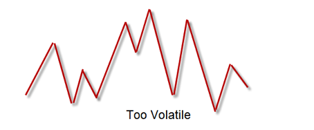
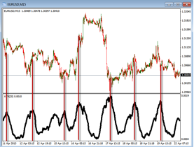
When trading the various currency pairs we want to be able to trade during the most deliberate times. If the price is not moving deliberately then we want to avoid trading during these times. A deliberate moving pair is one in which there are consistent areas of highs and lows. If these highs and lows are too high or too inconsistent then the market may be too volatile for trading. On the other hand if the market is too flat with minimal movement then the market may have too little volatility.  When using the Average True Range you can better identify when these areas are located. Volatility is an interesting part of trading. Too much and we risk poor entries and poor exits but without it we do not have the movements needed to profit consistently. Take a look at the pictures below to see what too much volatility and too little volatility might look like. With a chart that is too volatile you can see that the deliberate and consistent movements are not there. Where a deliberate pair might show higher highs and higher lows, the non-deliberate pair show inconsistent highs and lows for a price action that is less predictable. This type of price action is difficult to identify entry and exit points.   In addition, in the chart below we can see another type of price action that is difficult to trade. This type of price action will be difficult to the trade as there is very little movement occcuring.  Without movements we do not get the expected profit that we desire.  This can also be frusterating because there is no action happening and we can be in a trade for an extended time. As we add the use of the Average True Range we can see when the most active time for trading may be.  We can also see when it may be too flat or too volatile.  In the chart below you can see the ATR move up and down showing where the price movement becomes high and where it is low.  In the chart below you can see an example of this.

In this chart above we can see the ATR line which is below the price action.  You can see the swings between highs and lows.  The red vertical lines show where the price action and the ATR are peaking.  You can also see the lows where the price action is the lowest.  By looking at these highs and lows we can see where the price is moving and where it is not.  This may also give you a better idea where the market may be most deliberate in the price action.   Take some time to practice using the ATR on your charts to see if it can give you some added benefits with your trading.

Buy High Sell Low – WAIT – WHAT ARE WE DOING????

While the stock market has been a very good performer so far this year with most of the averages entering into record breaking territory a cautious or defensive approach may be a good trading strategy to employ going forward.  Everyone knows that the stock market has been range bound since the late 1990’s and breaching the top of that range is why we the market is setting records which means that there are many reasons for taking a cautious approach to investing or trading. 

Generally speaking as the stock market rises more and more people get on the band wagon fueling the rise due in large part to all of the media coverage and the fact that it looks like a pretty easy and sure way to make some money.  This makes allot of sense except for the fact that we do not know how long it will last but there are a few ways to help us determine this.  Of course there is no one specific fool proof indicator that will tell us when to get in and when to get out or when a nice run may be coming to an end but if we pay attention there are allot of signs to look for.

If we break up traders and investors into two broad categories we can learn allot about what may be going on at any given time in the markets.  The broad categories could be called professional versus amateur, big versus small, winners versus losers or simply smart versus dumb.  I personally like the last description the best and they are terms that are very commonly used in the trading and investing world.

All we really need to do is to pay attention to who is investing in what, in general terms not the specific issues, but really just what the general sentiment is around the markets.  Smart money is professional money and dumb money is non-professional money or the people that just follow the herd.  A good sign right now that it is time to be defensive is that there are stories that are coming out every week around how the biggest and most famous professional investors in the US, the smart money, are divesting out of stocks sometimes in general terms and sometimes specific companies are mentioned for specific reasons to sell.  Regardless it is largely due to the earnings reports of the given companies.  Of course there are other factors as well but the point is that professionals will seek out this information and make rational investment or trading decisions based on the company and industry facts while non-professionals will follow the herd usually at some point going off to get slaughtered.

As the stock market increases and goes higher and higher it becomes easier and easier for the average person to make money because all they need to do is to show up and invest or trade.  Another sign that it is a good time to be very cautious is when just about everyone you talk to is bragging about how high the market is going and how now is the time to invest before it is too late, this should be a huge red flag.  If you hear people with lower paying jobs or people that are very far removed from being stock market professionals bragging about the market like the paper boy, the pizza delivery guy or the bagger at the grocery store this is a good sign that prices are inflated and likely to come down.  Non-professionals or people that follow the herd are the dumb money that enters the market at inflated prices taking the place of the smart money that is leaving the market.  As soon as the market corrects itself, which is inevitable, the dumb money has purchased high and ridden the market up a little bit but it has also ridden it down through the correction only to get discouraged and sell so the smart money can come back in at lower prices and replace the dumb money. 

This is a continuous market cycle; smart money out as prices rise, dumb money in, market falls, dumb money out and then of course smart money in at a bargain.  If you go to a store to buy anything of any size do you want to pay full price, do you want to get the item for a cheap price at a good discount or would you prefer to pay a premium and give the store more than what the item is actually worth on the open market?  Most people will say that they are conscientious spenders and watch for deals so they can save money but many of those same people are the people that enter the stock market as prices are rising often times paying way too much of a premium.  Another way to look at it is using the old stock market adage; smart money buys low and sells high while dumb buys high and sells low. 

Watch Out Below

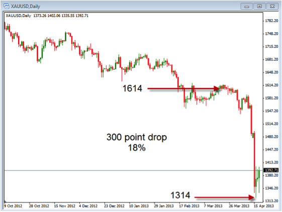
This week with gold and silver we saw some of the biggest down moves we have experience in this market.  Anytime the market experiences extremes in moves we need to consider the issues with volatility.  This volatility in the metals market this week has also affected the stock, option, currency and futures market.  This is also a good reason for having stop losses set and for using proper risk management.  In a market where the price drops by 10% we want to be able to get out with our 1-2% risk so we don’t experience catastrophic losses in our accounts.  Take a look at the chart below to see what has happened over the last few day in gold and silver.

The chart above is the daily chart of gold – XAUUSD.  Notice the indicated red arrow that show the most recent drop from about 1614 to 1314.  This is about an 18% drop in the price of gold.  You can see where not having a stop loss in place could have caused major problem with your trades.  There has been much talk over the last few years about buying gold without much discussion on how to get out.  Trading without a stop loss can be a fatal mistake in the life of a trader.

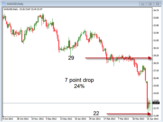
This chart is the daily XAGUSD – Silver chart for the last few months.  This chart shows a similar type of movement that gold showed over the same time frame.  You can see about a 7 point drop in the price of silver which is about a 24% drop.  Again, without a stop loss you could have ended up with a substantial loss in the account.

Another point to consider with what we saw happen this week is that the overall trend was down and if we were trading gold or silver we should have been shorting.  By following the key components of looking at charts we would have been able to take advantage of these down moves.  This would mean that instead of looking at big losses we would have seen some big gains.  Knowing what to look for on the charts can put us on the correct side of these moves.

These key components of looking at charts is the following:

  1.  Trends – knowing the direction that the trend is heading in will keep us on the right side of the market.  Using the price action and looking at higher highs and higher lows or lower highs and lower lows to determine the trend should be the primary thing to consider.  Applying moving averages to the charts can also help us determine the direction things are going.
  2. Support/Resistance – This is an important part of trading as it shows where the price may have a difficult time moving beyond.  It also helps to know where the price may break through in order to see a continuation of the move.

Take some time to review what you are doing in order to know the direction you should be trading.  Sticking with these key components will help you trade in the correct direction.

3 Keys To Trading Success

People are always looking for the “Holy Grail” of trading and generally center finding a great system.  I contend however that success has less to do with the system a trader uses and more to do with the implementation and consistent application of good trading habits. In fact, there are many good systems that a trade can use depending on what type of trader you are long term, short term, etc. (no perfect system exists) A few important key elements, if incorporated into our trading routines can make all the difference between being an effective and successful trader, or being a failure and quitting after all our money is gone or simple quitting out of frustration. If we can start to be successful by implementing the following habits then that success can build on itself. In the world of money and investing we call this compounding. Here are 3 keys that if you will develop will help your trading to become more effective and more profitable:

  1. Use Strict Risk Management: Only risk 1-2% per trade. The reason is simple; at some point in time it is a statistical possibility that you could have 5-10 losers in a row. It might not be this month or year, but over a 10 year period of time you could have 10 losing trades in a row. If you risked 5% per trade you would be down 50%. To make that up you would then have to make 100%. Risking only 1-2% puts you at a 10-20% loss with 10 losers in a row. That type of loss can be made back in 1-3 good trades.  Always use an initial stop loss order that reduces your initial exposure to the 1-2% max loss. Once the trade moves in your favor you can move your initial stop loss to your entry point or breakeven point and effectively reduce your risk on that trade to zero.  You can then use a trailing stop to start to protect profits as the trade move more in your favor.
  2. Use proper position sizing. There is more to money management than just using stops or not having too many trades on at once. Those are only the basics. Professional traders do all that, but also use position sizing. Let me reiterate that you should always trade with a stop loss in place to limit your losses. Most people use a percentage risk stop and that is usually not the best level to place your stop. The best stops loss levels are based on the chart using a recent significant high or low level. If you only use only a percentage you may place your stop to tight or to wide for the current market conditions. With the correct stop in place you can then calculate the proper position size for your trade. That is the best way to keep your risk per trade at the proper 1-2% risk level.
  3. Trade with the trend.. Trading with the trend is actually simpler and so much easier than other strategies. Generally speaking, simpler is also easier to implement and easier to follow. The key is to have a system that just goes for the middle of the trend. The reason is because; again it’s hard to pick the top and bottom (impossible to do on a consistent basis). The key is to follow the market not force the market. Traders must to be patient with what the market gives us and it is important to not try to “make things happen,”, which is the surest way to failure and frustration. Use a system that identifies and follows the trend so that you can “jump on that trend and ride it. Trying to trade against the trend may cause you to overtrade and potentially lose when the trend “catches up” with you. 

These 3 simple keys are not complex or difficult to understand, but are sometimes difficult to implement.  If they are consistently followed and implemented into your trading routine and trading plan, they can give you a much higher probability of success and lead to a much lower stress higher probability to trading success.

Weekly Charts In Review

In today’s article we are going to do a quick review of the daily charts for 3 major currency pairs.  One of the reason that we look at the daily charts is to better see the direction of the longer term momentum.  Understanding the longer term momentum can give us an idea of the direction that we should be looking to trade on the shorter time frames.  Regardless of the shorter time frames you are trading, understanding the momentum on the longer term charts can be valuable in trading.

When review the charts we want to look at a couple of specific things.  The first is to identify the trend on the chart by using the price action or some other type of indicator like the Moving Average.  When they are moving up, the trend is bullish and when they are moving down, the trend is bearish.  This will give us the direction to trade our shorter term charts.  The second thing we want to look at is the areas of support and resistance.  This will give us an idea of where the price action may begin to slow down or reverse.  Ideally we would like to see the trend moving up and the price sitting near support when we are buying or the trend moving down while price is near resistance when we are selling.

EURUSD

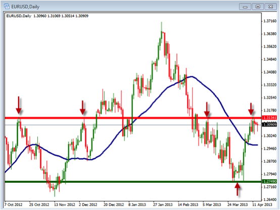
The chart above is the daily chart of the EURUSD.  In this chart you can see where we have identified the trend by using a 40 period Simple Moving Average to show us the direction the momentum is headed.  In this chart it is a bit difficult to see the trend strength as the moving average is moving sideways.  In order to say the trend is up we want to see the Moving Average pointing higher and the price above it.  In this case the line is sideways while price is above it.  We also see the areas where there is support and resistance as shown with the green and red lines.  We have also put red arrows in these areas where support and resistance is shown. 

 GBPUSD

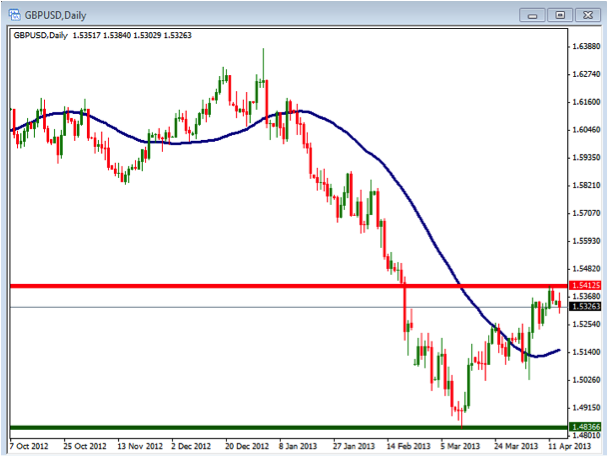
This chart shows the GBPUSD in a bit stronger uptrend than the EURUSD as the 40 period Simple Moving Average is point up while price is above it.  This would indicate that the trend is more established although sitting near a point of resistance.  Keep an eye on this chart to see if it is able to break above the resistance and move higher.

USDJPY

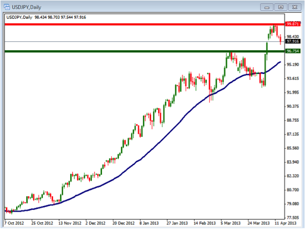
Last but not least we can see the strength of the trend on this USDJPY pair as the price has moved up in a strong fashion and is above the 40 SMA.  In addition we can see the areas of support and resistance where there may be some slowing of the price action.

As you evaluate you charts make sure you understand the direction and momentum of the daily charts so they can help you understand how to trade the shorter term charts.

Divergence And What It Means For You

Divergences

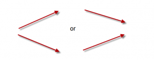
Today we are going to discuss the topic of Divergences.  The first thing to look at is how we define a divergence.  A divergence simply means that two things are moving in opposite directions.  Take a look at the pictures below.

On the left side the two lines are moving away from each other while the one on the right they are moving towards each other.  Although the one on the right side is converging we will still consider it as a divergence for our discussion.

When we are talking about charting and technical analysis divergence is usually looked at as a movement between the price and another indicator.  This could be the price and a moving average, price and MACD, price and Stochastic or any other indicator that you might choose to use.

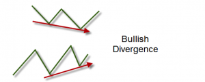
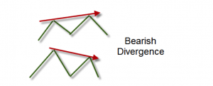
There are two basic types of divergences we will be looking at.  The first is the Bullish Divergence and the second is the Bearish Divergence.  Take a look at the picture below to see the basic idea of each.

With a bullish divergence we are looking for the indicator to make higher lows while the price is making lower lows.  The strength in the indicator is showing that there may be strength coming into the price action.

The bearish divergence shows that the price action, which has been strong, may be starting to weaken as the indicator begins to show lower highs.

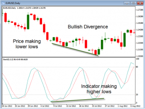
Take a look at these charts be low to see examples of the bullish and bearish divergence.

In this chart above you can see that the price of this chart was making higher highs while the Stochastic indicator make a lower high.  This is a setup for a bearish divergence.  Once this has been created we will look for the price to begin to move down.  Once we get a confirmation of the price moving down you can look to short the chart.

In this chart above you can see that the price of this chart was making lower lows while the Stochastic indicator make a higher lows.  This is a setup for a bullish divergence.  Once this has been created we will look for the price to begin to move up.  Once we get a confirmation of the price moving up you can look to go long the chart.

These examples are some of the basic divergence types.  There are also non-typical types of divergences which we may discuss at a future time.  The key with the basic divergences are to look at the lows for the bullish ones and the highs for the bearish ones.

These types of divergences can be found on any time frame chart and any type of chart.  They are seen on stocks, option, futures, forex and metal charts.  As you begin to look at your charts and specific time frames you will want to start to look to see if you can identify their formations.

Regardless of your trading method you can incorporate the use of divergences into your rules.  Knowing when there may be a change in direction can be valuable to any system.  Take some time to see if they can improve what you are doing in your trading.

Where’s Gold Going?

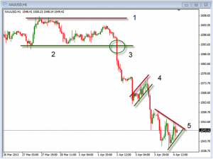
Over the past few days we have seen gold begin to move in a downward direction.  The chart below is a one hour chart of the XAUUSD which is our gold chart.  There are several things that we want to point out when looking at a chart like this.  Take a look at the numbered areas and what they represent.

  1.  This area formed the top part of the sideways channel and represents the area of resistance.  When looking at a chart we want to be able to identify this area.  This is a point where the price will often stop moving up and be pushed down by sellers.  It is also at the point where if a breakout occurs you can look to trade on the move up.  The stronger resistance area the stronger move you may see.
  2. This is the area at the bottom of the sideways channel that will act to support price action causing it to move up as buyers come into the market.  It is also an area where we can look for a breakout as the price moves below the support.
  3. This circle area shows an example of where the price has broken out below this support area.  Once a breakout occurs you want to look for an appropriate area to place the stop loss.  This would be at a place where the price reverses back into the sideways channel.  Any time the breakout fails we want to exit the trade.
  4. This area represents an area of price action called a flag pattern.  The price moves in the opposite direction of the overall trend.  As the price moves back in the direction of the trend and below the support line we would look enter a trade short.  Again, we would place our stop loss above the entry to get out if it moves back up.
  5. This area is another price pattern called a triangle.  The entry on this pattern would be a break above or below the support and resistance lines.

As we look at charts we want to be able to identify specific things.  These things include the trend, support/resistance and breakout points.  Notice that the chart above points out these important areas.  In addition to these areas shown above you can include indicators such as moving averages or oscillators to help define the trend.

Over the past week we have seen the price of gold begin to drop.  As we are looking at the chart we want to be able to find areas where there may be a potential for an entry to go long or short.  In the current chart of gold we would be looking to go short.  Regardless of the time frame or strategy we are using we can use support and resistance line in addition to the trend to help us find these possible entry points.  Take some time to look at the charts to determine where the next entry points may be.  Make sure you know how to properly evaluate the charts you are trading for potential trading opportunities.