What are Trailing Stops and How Do They Work?

Last week I discussed what stop loss orders are and the importance of using stop loss orders to manage your initial risk. Today I am going to discuss the use of trailing stops on your trades once they are “in play”.

What is a Trailing Stop Loss Order and how do they work? Just like initial stop loss orders, the trailing stop promotes trading discipline by taking all of the emotion out of the “exit” decision, thus helping traders and investors to protect profits and account capital. There are two different kinds of trailing stops – automatic trailing stops and manual trailing stops. The benefit of an automatic stop order is that can be set at a predefined percentage away from a stock or other securities current market price. A trailing stop for a long position would be set below the security’s current market price; for a short position, it would be set above the current price. A trailing stop is designed to protect profits in the security by enabling a trade to remain open and continue to profit as long as the price is moving in a positive direction either long or short, but then closing the trade if the price changes direction by a specified percentage, letting the trade exit or “stopping out” at the current trailing stop level. With a manual trailing stop, you would move the stop up or down (whether going long or short), in the direction of the trade using some method such as the low or high of the last 3 bars, for example. The advantage to using a manual trailing stop, depending on the method used, allows you to scale the trailing stop using current market ranges, instead of preset percentage as in an auto trailing stop.

An example of an automatic trailing stop is a stock that is $50 dollars at market and you place an entry order. At the same time you place a trailing stop 5% away from the market. As the stock price moves 5%, the trailing stop will move to break even and then continue to trail on up every time the stock moves another 5%.

One of the trickier things about a trailing stop is how far to place it away from the market. In our example, if you place the trailing stop at 5% and that is too tight for the market, you may get stopped out prematurely, or if, on the other hand you place it too wide, you run the risk of losing too much capital or not protecting enough of your profits. This issue applies to either a manually adjusted trailing stop or to automatic moving trailing stops.

The real advantage to using trailing stops is that you will be able to reduce your risk as the stock or other security moves in your direction and once you move past break–even you will start to protect profits along the way. So always use a stop loss order and it you want to extend the potential profits instead of using a fixed target, use a trailing stop loss to exit your trades.

Silver Review

Over the past couple of weeks we have seen the movements in gold be a bit volatile. This has also been seen in the silver market. Now that the government shutdown is over, at least for now, we are likely to see some more deliberate movements begin. So, this week we are going to discuss the daily chart of silver to look for possible trading opportunities. We will look at the trends along with the areas of support and resistance.

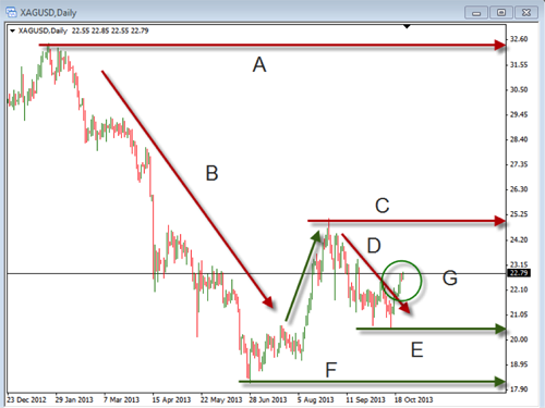
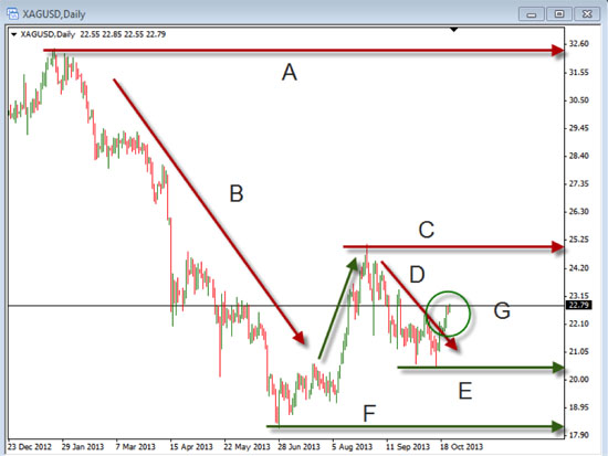
Take a look at this chart below. It is the daily chart of the XAGUSD, which is the chart of silver. We will evaluate each one of the lines on it.

 A. Long-term resistance

Whenever we analyze a chart we need to start by seeing what has been happening over a longer time frame. This gives us an idea for where the price may encounter a difficult time moving above. In this case, the long term resistance is well above there the price is currently sitting. This makes it a bit less relevant as the price has a long way to go before reaching it.

B. Long-term down trend

Line “B” shows the big move that happened as the price came off the high area of resistance. This is a major factor in evaluating what is happening with silver. Because of the overhead resistance and the strong down trend, we need to be aware that the price momentum which has been bearish will be difficult to change.

C. Intermediate-term resistance

As we begin to look at this line we need to recognize that it is becoming more relevant as it is closer to the current price. This would be the next level where any up move would have difficulty with. We need to know this in order to properly identify our areas of targets or stops.

D. Intermediate-term down trend

This down trend line is critical because it is the current momentum on the chart. Price has been moving down and we need to recognize that this is the momentum that needs to be broken to in order to see a change in current price action.

E. Intermediate-term support

This support area will be used to look for places to put the stop losses if we were to take a long position. It will also be an area where a short could be considered on a break down through this area

F. Long-term support

This is the area where the price will have difficulty moving below as it is likely to encounter buying pressure for some time.

G. Breakout

As you look at this breakout area you will see a point where there may be a change in momentum. Looking to enter as the price broke above the intermediate down trend line would have given a place that showed confirmation of the bullish move. In addition, you would look to place stops below the lower support with the target near the resistance above.

Take some time to review this chart to see if you can identify and other potential important areas. Over the next few weeks keep an eye on silver to see if you can see opportunities for some additional bullish movements to trade.

Let’s Talk Stops

Today I am going to discuss stop loss orders. Placing Stop loss orders may seem like a simple thing but is a very important part of a good overall trading plan, no matter whether we are trading stocks, ETFs, Options, or Forex. New traders may ask, “What is a stop-loss order?” A stop-loss order is an order placed with the broker to exit a trade (either buy or sell, depending on whether we are long or short) once the price has hit a certain price level. For example, if you enter an order to buy a stock at $50 and place a stop-loss order at $48, the trade will be closed out once the price hits the $48 level.

One of the advantages of using a stop loss order is that you don’t have to worry about the risk in the trade. There is not a hard and fast rule about where to set your stop loss orders. In the past, we have discussed ‘risk management’, which is really the science of understanding, quantifying and controlling our risk to a certain fixed percentage of your overall account. The initial stop is the key to limiting our initial risk in any one trade. If we trade without that initial hard stop loss order, we leave ourselves completely exposed to market risk. So it is critical to our long-term success that we ALWAYS use an initial stop.

When we look at trading, there are always tradeoffs or advantages and disadvantages to our actions. Another advantage to placing the stop loss order is that you don’t have to watch the trade constantly or, what I refer to as, “baby sitting” the trade as the stop loss order will automatically exit the trade.

Now, on the other hand, a disadvantage to placing the stop loss order is that you may get “stopped out” of the trade if the stop loss order is placed too close to the market price when the order is filled. If we do not allow enough room or space for the stock to move in its regular fluctuations, then we may get stopped out prematurely. This is referred to as putting our stop loss orders too tight for the regular movements in the market. So a good rule of thumb would be to look at the Average True Range, or ATR for short, to look at the normal fluctuations in the market of any particular stock or ETF. For example, if the ATR on a daily chart were, say, 5%, then it would be unwise to place the stop any tighter or closer to the market than that 5% or you are “begging” to get stopped out. The other thing to understand and keep in mind is that when the stop loss level is hit, the stop then becomes a market order and will then be filled at market, not necessarily at the exact price of the stop loss. So in volatile market conditions the loss may be larger than we originally calculated. However, this risk is well worth it as opposed to the alternative of not having a stop loss order in and leaving yourself overly exposed to large market risk.

The bottom line is to ALWAYS place your stop loss order to limit your risk, but not place it so close to the market to not allow for normal market fluctuations so we give the trade a change to succeed.

Happy Trading!

Market Manipulation: A Non-Issue

People ask all the time if the markets are manipulated and, if so, what do they do about it? It seems as though if the markets are being manipulated somebody must be profiting in a big way and making money at everyone else’s expense. The people or the entity that is doing the manipulating must be doing something illegal, they must be using insider information or they must be so big that they are, basically, untouchable from a legal standpoint. Generally speaking, I believe that all of the above items are true and, if that is the case, what can we do about it?

One of my basic business beliefs is that you can do business with any type of person, regardless of if they are a liar, a cheat, or a thief. As long as you know or can recognize what type of person it is that you are dealing with, you should be able to handle dealing with the person one way or another, even if that means that you do not associate with them at all. That being the case, acknowledging or admitting that the markets are manipulated can be very freeing and it really can open you up to a lot of new possibilities that exist in the markets.

The Fed has been printing money for their bond buying program for quite some time, which may be the most obvious form of market manipulation we have ever seen to date, meaning, of course, that our, so called, free markets and capitalist mentality really aren’t there. I’m not sure that we can see a more blatant form of manipulation, so this may be as much manipulation as we ever will see. The infusion of cash into our economy has artificially kept the economic recovery going and it has also ignited the stock market to reach record highs. I’m not saying that any of this is necessarily bad, but we should recognize it for what it is, which is manipulation in its purest form.

Companies and individuals alike have always tried to manipulate the equity markets and, to a large degree, I believe that they have been, and will continue to be, successful. So I personally don’t see what all the fuss about. As long as you recognize that the markets are being manipulated, which our government is doing right now, and you can figure out a way that you can prosper from it, ride the wave, make some money, and be happy. The stock market averages are near all-time highs with returns, so far this year, over 20%; this is based on the government’s manipulation because there really isn’t any reason to believe that markets would be doing this well on their own – the real estate market has been coming back to a degree, but unemployment is still very high, with a lot of people regularly leaving the job market, corporate earnings have been acceptable but not really high enough to make people get excited about investing and, generally speaking, the overall growth of the economy has been very sluggish. Any time that the Fed hints that they may reduce the amount of money that they are pouring into the economy the markets react violently.

Anyone that has had money invested over this past year in a retirement plan, or with regular dollars that has seen their account size increase, is taking advantage of the Feds market manipulation. I believe that all you need to do is to recognize that the markets are manipulated and go with it. The average investor or trader is never going to be able to change the fact that manipulation occurs, so just be prepared to move quickly into cash when it all comes to an end.

What are Japanese Candlesticks?

Today I would like to discuss basic Japanese Candlestick patterns and how we can use them to identify potential price movements. During the 17th century, Japanese rice traders developed candlestick charts to plot price movements. Japanese candlestick charts are often overshadowed by the use of various common technical indicators that are placed on the charts. However, the candlestick patterns themselves can be a powerful tool, if we can learn to recognize a few of the common candlestick patterns. Traders can use candlestick patterns to better understand possible market sentiment.

The individual candlesticks are simply graphical representations of price movements for a given period of time. They are formed by the open, high, low, and close of any trading instrument. Japanese Candlesticks are used on all tradable markets, including stocks, futures, forex, etc.

If the opening price is above the closing price, then a solid candlestick is drawn and this is a Bearish Candle. If the closing price is above the opening price, then a “hollow” candlestick is drawn and this is a Bullish Candle.

Each Candlestick is made up of two different parts. The first is the “filled” or “hollow” portion of the candle, which is known as the candle body and is the difference between the open and close prices for a specific time frame. The second part of the candlestick is the lines above and below the candle body, which are normally referred to as the wicks and represent the high and low prices for that specific time frame. For example, see the diagram below, if the price closes lower for the time frame a Bearish or “filled” candle is formed like on the left candle below and if the price closes higher then we have a Bullish or “hollow” candle like the candle on the right side below. 

Two main candlestick patterns to identify are:

1. The Doji Pattern

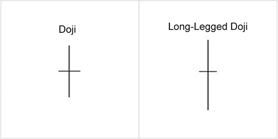
One of the most popular candlestick patterns is the Doji pattern. What is a Doji? A Doji pattern is when the individual stock, or any other market instrument for that matter, opens, moves up or down throughout the market day but closes at about the same price as the open. The lengths of the wicks (the high and low) can vary from short too long. The Doji pattern indicates indecision in market direction between buyers and sellers. The long legged Doji consists of a Doji with longer wicks and indicates stronger indecision between the buyers and sellers, as you’ll see from the examples below:

Traders can use the indecision indicated by the Doji pattern to identify a potential weakening of the current trend. This can often trigger a price reversal in the opposite direction.

2. Engulfing Candlestick Pattern

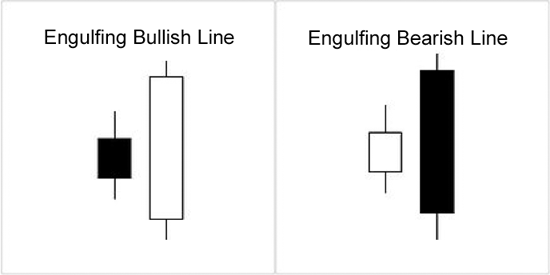
Another one of the basic patterns indicating indecision and a potential direction change in the market is the Engulfing pattern. Examples of bullish and bearish engulfing candles follow:

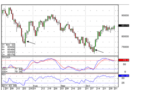
An engulfing candlestick pattern is a favorite pattern among candlestick traders because it is a good indicator of a possible market reversal. The pattern consists of two separate candles. The first day is a narrow range candle that closes down for the day. While the sellers are in control of the stock or ETF being charted because volatility is low, the sellers are not very aggressive. The next day is a wider range candle that totally covers or fully “engulfs” the body of the previous day and closes near the top of the range. In effect, the buyers have overwhelmed the sellers, which indicates demand is greater than supply. Buyers may be ready to take control and push the issue higher. Note in the chart below, that the whole market sentiment reversed at the Bullish Engulfing candlestick formations.

A bearish engulfing pattern would be just the opposite as the bullish engulfing pattern, indicating a change to the downside.

These two popular candlestick patterns, both Dojis and engulfing patterns can be used to help identify indecisive market sentiment and potential changes in direction. Look for one of both of these patterns to help identify momentum price shifts

Stop Loss Placement

One of the most important things a trader needs to do is to control their risk. Risk control is where we put parameters on how much we are going to put into the market and what we are willing to lose. Because of the important nature of this, we need to know how we approach placing stop losses in our trades. Regardless of your trading style or the time frames you trade, you need to know where you are going to place your stop loss before you actually enter the position. If you do not know where the stop loss will be placed before you enter the trade you will have a difficult time determining the correct position size for your trade.

The general guideline for how much to risk is no more than 2% of your overall trading account. This, of course, means that you could risk less if you wanted. In order to calculate your position size, and so that you don’t risk more than the maximum amount, you would need to know where your stop loss will be placed before you place it. Again, the importance of where you place your stop loss is of utmost importance.

So, now that we know it is important, we need to be able to determine the best place to put the initial stop loss. This should not be some “guess” or some “feeling” of where we should place it, but it should be a definitive rule that we use to know exactly where this placement should be. For example, your rule may be to place a stop loss below the low of the most recent swing low if you bought, or above the last swing high if you sold. This would give you the exact location of the stop by looking at the chart, then finding where the last swing low or high was located. You might also have a rule that has you use the 40 period simple moving average as your gauge for stop placement. You would simply place the stop loss below the moving average if you bought or above it if you sold. One other commonly used indicator used for the placement of a stop is the Parabolic Stop And Reverse or PSAR. This indicator will place dots on the chart either above or below the current price based on the trend. In general, if the trend is up, there will be a dot below the price and if the trend is down, the dot will be above the price. This can give an exact location for the placement of the stops. In addition, it will move tighter as the price moves in the intended direction so it can act as a type of manual trailing stop.

Regardless of what you use, you need to have some rule for your stop placement. This will allow you to determine, based on your maximum risk, the correct positions size to place on the trade. Take some time to review your rules and process for placing stops to make sure you have a definitive way of placing them.

Technical Indicators: Moving Average Convergence Divergence

What is the Moving Average Convergence Divergence (MACD – pronounced MAC-DEE or M-A-C-D) technical indicator? The indicator formally known as Moving Average Convergence Divergence was originally developed and promoted by Gerald Appel in the 1970’s. The Moving Average Convergence Divergence is also commonly referred to as MACD. The MACD is in the family of oscillating indicators and, specifically, a momentum technical indicator. It is also very popular because it is one of the easiest indicators to use. The MACD basically turns two moving averages into a momentum oscillator by subtracting the longer moving average from the shorter moving average. The result is that the MACD offers both a trend indicator and momentum indicator.

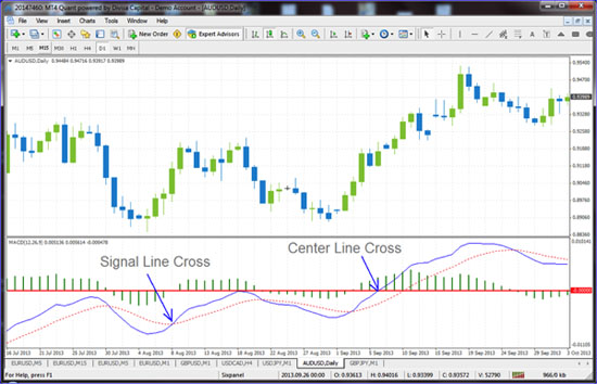
Note in the chart above that when the signal crosses the center line there is a momentum shift, also when the signal lines cross there are good entries.

There are three main uses that traders use the MACD for:

1. Market Momentum Shift – When the MACD rises or falls dramatically – that is a signal that the security is over-bought or over-sold and will soon return to normal levels. Traders also watch for a move above or below the zero line because this signals the position of the short-term average relative to the long-term average. When the MACD is above the zero line, the short-term average is above the long-term average, which signals upward momentum. The opposite is true when the MACD is below the zero line. As you can see from the chart above, When the MACD line crosses the zero line we see significant momentum.

2. Divergence – We have discussed Divergence in previous articles in relation to Stochastics or RSI, where indicators diverge from the price action. However, many traders use the M A C D as well to identify areas of divergence when the security price diverges from the MACD indicator levels. An example of this is when the price is in a down trend and is continuing down while at the same time the indicator is moving up or diverging from the price action. This is when divergence is indicated and this may signal the end of the current trend and a potential market trend reversal. Divergence may not be the only reason people use the M A C D, but to me it is one of the most powerful uses and one of the most beneficial.

3. Moving Average Crosses – As shown in the chart above, when the MACD line moves above the signal line, it is a bullish entry signal, which indicates that it may be time buy. And the opposite is true, that when the MACD falls below the signal line, the indicator gives a bearish entry signal, which suggests that the price of the security may be likely to experience negative or downward momentum. Many traders wait for a confirmed cross above the signal line before entering into a position to avoid entering into a position too early.

In conclusion, the MACD indicator will move above and below the zero line as the moving averages cross each other, as well as converge and diverge. Traders can look for signal line crossovers, centerline crossovers and divergences to generate signals. If you have never used the MACD indicator, put it on your charts and give the signals a try!

Government Provided Trading Opportunities

So what have we learned from the most recent government debacle, as much as anything else we learned, is that there is another one waiting to happen, it’s right around the corner. I’m not really sure that is anything new, but, at least, in the past, when the government shut itself down or, at least, threatened to do so, there was a solution that kept it open that was funded for a good amount of time. Now we have another potential fight to look forward to right after the New Year, around the middle of January. The nation’s debt limit will need to be raised again shortly thereafter. I believe a one-month extension is possible, so we may be at the end of the winter or the very beginning of the spring when we need to deal with that issue.

What we have learned from this past round of arguments and lack of production is that congress is providing us with a few good opportunities to trade. As the government was shut down for more and more days, the stock market continued to drop, meaning, of course, that we had the opportunity to short the market. The government being partially shut down was not a good thing; however, that, coupled with the self-created debt crisis, made matters a little worse. Again this provided us with a small short opportunity, but the likelihood that the congress would let the nation default on its loan payments was something that just didn’t make sense. The opportunity then became long because as the market fell unless you actually believed that the congress would let the country default it was obvious that there would be a surge when they began to get closer and closer to a deal. It was also a little obvious that the closer the debt ceiling deadline came the higher the market should rise because a deal was becoming more and more imminent if you assumed that congress would eventually do its job.

The good news for some of us is that this isn’t just talk from looking at the charts for the last few weeks and then correlating the moves with the news events this was the actual thought process along the way; you should have been able to see the negative from the shutdown and then the surge from the deal. If this isn’t something that you participated in, stay tuned because there is another opportunity right around the corner. As previously mentioned, we are going to relive much of these same events early next year so more than likely the same or a similar pattern will emerge. Exactly how it occurs is something that will need to be read in real time as the events unfold. But make no mistake about it, congress has provided us with the material that we needed to trade successfully over the past few weeks and they’re going to do it again. All we need to do is to be ready to participate when it occurs.

Even if you missed the most recent opportunity, or if you don’t want to participate in the rolls in the price action that the news events create in general, you can still find the short-term rhythm of the market taking advantage of the show congress puts on for us. It is already nearing the end of October, which, of course, means that we should be planning our goals for 2014. I’m a big believer in participating in the trends that the market presents to us; the first quarter of next year is already set up to provide us with some good trading opportunities to start off the New Year.

Up, Down, and All Around

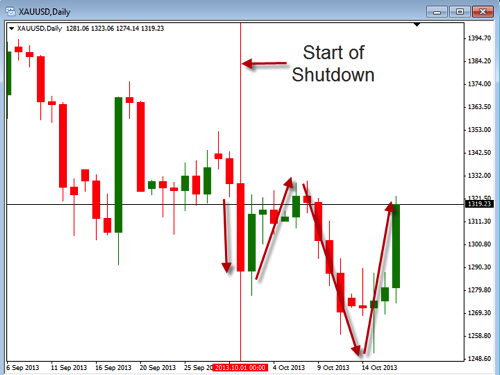
I would love to say the Government shutdown issues and debt problems are all over but I’m not sure that is the case. So I will say they are currently postponing the problem for the time being. This congressional “deal” has made gold jump up, at least temporarily. Over the last 16 days of Government shutdown we have seen the gold market move all over the place. We will see if things settle down now that the Government is back to work. I would continue to use caution until the volatility issues settle down a bit. Take a look at the chart below of the daily time frame to see the recent movements that have occurred.

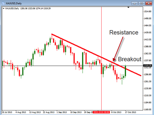
On this chart you can see the vertical line which represents the start of the shutdown. You can also see the down and up arrows which represent the daily movements during this time. Today you can see the large move up which brings us back up to the area we were moving in prior to the shutdown. This is a good example of volatility moving the price but really not going anywhere. At this point we want to see if the down trend is going to continue or if we are going to breakout and head higher. Take a look at the chart below showing the current area of resistance.

On the above chart you can see the downward pointing resistance line in which the price is currently trying to break out of. If we can get a close above this we may start to see a longer term move higher. This is also a point where we may look to see the price move down off of the resistance line and move lower.

The next chart shows a shorter time frame and how the price has been moving on an hourly basis.

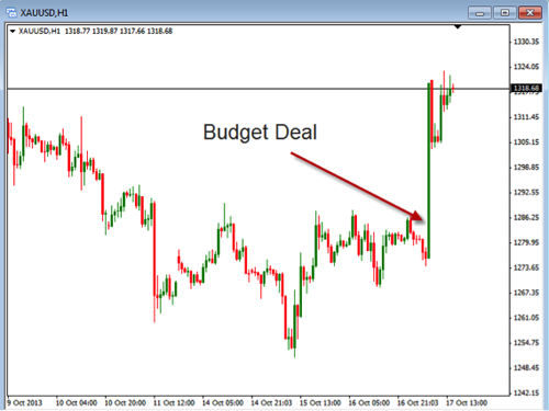
In this chart you will notice that the price moved up quickly on the announcement of the budget deal. This could be the catalyst needed to see the price breakout above the daily resistance level. Regardless of it breaking out or not, we need to recognize that we are dealing with an increase in the volatility in gold.

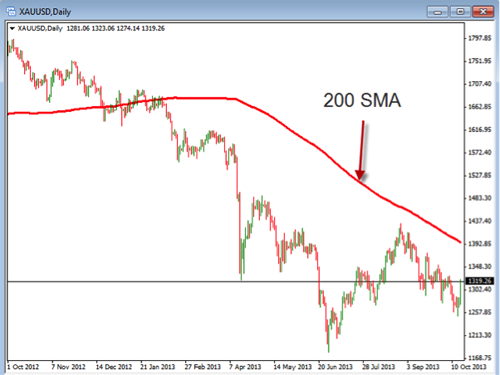
As you look at the opportunities currently in gold, you will want to consider where we are in the relationship to the prior highs. As you know, gold has dropped over the last few years from its highs above $1900 to where it is currently. Of course we don’t know price is going up but we need to consider the fact that it might once it breaks through some areas of significant resistance. Consider the chart below which shows the 200 SMA as an area of resistance. This would be the significant resistance we may want to see broken in order to become bullish on gold.

While gold seems to want to jump up and down right now, at some point this is likely to settle down. As this happens you may want to look for a bullish move back up again to start buying. Until this happens, our overall bias will still remain bearish. Take some time to review the various charts for gold and see where you might consider taking new trades.

Know the Trend

As we enter the third week of the government shutdown, along with the debt ceiling deadline looming, we need to make sure we are careful in all of our trades. Currently news seems to cause the markets to over react to things so make sure you are using good risk management so you don’t get caught in a negative reaction. With that being said, today we are going to discuss the importance of determining the trend during these volatile times.

As you know, the trend is going to show you the overall general movement that is happening to a currency pair for a specific time frame. This does not mean that the trend for that chart is all inclusive of all time frames. This means that just because the trend is up on the daily chart that it will also be up on the 5 min. chart. This is important to know as we need to look at the trend that is most relevant to the charts we are trading.

In a market like we are currently in it is advisable to look at multiple time frames and see what their trends are. By looking at the higher time frames we can make sure we use the stronger momentum to help us know the direction to trade. So, for example, if we are trading the 15 minute charts we may want to look at the hourly as well as the daily charts to consider their impact on the short term 15 min. time frame. If the 15 min. chart is currently in an uptrend we would want to check that against what is happening on the hourly chart. If the hourly chart is also trending up we would have confirmation of the direction on the 15 min. chart. Finally, we could confirm those trends against what is happening on the daily charts. If the daily and hourly charts are confirming the 15 min. chart trend we can have confidence that we can take a long position by buying the currency pair once a trigger has occurred.

This approach to looking at the trend will keep us from being too myopic in our analysis of the charts. When we are myopic it causes us to avoid looking at the big picture. When we don’t see the big picture we may miss the advantage of knowing the stronger term momentum which will cause the price to be more likely to continue to move in the direction it is going.

So, during this time of uncertainty, consider adding the approach of using longer term charts to help you better know the overall trend. This may add the confidence you need when trading during volatile times. It will only add a few additional steps in your evaluation process but it will be well worth it if it keeps you from being whipsawed in and out of trades during potentially big reactions to the news. Take some time to review this approach to better understanding the overall trends of the currency pairs you are trading.