Fibonacci Lines

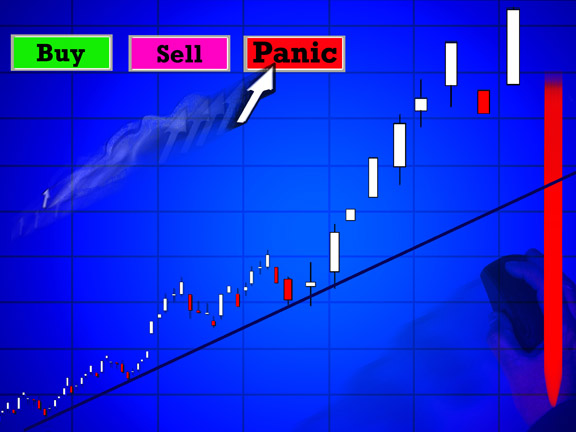
In a market that has been as volatile as we have been experiencing, it is often times good to use some additional confirmation in order to look for trading opportunities. Today we are going to look at how the Fibonacci lines might be able to help us look for these opportunities.

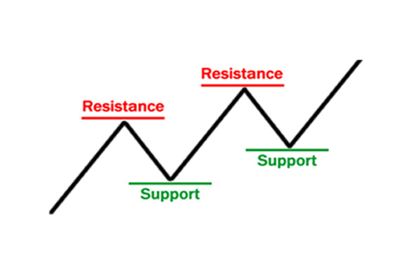
Fibonacci retracement lines are oftentimes used to help us see where the price might find the next level of support or resistance. These retracements are looked at by many traders and can be a significant area to look for change. A bounce-off or breakthrough of these areas can be a great opportunity to enter a trade.

The idea of using these retracements is to draw a line at the beginning of the trend and stopping at the end of the trend. The lines will be placed on the chart indicating where a retracement may be located. Once the level is reached, you will then look for opportunities to enter a trade.

Another way to use the lines is to look for areas where we might place our stops and our targets. These lines will give us a visual as to where we might want to place these exit points.

Take a look at the chart below to see an example of Fibonacci retracement lines on the chart of Gold. You can see the red line, which indicates the downtrend. This is the trend where we will draw our Fibonacci line. The line is drawn from the beginning, which is the top of the red line down to the bottom of the rend line. You can see that there are several lines that are placed in the chart showing the various levels of retracement based off of the Fibonacci numbers. The bottom line is the zero line, which represents no retracement at all. The next line up on this chart is the 23.6 level, followed by the 38.2, then the 50, 61.8 and, finally, the 100% retracement line. At each of these levels, you will see the possibility of the price changing direction. If you see a bounce down from these levels, you will have an opportunity to short the chart. If it breaks up through, you have an opportunity to buy. Either way, you will want to look at these areas for possible trade decisions. Regardless of your rules for entering into a trade, the use of Fibonacci retracements might be a good addition to your trading. We all know the importance of using trends and identifying support and resistance areas, so this indicator is a natural extension of that concept. As we identify the trends, we can draw the Fibonacci lines and as we see the lines we can use them to help us better identify these key support and resistance areas. Take some time to review this indicator and practice using it on your charts in conjunction with your current rules. You will then be able to see if they can help support your trade decisions.

How Strong is the Market Trend?

One of the first and most important things to do in successful trading is to determine the direction of the market or the market trend. Once the market is in a good trend, moving either up or down, it is important to understand the strength of that trend. One very good tool to help determine the strength of the trend is the Average Directional Index (ADX). The ADX indicator can help determine if a trend is strong or weak. When the ADX numbers are higher, it indicates a stronger trend, and lower numbers indicate a weaker trend.

If the ADX indicator is showing a lower number, the trend is weaker and a market may be in a range or channel. Since we are always looking for good trends to trade, it is best to avoid trading stocks, ETFs or Forex pairs with low ADX values. You would rather look for trends that have higher values, thus indicating a stronger trend.

It should be noted that the ADX indicator measures the strength of a trend, not the direction of the trend, either bullish or bearish. Therefore, a high ADX number could indicate either a strong uptrend or a strong downtrend. It does not tell you if the trend is up or down, it just indicates to you how strong the current trend is.

Some charting packages may have two other lines on the chart, +DI and -DI (the DI part stands for Directional Indicator). When determining the strength of a trend, these additional lines don’t have anything to do with the strength of the trend, so I am not concerned with them. For this purpose, we are only concerned with the main ADX number.

Understanding the ADX Scale
If the ADX indicator is lower, between 0 and 20, then the stock is generally in a trading range. It is likely just a sideways ranging market.

Once the ADX indicator gets above 20, then you will often to see the market in of a good trend.

When the ADX indicator gets above 25, then you have at a stock that is in a strong trend (up or down).

If you have lower numbers, you have a trading range or the beginning of a trend.

Here is an example of the ADX indicator on an S&P 500 chart:

In the current S&P 500 chart above, notice the ADX indicator is the blue line at the bottom of the chart. Notice when the ADX is showing a lower value, the price is moving against the trend, or more in a sideways channel. Notice what happens when the indicator gets into higher territory (over 20) the S&P 500 is in a good uptrend. These are the trends (either up or down) that are the best to trade.

So how can you use the ADX indicator to use? You can look for ADX values of 20 or greater to help determine a strong trend for trading. The ADX indicator is not used to give buy or sell signals. It is most often used, along with other indicators, to help determine entry and exit signals. What the ADX does give you is the strength of the market trend to help determine the best trends to trade.

FOMC Trading

This week the FOMC will make its decision on interest rates here in the US. This report is usually one of the potentially more volatile news releases. This is a report that comes out about eight times each year and one that will cause some volatility in the market before, during, and after the announcement. Because of the influence the FOMC has about the monetary policy in the US, the effects can be wide ranging. Generally speaking, the announcement will cause a bump in volatility regardless of what is said.

With that being said, today we are going to discuss the impact of volatility when a major news announcement is released. More importantly, we are going to talk about what we can do during these times.

Pre-announcement
One of the most important things we can do in our daily routine is to identify those economic announcements that could affect our trading for the day. If we don’t know what is coming out, we won’t be able to protect our trades. Each day, you should look at the calendar to see which scheduled announcements are coming out and when they are being released. If it is a big announcement, such as FOMC, we can expect the market to act more volatile the day before the release, as traders are trying to anticipate what might happen. On the other hand, if it is a small announcement, you may only see minor volatility right before the release occurs. Knowing that there can be volatile moves before the actual release can keep us out of trades that might be negatively affected by the news.

If you are going to trade the news, you will be placing your trades as close to the announcement as possible so you can take advantage of the potentially large movements that occur. You will notice an increase in spread so you will have to take that into consideration in placing your orders or you may get filled early, which might not be the best thing.

Announcement
At the announcement, you will notice a movement that occurs. This movement could be big or small depending upon how the numbers come out. Typically, if the actual number is better than the forecast, it is good for the currency, and bad if the number is worse than the forecast. Sometimes it’s better to just wait the announcement out, then begin to trade after.

Post-announcement
After the release of the news, you will see the market react based off of how the numbers came out. Sometimes this move will be very volatile, while others it will be non-existent. Depending upon how active the market moves, it will determine how long the volatility might last in the pair you are watching.

So, with the FOMC release on Wednesday we need to be prepared before, during, and after the announcement for potential volatility. In watching for this, we need to know what we are going to do during each of these phases of the report. Our choice for trading will range from doing nothing and watching, to actively trying to trade the increase in volatility. Whatever you decide to do, just be prepared and you will be fine. At a minimum, if you are trading the news, consider lowering the amount of risk you are taking in each trade during this time.

The VIX: What is it and how is it used?

The last couple of weeks there has been quite a bit of volatility in the market due to several mixed events in the economy and global events. Last week there was poor economic data out of China and soft domestic economic data. The Fed has started tapering, or reducing, the Fed’s Stimulus QE3 program and has created some uncertainty in the market. How can we quantify or measure this uncertainty?

This is where the VIX can be used. The VIX is often referred to as the ‘Fear Index’. The VIX is the ticker symbol for the Chicago Board Options Exchange Market Volatility Index and is a popular measure of the implied volatility of the S&P 500 index.

Where did the VIX come from? The first VIX, introduced by the CBOE in 1993, was a weighted measure of the implied volatility of eight S&P 100 at-the-money put and call options. Ten years later, it expanded to use options based on a broader index, the S&P 500, which allows for a more accurate view of investors’ expectations on future market volatility. Higher VIX values are generally associated with a large amount of volatility as a result of investor fear or uncertainty, while lower values generally correspond to less stressful, even complacent, times in the markets.

During periods of market uncertainty, the VIX will often spike higher because there is a panic demand for OEX Puts as a hedge against further declines in the overall stock market. During more bullish periods, there is less fear and, therefore, less need for stock investors and portfolio managers to purchase puts. This is why, as stated above, the VIX is often referred to as the fear index – at times when the index rises because of market volatility, the market tends to be in more of a panic and often the panic leads to a market sell-off. Conversely, during times when the market is calmer, either ranging or a steady trend, the volatility is lower; therefore, the VIX will be lower. This inverse relationship in the market is illustrated by the graphs in Figures 1 and 2 below.

 Figure 1: Current S&P Index Chart

Figure 2: VIX Volatility Index

Notice that the VIX spiked up, as the S&P index moved lower, ahead of the FOMC announcement this week because of the uncertainly and potential FED actions. In the charts above, generally speaking, when the markets are more uncertain, the VIX is higher and the S&P has moved lower. After this sell-off or panic is over, the market is generally lower and may be a good place to buy, as the market may rebound or move higher. As this happens, the VIX will often move lower as less uncertainty is perceived in the market.

In conclusion, understanding the emotions in the market, or what is commonly referred to as market sentiment, is very important and using the VIX can be a valuable tool for investors looking for some clarity concerning market volatility.

Is Your Money Smart or Dumb?

I have heard a statistic that states the US stock market experiences a 10% correction one time per year, on average, and a 20% correction at least once every three years. If these statistics are correct, what does this tell us about protecting our positions, regardless of if they are long-term positions or shorter-term positions? Either way, if we are watching the price action of our investments, we can get an idea of when it may be a good time to exit the position by looking at the broader market. Of course, short-term positions may be a lot less related to what the broader market is doing simply because a short-term trader is looking to exit relatively quickly; they will not be looking for or expecting long term growth. However, even if you have a short-term position, taking cues from the broader market can still be very helpful.

Looking at the market as a whole may tell you if you should be trading or investing at all at specific time. When you go to a store to purchase a product do you want to purchase the product at a fair price, at a premium or at a discount? Most people like sales so buying anything under market value is typically thought of as a good thing so we want to get as much as we can on sale. The funny thing about this is that this is not typically how people view their securities purchases. You can buy stocks, like any any other product, at a premium, at a fair value or at a discount. If you can purchase securities at a discount simply by waiting until the next 10% correction occurs and if you can catch a 20% correction or more it’s even better, why pay full price? There is really no reason to pay full price for securities as long as you have the patience to wait for a sale in the market and there is definitely no reason to pay a premium just because everyone else may be.

There is an old stock market adage that states that the market climbs a wall of worry which simply means that the higher the stock market goes the more nervous traders and investors get because at some point it will go down however as it goes up greed takes over along with the feeling that you may be missing something, everyone else is making money so why shouldn’t you. The earlier part of a trend through its middle is typically where the smart money gets in and out, the dumb money gets in at the latter part of a trend which is what cerates the extension of the trend, this is what allows the smart money to get out as the trend continues. By the time the market corrects and the trend reverses itself the smart money is either short or in cash while the dumb money got it during rising prices and stayed in for a given amount of the correction. The exit of the dumb money creates the next opportunity for the smart money to enter by taking a short position as the dumb money sells or by staying in cash waiting for all the dumb money to exit so they can enter and ride the cycle again.

One thing that comes to mind is an old financial planner’s saying, it doesn’t matter how much money you make what’s important is how much money you keep. This was referring to income but it is very applicable to investing as well because if you ride the market cycles up and down the value of your accounts will increase and fall without really accomplishing much at all. If you keep getting into trends late or near their end your account will probably just fall. Why not wait for a sale or even a fire sale in the stock market and load up when everyone else is running away? Real estate investors know that when they invest in a piece or real estate they make their money on the buy, trading and investing is not much different in this regard, the better or smarter your entry into an investment is the more likely you are to do well when it ends.

Uptrending Gold?

This week we are going to follow up with our article from last week on whether or not gold is in an uptrend or downtrend. In the chart below you can see the 4-hour chart of gold. One of the things we look for when deciding if the trend is up or not is to look at the overall price action on the chart. We know the downward movement of price will be considered a downtrend while the upward movement is considered an uptrend. I would think that most traders would identify this chart as an upward moving trend.

Once we determine the trend of the chart, we can then begin to look for opportunities to trade it. In this case, if we decide the trend is up, we would be looking for areas to buy into it. The next important thing is to actually decide on what the “trigger” will be to get you into the chart. There are many, many different ways to enter a trade, so each one of us needs to look at the rules we are using to decide if the entry trigger has been met or not. Regardless of what our trigger is, we are generally going to be looking for a “good” place to enter our trade. Good places, in an uptrend, usually happen after the price has dropped back down a bit. In the chart above, you can see the down arrows that show these pullbacks in the trend. These would be considered good areas as they are moving back down to find some level of support.

After the price has pulled back, we would then be looking for the actual entry place. Again, this will be determined by what our rules tell us in order to buy gold. Now that you have determined you will be entering a long trade you will want to determine the amount of gold you will be buying. This is done after you have decided where to place your stop loss. If you know where you will be exiting if the price moves against you, you can determine the appropriate amount to trade. This is done by, first, knowing the amount you are willing to risk in any single trade. For example, you may decide that 1% of your account is a good amount to risk. You should never go above 2% on each trade, as this will give you too much risk in a single trade. You would then determine what your position size would be based on both the stop loss amount and the amount you are willing to lose in each trade.

So, regardless of your trading rules, you will want to consider opportunities to buy gold if this 4-hour uptrend continues. Just make sure you have your rules for entering, exiting, and positions sizing. If you have all these things, you will be in control of your trades and you will have the greatest chance of success. Take some time to review your rules and see if gold might be ready to trade.

Using Support and Resistance

Support and resistance is one of the most important concepts to understand in trading. The reason support and resistance is so important is because these levels can help us understand better what the trend of the market is. If we can answer the question, “Is the market in an uptrend or a downtrend?” – this can lead to much more productive trading. Using support and resistance levels can be critical to identifying these trends. In fact, one of the definitions of a trend is looking for higher highs and higher lows in an uptrend and lower highs and lower lows in a downtrend. Newer traders who are following the markets will generally start by noticing tops and bottoms to the markets. These tops and bottoms are the basis of support and resistance levels or zones.

What is Support?

Support level is a price level where the price tends to find support or a ‘market floor’ as it is going down. It is where demand is strong enough to prevent the price from declining further. The idea is as the price gets cheaper, investors become more interested in buying and are less interested in selling (an oversold situation).

What is Resistance?

Resistance level is the opposite of support. It is where the price tends to find resistance or a ‘market ceiling’ as it is going up. It is where demand weakens enough to prevent the price from increasing further. The idea is that as the price gets more expensive, buyers become less interested in buying and sellers are more interested in selling (an overbought situation).

Using Trend Lines to Help Identify Support and Resistance

The first step to identifying support and resistance levels is to go on a chart to connect the recent significant highs using a trend line at the top of the market. The next thing to do would then be to connect the lows using a different trend line at the bottom of the market. Once the tops and bottoms are connected, this will show the support and resistance levels, and helps identify the support and resistance zone or channel forming the outsides of the movements of the market. Once these trend lines are drawn, it is easy to see and identify the support and resistance zones or channels and also identify if the market is generally moving up, identifying an uptrend, or generally moving down, identifying a downtrend. This is illustrated in the chart below. Notice the trend line is supporting the market price action as a floor and the market is moving up and down between the support at the bottom and the resistance at the top.

Conclusion

Support and resistance levels are critical to trading and are used by traders every single day, whether they realize it or not. By identifying support and resistance zones, using trend lines can help you to identify the areas where the market may turn or bounce and are some of the best places to enter the market, as the market trades between these channels, floors to ceilings in an uptrend and ceilings down to floor in a downtrend. If you are new to trading, draw these channels using trend lines and watch how often the market bounces off these levels.

Trading with the Trend

If you are new to trading you will want to incorporate the idea of trading with the trend as one of the first things that you do. The trend of the market, currency, stock or other trading instruments is one of the most important things we need to understand as a trader. The trend is the overall direction that the price is moving. There are generally three trends that or directions that the price can move: up, down or sideways. Knowing this direction will keep us on the correct side of the price action. If we are on the correct side of volatility we will increase the probability of profitable trades.

In order to trade with the trend we will need to know how to define the trend. There are many ways to do this, the important thing is to find a simple way to determine the price trend without making it too complicated. One way to do this is to just look at the price movement. Is it going up or is it going down? If the price is making higher highs and higher lows the trend is up and if the highs and lows are lower, then the trend is down. If neither of those situations are happening, then the trend is sideways or non-trending. Another way to identify the trend is to look at a moving average. A 40 period simple moving average is a commonly used on where if the moving average is going up the trend is up and if it is going down the trend is down. The goal is to get a general idea of where things are going. Of course, even if everything says the price is going up, it could turn and go down. This is one reason why we need to use good money management.

Once we have been able to determine the trend, we will want to start to look for opportunities to trade in this direction. There are many things we can use to look for triggers but keeping it simple is often the best and most effective way to look for entries. The general idea is to first look for the trend, then look for a good time to enter the trend. As the price goes up in an uptrend we know that it will eventually run out of momentum and begin to move back down. During this time of down price action we will want to look to enter as the price begins to move back in the direction of the overall trend. In order to do this you can watch the price and when it starts to move up again you can enter. You could also use an indicator to help you visualize an entry. Many traders will use an oscillator like the stochastic indicator to show when the price is moving up again.

Regardless of how you enter, you will want to first identify the trend, then look for a pull back and finally look for the trigger. If you focus on trading with the trend you will find the market will help your trade be profitable. Take some time to review your process for finding the trend and entry point so you can become better at trading with the trend.

Using Flag Price Patterns

Trading with the trend is one of the best ways to succeed. However, identifying a trend in the markets can be a bit tricky; trends start and stop, continue and reverse. Once a trend starts, it doesn’t go straight up or down, but will have areas of retracement or pull back. The very nature of the market forces of supply and demand makes sure that there are natural levels of profit taking in most market moves. One of the most important elements of successful trading is identifying these pullbacks and to understand if they are just temporary pauses, or if they are actually market reversals. This is where analysis of the price action comes in. We can use certain price patterns based on this price action to help determine if these pull backs are possible setups for an entry.

One type of price pattern we can use is a continuation pattern such as a Bull Flag or Bull Pennant for an uptrend market or Bear Flags and Bear Pennant for a downtrend market. These patterns help us to identify areas of continuation, looking at a pull back or a consolidation and resumption of previous trend after the pull back. Here are some examples of what these continuation patterns look like:

Flags and pennants can be generally categorized as continuation patterns. These price patterns usually show brief pauses in a strong trend. They are usually seen right after a larger quick move. The market will often pick up again in the same direction. Over time these continuation price patterns are very good at identifying potential entry points.

Bull flags are characterized by lower tops and lower bottoms, with the pattern slanting against the trend. But unlike wedges of a Bull Pennant, their support and resistance lines run parallel.

Bear flags are comprised of higher tops and higher bottoms. “Bear” flags generally slope against a strong down sloping trend.

Pennants are similar to flags but are not parallel and look very much like symmetrical triangles. Pennants are also generally smaller in size or volatility and duration than Flag patterns.

Here is a recent example of several bull flags on the AUDUSD Daily Chart:

Note in the graph above that after a move up, the Bull Flag is formed by the lower highs and lower lows in a pullback and once it broke above the flag it resumed the bullish uptrend and then another Bull Flag formed by more parallel lower highs and lower lows running against the uptrend, and once the pullback is “broken” the price breaks out and continues the previous up trend for a very positive gain. The best way to take advantage of this pattern is to set a “buy stop” entry order close to the top of the pullback so that if the trend resumes to that level you would be triggered into the trade to take advantage of the continuation. The same patterns apply to a bearish downtrend but in the reverse pattern and with a “sell stop” at the bottom for an entry order.

Take some time on the charts to look for these Flags and Pennant patterns to help identify good entry points as the current trend resumes.

What’s Up (or Down) with Gold?

Just when we think the gold market is ready to take off, it decides to drop back down again. This just proves that it doesn’t matter what we think; the only thing that matters is what the market is actually doing. Today we are going to look at three charts: the weekly, daily and 4-hour time frames. As we look at these, we will point out the important areas of support and resistance that may be important to know in the near future.

As we begin, we will first look at the weekly chart, which will help us see the “big” picture of how the gold market has been moving over the longer-term. There are two fairly obvious things that we should get from this view. First, the overall trend has been moving down since the high back in 2012. The second is that we have a very well-defined area for both support and resistance. In addition, as you look at these two lines you will notice that they are converging into a point. This consolidation often times leads to some sort of breakout. We will keep this in mind as we look for potential directional changes for the price of gold.

This next chart shows the daily price action of gold.

In this chart you will notice that the daily trend has been moving down, but has recently moved back up. These two up arrows indicate the areas of support and resistance on a more intermediate time frame. Because of the downtrend, we would be looking to trade in the direction of the trend on a break down from the green support area; this would be with a trend trade entry. A break above the prior high, around 1266, would give support to the idea that the price wants to move up again. We will keep our eyes on these daily price areas.

The third chart below is of the 4-hour time frame. This will give us the shorter-term outlook of the price action of gold.

In this 4-hour chart you can see the current uptrend a bit closer. You will notice the pattern the price is making of higher highs and higher lows. You can also see the green arrows, which represent the areas of support. Currently, the price is moving up and off support. This might be an area where we see the price moving higher on. A break of this support could lead to another down move.

With gold trying to decide where it wants to go, it is a good idea to look at multiple time frame charts to get a better overall picture of what might happen. As we look at the longer-term view, we can see things that we might be missing when looking at shorter-term charts. This is important even if we are trading a 5 min. chart, as we will have better insight into the short-term moves. Take some time to review this to see how it might help with your trading.