What is a Deliberate Market?

Today we are going discuss a bit about trading when the market is moving in a deliberate fashion. In order to know if we are trading in a deliberate market, we first need to define what a deliberate movement looks like. This should be fairly obvious, but we will try to define it anyway.

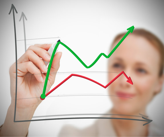
Deliberate markets are ones that the price action avoids big price swings or flat price action. What we are looking for is a market that avoids trading in the extreme ranges of price action. If it is too flat, then the setups have a hard time developing. If it is too volatile, then the setups become harder to identify. Deliberate movements are those that fit in between these two extremes.

Non-deliberate markets have price action like we described above. When we are trading during times of big price action we will see candles that move up or down quickly, followed by quickly reversing moves. As you can imagine, if the price moves too fast, we will have a difficult time entering and exiting our positions. On the other side of the extreme, we have flat markets that seem to just move sideways. These types of movements can be frustrating because as soon as we get a setup the trade goes flat.

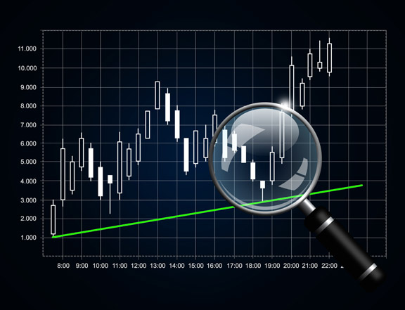
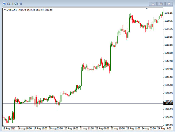
Now that we have defined what a deliberate market is and is not, we can know what we need to look for on the charts. When looking for deliberate markets, we should focus on finding price action that is smooth and consistent in how it moves. Just like when trying to identify the trend, we want to find price action that swings from high to low with the extreme moves. As the price deliberately moves to new higher highs and higher lows, we will be looking for buying opportunities. As the price deliberately moves to new lower highs and lower lows, we will be looking for selling opportunities.

As we look for deliberate moving markets we need to realize that we are not looking for perfection, just nice consistent moves. As we look and identify these types of markets, whether we are trading gold, futures, stock or currencies, we will be placing our trades in the best possible situation to profit from our trades. If we become too anxious and jump into a trade without evaluating the deliberate or non-deliberate movements, we will never know if we are getting in at the best times.

Sometimes it can be difficult to tell if the market is really deliberate or not, so take some time to practice looking at and analyzing your charts in order to become more comfortable with making the decision. This will give you more confidence and place you in the best possible positions to be successful with your trade. Although we may never find the perfect market movement, we certainly can find the times when it is not perfect. Avoiding these times will keep you on the right path for trading the best markets.

Stochastics Indicator and Divergence

The Stochastics Indicator is one of the more common indicators used in technical analysis. What is the stochastics indicator and how is it used?

The stochastics indicator was first developed and promoted by Dr. George Lane in the 1950’s. Today, stochastics are used for technical analysis in most markets, including stocks, options, futures and Forex.

The stochastic fits into the technical oscillator family, measuring the magnitude and momentum of price movements. The momentum is the rate of the rise or fall in price. The stochastic indicator is measured on a scale from 0 to 100; high (overbought) and low (oversold) levels are generally set at 80 and 20 percent.

The stochastics indicator has been referred to as a ”leading indicator” since it can identify a change in momentum, even before they appear in pricing behavior, which may indicate a potential change in direction of the trend, or what we refer to as divergence. Traders also use the indicator to determine overbought and oversold conditions by identifying the tops and bottoms of price cycles in the markets, especially on short-term charts.

While the stochastic indicator is helpful in identifying overbought and oversold levels, the primary use for which George Lane created this indicator was for spotting bullish and bearish divergences. Using stochastics, I will show you that momentum often shifts before price does and spotting these instances can be a great method for entering your stock or Forex trades.

The idea behind divergence is that when a new high or low in a security occurs, but is not confirmed by the stochastic indicator, it indicates a weakening of the current trend and a potential trend reversal.

Bearish Divergence in an Uptrend
Bearish divergence occurs when price makes a ‘Higher High’, but the stochastic indicator makes a ‘Lower High’. This shows that the upside momentum is slowing, even though prices are continuing to make new highs, and a trend reversal may be setting up. Notice in the EUR/GBP 15 min chart below, the stochastic indicator is making lower highs at the same time the price action is setting higher highs. This is the definition of bearish divergence, which could be used to indicate a possible move lower.

Fig. 1: Bearish Divergence

Bullish Divergence in a Downtrend
Bullish divergence is simply the opposite of bearish divergence and occurs when prices make new ‘Lower Lows’, at the same time the stochastic indicator is making ‘Higher Lows’. Notice in the EUR/USD daily chart below, the bullish divergence as the price action had continued lower at the same time the stochastic indicator has started to move higher, indicating a weakness in the down trend and a potential change in the price movement or trend before the price action shows any real sign of a reversal. Note the change in trend direction immediately after the bullish divergence occurs.

Fig. 2: Bullish Divergence

Conclusion
While many traders use stochastics to identify overbought and oversold areas, and identifying entries and exits using the crosses of the %K and %D, I think that divergence is the most powerful use of stochastics. So take some time to look for these divergences signals.

Issues With News

Today we are going to talk a bit about trading the news. This is a common trading strategy that traders use to help identify areas to enter a trade. They will wait for the news to be released, then take a trade as the price begins to move quickly. Often times this is done by placing a buy stop order above the current price and a sell stop below the current price. If the news comes out and moves quickly one way or the other, the trade can profit from the move. There are some problem that we need to be aware of when trading the news.

  1.  News can come out one way, but the market often reacts differently. So if the news comes out negative for the USD, we may see the USD strengthen for some reason. This is why the release numbers are less important than what the reaction is to the market. Some traders get confused that the market doesn’t do what it should.
  2. No movement. Sometimes we can be anticipating a big move, but it just does not happen. This can be frustrating, but it is something we should be aware of when trading the news. In a situation where there is little movement, we should consider getting out of the trade or canceling orders if not filled.
  3. Too much movement. It sounds like this might be what we want, but if the price moves too quickly up, then quickly down, it is possible that we get filled and exited on both positions and lose on both sides.
  4. Spreads. Often times, the spread will become very large, causing us to get filled on our trade even if the price actually doesn’t move to our entry price. This can be frustrating because we get filled even if we don’t want to.

There are other issues that we may encounter when trading the news, but these are some that you need to be aware of. Many traders like the idea of using news to enter into a trade, but we need to be aware of these issues.

If you are relying on the news to help you enter into a trade, make sure you are using a set of well-defined rules to enter the trade. Where some traders get into trouble is that they just buy or sell without any real plan for the entry and, more importantly, the exits. Take some time to decide what makes a news entry and the exit. Take a look at how long you will wait after the news to enter the trade. Sometimes if we wait too long, we are no longer using the news to enter and it now becomes a regular trade entry.

Regardless of whether or not you use news to actually enter a trade, you will be impacted by the news. So make sure you have plans on how to handle your trade when news comes out. You could have a rule to close the trade or take smaller position sizes when you know news is coming out. Either way, make sure you know when the news is coming out so you can be prepared.

Reasons to Look at the ETF Market

If you have a portfolio that is sitting in mutual funds, it may be a time to think about doing something different and move to a more active trading strategy. A great place to start is trading in Exchange Traded Funds or ETFs, which would allow you to take more control of your portfolio over more traditional mutual fund investing.

Exchange Traded Funds are not new, they have actually been around for about 20 years, but they are getting a lot of attention lately with the stock market being so active. In part, this is due to the ability for an individual investor to easily combine index investing with the convenience of the individual stock ownership. In one tradable instrument, this is a combination that is hard to resist. Each ETF is a collection, or grouping, of stocks that follow a particular index, industry, or commodity, like a traditional mutual fund does; however, an ETF can be traded like an individual stock on an exchange.

There are several advantages ETFs have over mutual funds for stock investors because of the fundamental difference that ETFs trade like individual exchange traded stocks.

Listed below are the main differences:

– When a new investor buys shares in a mutual fund, he or she pays the end of day NAV (Net Asset Value). Since ETFs are traded on the exchange, they act just like any individual stock issue and can be purchased any time at the current price during the market hours.

– With ETFs you can also buy or sell any number of shares that you would like, even down to one share, if desired. This is a real advantage for the investor with a small portfolio, as many mutual funds have much higher minimum requirements.

– When an investor purchases shares in ETFs, unlike mutual funds, you may use pending limit orders, stop loss orders, and take profit limit orders, just like stock trading. Also with ETFs, you may go long or short, just like stocks.

– For investors with experience trading options, you can trade puts and calls on many ETFs, just like any other optionable stock.

– The management fees are generally smaller with EFTs than mutual funds; you just need to pick the group of shares that follow their sector or specialty and are less likely to have highly paid fund managers.

The main differences center around the fact that you can take more control of you investing decisions, take advantage of more active trading methods, and stop paying the mutual fund managers to lose your money for you.

In conclusion, when you look at potential improvements to your investing strategies, it may be wise to look at Exchange Traded Funds. This can be for the various reasons mentioned, or, more importantly, you can get a great deal of flexibility with ETFs that isn’t available from traditional mutual funds. So if you are investing in stocks, maybe you should give ETFs a try as well.

Gold – Up or Down????

Throughout most of 2013, the price of gold fell at a fairly steady pace. With the exception of a few upward bumps in the middle of the summer, there wasn’t much to cheer about if you were holding on to a long gold position in your portfolio. So far, in 2014, we have seen a fairly abrupt turnaround with, generally speaking, a steadily increasing value. There were a lot of reasons that have been cited for its steady drop last year and there are a lot of reasons that are cited for its recovery so far this year. What has been very entertaining for me over the past few weeks is reading some of the material from the gold experts that give their views and opinions with regard to what is likely to occur for the price of gold going forward this year.

The reason that it has been so entertaining for me is that virtually every day I have been reading a gold related article; one day the article that I read will state all of the reasons why now is the time to buy gold and why 2014 will prove to be a great year in its recovery and the next day I read an article about how the gold rally almost has to end soon and we should see its value drop at least a few hundred dollars by the end of the year. If I had my finger on the trigger of my account and I had to make a choice of whether I should add gold to my portfolio or pass on it, based on the so called experts’ opinions, since there is so much conflicting information available right now, I may just decide to do nothing and watch the show.

I have come to the conclusion that gold analysts may be worse at their jobs than the economists who try to predict what the economic news reports will state each month. The predictions around the news reports seem to be wrong approximately 60% of the time, but at least there’s some sense of congruency in the respect that the predictions will be relatively close to each other, wrong as they may be. The gold guys are off from each other 180 degrees; they almost couldn’t be any further apart from each other in their predictions, if they had to be. With one side calling for a huge decline and the other side calling for a huge gain, what can the average investor or trader do if they want to add gold to their portfolio?

All of this leads to one obvious conclusion based on all of the schizophrenic material that is available, that conclusion is that no one really knows so the best thing to do is your own analysis. The gold experts clearly do not know any more than the rest of us, so we really don’t need them at all. In fact, they would likely hinder or cloud our judgment, which may lead us to bad decisions. Trading and investing always comes down to value, we make our decisions based on the current value of an asset and what we expect the future value of the asset to be. So, right now, especially right now, we should treat gold as we would any other asset and do our analysis and due diligence, making our decisions based on our own criteria. We need to apply our methodology to it and see what the result is. If our analysis tells us to buy it, I believe that we should buy it, and if our analysis tells us to stay out or short it, then we should do so. What we probably should not do at this point is to listen to what any of the experts’ state; though it is entertaining, it can be distracting.

Gold is like any other commodity – its value will either rise or fall. When its price does finally take a direction that most experts can agree on what will likely entertain me even more than the conflicting stories that are out right now is that the gold guys that end up on the right side of the movement will jump up and down thumping their chests saying how they were right and they called it. This is a great lesson for being self reliant and not letting others influence your decisions since it is shown time after time that the experts don’t have a crystal ball and they may not know any more than the rest of us.

Gold Chart Review

After a few weeks, where we saw gold move up, this last week we have seen a bit of a retracement. When looking at the charts, we want to identify several things so we can correctly analyze what is happening. The first thing we want to look for is the trend that gold is moving in. This can be a bit confusing if we do not know the time frame we are trading. If we are trading on the shorter-term chart, we will want to evaluate them for the current trend. If we are trading the longer-term charts, then we will focus on the daily chart to tell us the direction it is moving. Once we have identified the trend, we will want to look for the momentum of gold. Momentum is different in that we are looking at what is happening on the shorter-term moves. You could have a bullish trend while the momentum is bearish or a bearish trend with bullish momentum. Finally, you will want to identify the areas of support and resistance to help you know where the price may encounter some difficulty moving above or below.

Once you have done these things, you will be able to better know the direction you should be trading. Take a look at the chart below – this is the daily chart of gold. You can see that the overall trend right now is a bit more bullish than bearish, as we have recently taken out some prior highs – the green line of support has been drawn to show this. You can also see the last few candles, which have moved down showing some bearish momentum. This type of pull back is not unusual after a big move up and, in fact, will be needed as we look for additional opportunities to enter into a trade.

In this next chart below, we have drawn the support and resistance lines on the 1-hour chart of gold. You can also see that it shows a bit better the pull back that we discussed on the daily chart. With this pull back you will be looking to enter a long position as the price begins to move back in the direction of the uptrend. One way that we could look to enter a long position would be to wait for the resistance line, the red line, to be broken by the price. A close above this area would suggest that the price wants to resume the bullish direction.

So, currently, gold is pulling back within an overall uptrend, which gives us some opportunity to look for another entry. Take some time to go through your evaluation of what is happening with gold. Use your time frames and look at the possible areas where price is suggesting you should buy. When you use the trend, momentum and support/resistance you will begin to have a clearer picture of what is happening and where you may want to look at entering into a trade.

Is the Trend Up, Down, or Sideways?

The first thing that every trader should do before placing a trade is to identify whether the trend is up, down, or sideways. If you’ve been around the markets for a while, you have probably heard the phrase: “The trend is your friend.” Why is this important? Because if you trade with the trend, you will find it to be easier to execute profitable trades and the market will be more forgiving if your entry is not perfectly timed.

What is a market trend? Generally, the trend is defined as the price moving higher in a bullish market and the price moving downward in a bearish market.

Identifying an Upward or Bullish Trend
A bullish trend is defined as the price action moving higher by connecting higher highs and higher lows, is associated with increasing investor confidence and increased investing in anticipation of future price increases. A bullish trend in the stock market often begins before the general economy shows clear signs of recovery. For an example of a bull market, we can look at the AUD/USD pair in the Forex market below and can easily identify the bullish trend as determined by the higher highs and higher lows, as the price action has been moving higher. Note that, as with any trend, the price does not only move higher, but it moves up, then down, and then back up again; this price movement is what we string together to identify a general direction of the market. Also note that in a strong uptrend, the price is generally above the 50 period moving average line (red line) and the 50 period moving average is also moving up at the same time. These conditions are a fairly simple way to identify or confirm an upward or bullish trend.

Determining a Downward or Bearish Trend
A bear market, or a bearish down trend, is a general decline in the stock market or a specific stock with lower highs and lower lows over a period of time depending on the length of the trend. A bearish market is generally associated with a transition from high investor optimism to widespread investor fear and pessimism. In addition to the price action moving lower, noted by the trend lines connecting the lower highs and lower lows, you can also notice if the price action is moving below the 50 period moving average and moving average is moving lower, as well as a good indication that we have a bearish trend. Note in the chart of the AUD/USD pair daily chart from mid-2013 below to see how to identify periods with a bearish trend. Notice the 50 period moving average (red line) is moving down and the price action is generally below it.

Conclusion
If we can identify the trend, trend trading can be one of the best methods to trade. So being able to determine a confirmed bullish or bearish trend could greatly improve our success. Practice looking at different market charts and determining whether the market is in a confirmed bullish trend, confirmed bearish trend, or neither. Trading with the trend can also be lot less stressful!

Average True Range

Today we are going to discuss the idea of using the Average True Range or the ATR. This is an indicator that can show us the average movement that is happening on the chart over a specific time frame. It will generally be somewhere between a 14 period and 21 period time frame, but could be any period you choose. With a 14 period average true range, we are looking back at the last 14 bars to get an idea of the average movement that has been happening during those times. The indicator will look at the highs and lows for each period and then average them together to come up with the line. This will give us the average range or movement that is currently happening.

Knowing this can help us better identify the amount of movement we may expect from a trade setup. In addition to helping identify the targets, it can help us know if our stops are in an appropriate place. One of the problems that traders run into is that they place their trades too close and they end up getting stopped out prematurely. By knowing that the average true range of a pair is 10 pips, we can know that we should place it more than that amount in order to avoid getting stopped out in the normal price movements.

Regardless of the strategy you are trading, knowing the average movements can help you in placing your targets and stops in better areas. Let’s look at some examples of how we might use this. Whenever we place a trade we should first look to place our stop loss after our entry. This stop loss is what will protect us in case the trade does not work out. Stop losses may also cause us to take a loss before we need to if placed too close. This is a common mistake that traders will make as they feel that a tight stop loss is better because they are risking less. The problem with this is that if it is too close, we will get stopped out even if we could have been profitable. By using something like the average true range we can get an idea of what is too close and what may be appropriate. A common rule would be to place the stop no closer than 2 times the average true range. So, if the ATR is 10 pips, we would place our stop at 20 pips in order to avoid getting stopped out too early.

The same idea can be used with our targets so we can know we are placing them at a reasonable distance. If we are expecting a 100 pip move but our ATR is only 10 pips, that might indicate we are expecting too much on this trade.

Take some time to look at the ATR to see if it can help you in your trading by better identifying where you should be placing your stops and targets.

Japanese Candlestick Patterns

What are Japanese candlesticks and how can you use them? First, where and when did they originate? During the 17th century, Japanese rice traders developed candlestick charts to plot price movements. Japanese candlestick charts are often overshadowed by the use of various common technical indicators that are placed on the charts. However, the candlestick patterns themselves can be a powerful tool if we can learn to recognize a few of the common candlestick patterns. Traders can use candlestick patterns to better understand possible market sentiment.

The individual candlesticks are simply graphical representations of price movements for a given period of time. They are formed by the open, high, low, and close of any trading instrument. Japanese Candlesticks are used on all tradeable markets, including stocks, futures, forex, etc.

If the opening price is above the closing price, then a solid candlestick is drawn, which is a down or bearish candle. If the closing price is above the opening price, then a “hollow” candlestick is drawn, which is a bullish candle. Each Candlestick is made up of two different parts – the first is the “filled” or “hollow” portion of the candle, which is known as the candle body and is the difference between the open and close prices for a specific time frame.

The second element of the candlesticks are the lines above and below the candle body, which are normally referred to as the wicks, and represent the high and low prices for that specific time frame. For example, in the diagram below, if the price closes lower for the time frame, a down, bearish, or “filled” candle is formed, like on the left candle below. If the price closes higher, then we have an up, bullish, or “hollow” candle, like the candle on the right side below.

Two common but powerful Candlestick Patterns to look for are:

The Doji
One of the most popular candlestick patterns is the doji pattern. What is a doji? A doji is when the individual stock, or any other market instrument for that matter, opens, moves up or down throughout the market day, but closes at about the same price as the open. The lengths of the wicks (the high and low) can vary from short to long. The doji pattern indicates indecision in market direction between buyers and sellers. The long legged doji consists of a doji with longer wicks and indicates stronger indecision between the buyers and sellers.

Traders can use the indecision indicated by the doji pattern to identify a potential weakening of the current trend. This can often trigger a price reversal in the opposite direction.

Engulfing Candlestick Pattern
Another one of the basic patterns indicating uncertainty in the market and a potential direction change in the market is the engulfing pattern. Examples of bullish and bearish engulfing candles follow:

These engulfing candlestick patterns are a favorite pattern among candlestick traders because they are a good indicator of a possible market reversal. The pattern consists of two separate candles. The first candle is a narrow range candle that closes down. While the sellers are in control, being charted because volatility is low, the sellers are not very aggressive. The next day is a wider range candle that totally covers or fully “engulfs” the body of the previous day and closes near the top of the range. In effect, the buyers have overwhelmed the sellers. Buyers may be ready to take control and push the issue higher. Note in the current chart below of the EUR/USD 5 min chart, that the whole market sentiment reversed at the bullish engulfing candlestick formations. Also note that just before the bullish engulfing pattern, two dojis are also present, setting up market indecision first and then the engulfing pattern followed through on that market indecision and a change in momentum and trend occurred.

A bearish engulfing pattern would be just the opposite as the bullish engulfing pattern, indicating a change or reversal to the downside.

Conclusion
These two popular candlestick patterns, both dojis and engulfing patterns, can be used to help identify indecisive market sentiment and potential changes in direction. As illustrated, when both are present, there is an even stronger case to be made for a market reversal. Look for one of both of these patterns to help identify momentum price shifts.

Market Corrections are Healthy

When the long, upward trend that had gone largely unopposed since the end of 2012 began to pull back in late January of 2014, it seemed as though everyone was holding their breath in anticipation that it was ending with the big drop that everyone seems to be expecting. There were a lot of articles that were written that were presenting different scenarios of doom and gloom. There were a lot of reprints of articles that were written in November of 2013 that were comparing the 1928-1929 Dow charts to the Dow chart of today showing how closely paralleled the movement has been. Under those scenarios the market will be in for a drop of at least 3,000 points, bringing it down just a little less than 20% from current levels and right at 20% from the high of the beginning of 2014.

When the S&P dropped approximately 6% off of its high towards the end of January through the beginning of February, there were stories that this was the inevitable drop. It turned out that none of that was true. In fact, if you look at the facts, the drop that had occurred to the new lower levels happened while there was some pretty decent economic numbers that were coming out; there was little reason for the drop to occur at all. It is true that the housing numbers were not great and consumer sentiment was down, but, generally speaking, the overall numbers were not bad. When the market began to rise again, erasing much of this drop, the economic news that was coming out was probably worse than what was coming out when the drop occurred the days and weeks before. The obvious question that this brings about is what is the real story around all of this movement? It seems counterintuitive that the averages fall on okay to decent news, but rise and recover on less than that. Is the market just fulfilling the completion of the Dow price chart that mimics the crash of 1929? If that is the case, this is the time to take cover and run to cash.

It seems likely that the drop that we saw was more emotional and fear based than anything else. It appears as though there was a lot of indecision for a few weeks and, when the market stumbled a little, the drop gained momentum simply because traders and investors were expecting the worst. When that did not materialize, greed took back over from fear and fueled the recovery that has since been ongoing. It appears as though the rise that is recouping the recent loss is more real than the drop was. The indices were at high levels but flat for several weeks leading up to the drop but they seemed as though they were stable or at equilibrium. The frantic drop disturbed this equilibrium but the ensuing rise seems as though it will bring the averages back to, or at least very near, their previous levels, which will again be back to equilibrium.

Historically, we see a 10% drop in the market averages about once a year and a 20% drop every 3 years. It’s been about 3 years since the last 20% drop, so there is a likelihood that a good-sized drop will happen in the near future. This isn’t a bad thing at all; in fact, it is necessary and very healthy. We have seen this occur over and over again throughout the years and this next drop will probably be no different than any of the others in the respect that we will see a drop and then a recovery. Shorter-term traders and investors may consider moving to cash or at least moving a good amount of their holdings with a cash emphasis. But, generally speaking, there is no reason to worry or panic about this at all when it occurs. All you can do is protect yourself as much as possible and take a defensive stand when there is a possible downturn looming and wait to get back on the offensive side when it does occur and there is a sale in the market. If you go to a department store to purchase an item, do you want to purchase it at full price or at a discount? Most people would say at a discount, so why do we want to pay full price for our investments when we can wait and get them at a discount? A good size drop in the market is not a problem at all; it is an opportunity to make some money after the fall. It may sound a little aggressive, but when there is blood on the street, it’s time to take advantage and make cash.