Earnings On The Rise, But Can Stocks Go Higher?

The late Benjamin Graham, the author and economist whose writings are probably the most influential on the subject of value investing, thought any stock with a P/E ratio above 16 had a price that was considered “speculative,” meaning too high a price to pay for value-minded investors.

Here’s the problem: it has been almost 25 years since the S&P 500 average P/E ratio was lower than that for any length of time. For whatever reason, in the current environment, P/E Ratios of 15 are relatively low. If the market then drops to those levels is time to buy or a signal of trouble?

In today’s economy, if a P/E ratio of 15 is low enough to make investors take notice, then a P/E ratio of 14 might be low enough to make them take action; if so, now is the time. Earnings reports have made a surprising turn in recent weeks. Though the market indexes have risen almost three percent over the past year, the average P/E ratio has dropped nearly nine percent.

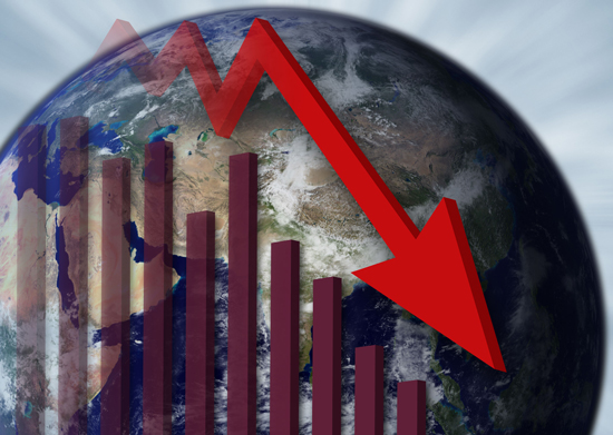
The importance of this data cannot be understated. If the price of stocks has risen by three percent, but the P/E ratios have actually fallen, then it can only mean that earnings have risen at a faster pace! The largest U.S. companies are doing better than ever since the credit crisis brought on a recession. There is no doubt that stocks could go higher, but only if investor sentiment thinks that these earnings matter.

Beating the Rate for Beating Estimates

According to data from Standard & Poors, earnings reports this season have shown that over 80 percent of companies reporting so far have beaten their estimates. The historical average for those that beat estimates is 64 percent and the previous quarter featured only 49 percent that accomplished the feat.

The markets’ surge higher appears to have been well founded; and yet, despite U.S. investors exuberant bullishness, they may still be underestimated the value of these companies. This is the chief argument of those who are strongly bullish on the market even now, and it isn’t bad reasoning. A little research turns up the fact that this line of thinking makes for a good investing strategy.

A Simple P/E Ratio Strategy

Consider the following sample strategy to prove the point. Suppose you implement these steps over the past 20 years. First, you watch the P/E ratios of the individual stocks of the S&P 100, and on the first day the ratios of any of them dropped below 15, you bought it. Second, you placed a 25% trailing stop order on the stock.

Third, you let it run until you were stopped out.  The results of this strategy are that 4 out of 5 stocks would return a profit, some meager, and others quite remarkable. It’s hard to go wrong with such a strategy.

However there were a number of stock on which this strategy did not produce productive results over that time frame. In case you are interested, here are the ticker symbols:  EMC, F, C, HPQ, AXP, DD, XRX, TWX, GE, WY, BYI, AAPL, RTN, JPM, V, T, and VZ.  You’ll probably recognize many of them as household names of stocks that have definitely risen over the years. The problem is that these tended to fluctuate more than 25% after hitting a P/E ratio of 15. The rest of the S&P 100 didn’t seem to have the problem as often.

Swing high… Swing Low

I want to spend a few minutes discussing the topic of the swing highs and swing lows.  When identifying the swing highs and lows we are also identifying whether the price action is trending up or trending down.  It can also help us identify areas of support and resistance.  A swing high is an area where the price has been moving up to form a peak and then moves back down forming what looks like an upside down V.  The swing low is an area where the price has been moving down then forms a bottom that looks like a V and then begins to move back up.

Looking at today’s chart of gold you can see areas of swing highs (SH) and swing lows (SL) as identified by the letters SH and SL on the chart.  Notice how these are moving lower which would indicate to us that the price momentum of gold is bearish.  We can also connect these swing highs and swing lows to identify areas of support and resistance.  These areas can be located on the chart as either diagonal lines or horizontal lines.

Currently gold is sitting in an area of support and has been fairly range bound since the first part of March 2012. Notice the range between about 1700 on the high side and 1600 on the low side.

As you look for opportunity’s to buy or sell gold look for the times where the price is getting ready to move up off of an area of support or resistance as it forms new swing highs or swing lows.  Regardless of what your are trading you can look at the charts to identify these areas visually by inspecting the high points and low points of the price movement.

Take some time to draw on the charts the areas that are swing highs and swing lows so you can better practice drawing your trend lines and your areas of support and resistance.

How To Tell Which Way The Market Is Going

Can anyone really predict a market change of direction?

Last week, I discussed identifying flag and pennant price patterns to identify a continuing or ongoing trend in either direction.  Now, the next logical question; is it possible to look for price patterns that would help to identify or predict a CHANGE in direction from a current trend?

The answer is found by using a combination of price patterns and technical indicators to identify possible changes in direction.  This is called “divergence.”  The definition of divergence is:  When the price of an asset and an indicator, move in opposite directions.  In technical analysis, traders make transaction decisions by identifying situations of divergence, where the price of a stock or other tradable asset diverge from  a set of relevant indicators.   Several indicators can be used to identify areas of divergence.  Stochastics, MACD, or indexes such as MFI (Money Flow Index) can also be used.

For  example, if Bearish divergence is identified in an uptrend market by the price action of the security continuing up while the indicator shows a weakening market at the same time, or an area of “divergence” the trend may be nearing an end and be ready to reverse.

Here is an example of a classic bearish divergence pattern on this current chart for Apple, Inc :

Notice how the price of AAPL continues to make new highs while the Stochastics are telling a completely different story.  This shows a clear area of “bearish” divergence as the stock price moves higher and indicator is moving lower.  Then notice that the stock makes a clear change in trend and moves lower directly following this area of bearish divergence.

Bullish divergence on the other hand is the opposite of bearish divergence, where the price action is moving down and the indicator is moving higher

You will be amazed at how often this simple predictor can help identify a change in direction. The first thing that should  be obvious is that divergence can help us avoid getting into a trend that may be short lived and ready to change direction,  saving us a loss. And the second thing we can do with divergence is to help identify an opportunity to enter the market going the other direction.

Trader’s Challenge: Spend sometime this week looking for bullish and bearish divergence patterns between the price and your indicators,  and see how often the price changes direction shortly after the divergence pattern occurs.

The World Is Succumbing To Debt — What Can I do?

Hi everybody, Bill Poulos here. Today’s message is plain and simple. The post World War Two era is over with when it comes to investing in portfolio theory and buy and hold. I call buy and hold “buy hold and hope”. The reason it’s over with is the world economy is very weak and struggling to recover. But it cannot recover fully because of the sovereign debt of the western nations. Principally the United States, Europe, the UK, and others. And that debt is stifling. You  all know what is going on in Greece. Greece has got debt far beyond their annual GDP. They can’t repay it. They’re restructuring. They have to renegotiate their bonds with the bondholders. They are cutting back severely on government programs. People are rioting in the streets. You know all of that. You think that may happen elsewhere in Europe? It can and it probably will.

And how about the United States? Our debt as a percentage of GDP is almost as bad as Greece. What that all means for the investor is the Post World War Two era is over with. Things are not the same and they aren’t going to be the same for many years to come.

So ask yourself if you’re comfortable with your current investment strategy. Are you content with your financial planner or your broker? Have you taken basically a hands-off position where you’ve played a passive role at best, expecting that everything will get back to normal?

Now, the stock market has gone back up since early ’09. That’s great, but would it be okay with you if your portfolio or your IRA or 401k drops 40 percent from here? Now I am not saying it will, but it certainly can and probably will in the next year or two.

So if that’s not okay with you, you need to be getting into the game yourself. You need to be taking control so that if the market does drop 40 percent again or 50 or more, then you’re not going to get hurt.

Then for you traders out there who already know how to trade, or let’s say it’s more of a part time, even a hobby, it’s time to get serious. It’s not a hobby, it shouldn’t be a hobby, it shouldn’t be part time in my judgment. It should be a very, very serious thing that you engage in to safeguard your savings, your portfolios, your investment accounts.

So whether up until now you’ve not been a trader at all, or whether you are a trader part time or as a hobby or jumping from this method to that method to some other method, or your own method where you kind of play at it, it’s time to get serious about this. For those who have not traded, trading sounds like it’s extremely difficult and hazardous. And it can be both of those, but it does not need to be. As Einstein said, “The solution to any problem should be as simple as possible but no simpler”. That’s the way it is with trading the markets in my opinion. If you have good methods, and sound discipline, good risk management principles can control your emotions. You have the opportunity to do very, very well. It does not take that much effort. Once you learn it, trading on an end of day basis, after the markets close, where there is no pressure whatsoever, you have all evening and into the next morning before the markets open to look for high probability trading opportunities and to manage the trades you already have open. That’s a low pressure way, and very simple way to conduct your trading activities.

So it’s not time consuming and it’s not difficult. In fact, the more difficult you make it, the less likely you are to succeed. It’s an inverse proportion. But even so, a lot of people think they don’t really have time to do that once a day after the markets close. But you know those same people have time to do various other activities, including watching television, going to social functions and other distractions. None of that’s bad, but if you have time for that, you’re going to have down time. Hardly anyone is working 24 hours a day. So instead of watching television, you can take 20 minutes a night and devote it to your trading activities.

You’ll soon see that you have the opportunity to trade not every stock, not every ETF, exchange traded fund, but only a select few. Only those that I call that trade deliberately and the ones that offer the best opportunity. Once you understand what all that means, they are not that hard to identify.

So the bottom line here is the Post World War Two era is over with. Buy and hold is dead as far as I’m concerned. We’re in a new financial and investment environment that will last for many years. Unless you want to be subject to 40 to 50 percent drops in the market, I suggest that you take a look at getting very serious about taking control and learning how to trade seriously, in a way that complements your lifestyle, in a way that will be easy for you to do, and very satisfying.

How Trade The Gaps

In today’s article we are going to discuss the topic of gaps that occur in the Forex market.  Unlike the stock market where gaps can occur day-by-day in the Forex market we typically only see gaps occurring over the weekend.  This is due to the fact that once the market opens on Sunday it won’t close until Friday.  A gap happens when the price on Sunday opens differently than where it closed on Friday.  In the chart below you can see an example of a gap that happened this last weekend as the price opened a lower than where it closed Friday.  This was a gap down of 60 pips.


A gap can be problematic with our trading because it can throw off our risk and money management rules.  For example, if we have a stop loss set at 10 pips below our entry price but the market opens with a gap down of 20 pips we have now taken a stop loss that is 10 pips worse than what we anticipated.  This means if we initially risked 1% of our account we have now taken a greater amount of loss than desired.  In order to avoid gaps completely we would need to be out of all positions before the close on Friday,s.  Because this is not possible with all trades we need to make sure that the amount we were risk in each trade is at a level that will take into consideration the possibility of these gaps.  That is why it is suggested that we will risk no more than a maximum of 2% of our account on any single trade.  That way if the market opens with a gap we are still in a position where our risk is at a manageable level.

On the good side of things gaps can give this opportunity’s to look for certain types of trades.  Gaps can generally do one of two things.  They either gap down or gap up and continue to move in that direction or they reverse and begin to fill the gap.  Either way we can look for opportunity’s to take advantage of these movements as we learn how to trade them.  As always make sure you use good risk and money management and you know your rules for taking trades.

Take some time to go back and look at the charts to determine for yourself where the gaps occurred and how you might use them to your advantage and remember keep your risks small in order to avoid the downsides that can happen when markets gap.

Economic Predictions… Fact Or Fiction?

I have noticed over the years that one of the biggest ways that new traders or investors get hurt is by not paying attention to the world around them.  Often times even when they do pay attention they misinterpret what they are seeing or hearing and they get caught on the wrong side of quick and sometimes damaging moves in the market.  This is true in all of the equity markets but we may see the biggest impact of this in the Forex market.

The efficient markets theory basically states that all investors have all of the same information at the same time so there is no unfair advantage.  This may or may not be true but what does happen is that when an economic news report is scheduled for release analysts make their predictions about what the reports will actually say in advance of the announcement.  This information is published and the results are immediately baked into the price of securities.  When the reports come out the reaction in the markets that we often times see is the reaction to how wrong the analysts’ predictions are versus what the actual results are.  The market makes an immediate correction which can be seen by large quick moves based on unemployment reports, housing reports or interest rate announcements.  As soon as the actual numbers are released the markets will correct based on the new information.

The interesting thing about economics is that you can almost always find an analyst that has an opposing view to any report or article you read or any news story that you hear which is largely why many traders put relatively low value on what the gurus or so called experts actually say.  When the announcement is made there is an immediate correction in the market to compensate for the difference between what the analysts predict and what the actual results are.  This typically happens on at least 50% of the announcements each month which means that the analysts are wrong 1/2 of the time and sometimes much more.  The point is that much of the economic information that comes out is purely opinion based and in no way is an actual reflection of what true events may occur.  It is a little scary that this occurs because it is part what traders and investors are basing their decisions on but nevertheless it is what happens.

In the current week, April 30, 2012 through May 4, 2012, there were 67 economic reports released from around the world with the analysts’ predictions being wrong on 43 of them meaning of course that they were wrong 64.18% of the time.  Opinions about longer term trends and what is likely to happen in the future is just as suspect.  I was recently watching one of the stock oriented news shows where most of the analysts were talking about a correction that is inevitable in the stock market then they introduced an asset manager that believes that the S&P 500 will reach 1,500 by the end of the year and that there is no reason to concern yourself about a bear market.  Both sides make very good cases for their beliefs.  This leads to the obvious conclusion that we need to make our own trading and investment decisions based on our own experience leaving the guessing to the gurus.  We do not necessarily need to know which way the market will go based on the actual results of the news reports we just need to know when the events will occur and we need to beware that there could be a reaction in the market at that time.  If we know this we can either put ourselves in a position to take advantage of news releases or at least protect ourselves as much as possible if we have an open position at the time.

Can We Find Clues In Price Patterns?

Today I would like to discuss looking for clues to find good entries when trading with the trend.  A trend can be a funny thing; they run then fizzle, start and stop, and sometimes can be very fickle.  Once a tend is established they don’t go straight up or down but will have points of pull back. (the very nature of market assures that  there are natural levels of profit taking in any market move)   The trick to successful trading is identifying whether those points are just “resting places” or are they are “change in direction” points.  This is where price action comes in.  We can use certain patterns based on this price action to help determine these pull backs and possible break-outs setups.

One type of price pattern we can use is continuation pattern such as a Bull Flag or Bull Pennant for an uptrend or Bear Flags and Bear Pennant for a downtrend.  These patterns help us to identify areas of continuation pull back or a consolidation and resumption of current trend after it that pull back. Here are some examples of what these patterns look like:

Flags and pennants can be generally categorized as continuation patterns. These price patterns usually show brief pauses in a strong trend.  They are usually seen right after a larger quick move. The market then usually picks up again in the same direction. Over time these price patterns are very good at identifying continuation patterns.

Bull flags are characterized by lower tops and lower bottoms, with the pattern slanting against the trend. But unlike wedges of a Bull Pennant, their trend lines run parallel.

Bear flags are comprised of higher tops and higher bottoms. “Bear” flags generally slope against the trend.

Pennants look very much like symmetrical triangles. Pennants are also generally smaller in size or volatility and duration.

Here is an example of a recent Bull Pennant in an Uptrend for Apple, Inc:

Notice:  that after a strong move up, the Bull Pennant is formed by the lower highs and lower lows, against the uptrend and once the pennant is “broken” the price breaks out and continues the previous up trend for a very positive gain.

Trader’s Challenge:  If you are new to trading or haven’t  been following these price patterns, to start to look for these Flags and Pennant price patterns as a great way to find good entry points after they break out of the pattern.

Candlestick Forex Trading Tips…

There are several different types of charts that can be use when trading Forex.  Line charts, bar chart and candle charts are some of the more commonly use ones.  My favorite chart type is the candlestick chart.  In today’s article we will discuss how to use the candlestick chart and what the candlesticks really represent.

Take a look at the candles shown below.  One candlestick is green which tells us the price action for that candle was up.  The other candlestick is read which tells us that the price action for that candle was down.  Regardless of the time frame represented by the candle we can simply look to see whether the movement was bullish or bearish.

Notice that big green candlestick above opens at the lower end of the box and closes at the higher end of the box.  This is called the body of the candle.  The red candle or down candle opens at the top of the body and closes at the bottom of the body.  Also take note of the wicks or shadows that stand above and below the body.  These wicks represent the distance the market traveled above and below the open and closing price of the body.

Candles can also give this information in regards to the strength or weakness of a move for that candle.  Notice in the picture below that the candle on the left side has a very small body with very large wicks.  This type of candle tells us there was very little momentum pushing the price higher or lower.  Compare that to the candle on the right where the body is very large and wicks are very small.  This tells us there was very strong momentum during this time.

Candles like other forms of charts helps us identify the trend and support and resistance.  One of the key components of any chart is to identify the direction the price is moving as well as areas of support and resistance.  Using candlestick charts can help us with both of these areas of charting.  Take a look at the Candlestick chart below where you can see the areas where trend is occurring and areas where resistance and support is occurring.


Candlestick charts are one of the several types of chart you can choose from when looking at Forex.  Take time to consider the visual advantages they give you as you begin to identify the trends and the support and resistance areas of a currency pair.  As you apply them to your charts I’m sure you’ll agree that they can be helpful in your trading.

Look East for Western Market Clues

The major market indexes’ 3-month upward surge stumbled over the past seven trading sessions, but that was a foregone conclusion to people in Australia and Japan.  Well perhaps not all who live in those countries knew this, but those who closely trade the currencies of those countries probably knew. Granted they are a microcosmic segment of the populations there, but given how important such signals appear to be, a greater percentage of equities traders around the world ought to pay attention the correlation. See for yourself in the following figure.

This figure represents a comparison between the S&P 500 cash index and the relative price of the Australian dollar compared to the Japanese Yen. As you can see from the chart, the directional movements of these instruments (if not the exact degree of those movements) track very closely. Each of the stock market’s notable turning points matches well with the major turning points in the Australian dollar/Japanese Yen currency pair.

What does OZ know?

Why should this correlation exist? It’s a good question and the most readily available explanation may not be definitive. Since the credit crisis of 2008, the Fed substantially lowered rates and removed what was called “the carry trade.” Large institutional investors found that a relatively low-risk way to earn money each day was to use Japanese Yen to buy U.S. dollars in the currency markets. Doing so allowed them to earn interest at an annual rate of 4 percent, because this amount represented the difference between interest rates at the time.

But the landscape has shifted. Now the carry trade is conducted between the Australian Dollar (which pays almost four percent interest) and the Japanese Yen (which pays virtually nothing). This trade, however is more risky than the old US-Yen trade. So when investors feel like they need to reduce exposure to risk, they come out of this trade, weakening the Australian Dollar and strengthening the Japanese Yen.

Okay, but does it come with a fortune cookie?

Since this trade can help us gauge whether or not investors are comfortable taking risk, it may serve as a useful leading indicator for when the markets are likely to weaken. This indicator would take place in the form of diverging directions; specifically, the stock market would continue higher while the Australian Dollar weakened compared to the Yen. The figure above demonstrates that dynamic.

During the past year that indicator has signaled four times. When the signal occurred (the currency pair fell while the markets rose), the days that followed that signal were marked by the US market falling significantly.

The last three times that fall has come directly after the period of divergence. But when the fall is over with, the pair resumes tracking the U.S. Stock Market. Therefore, when this currency pair begins to trend upward, it’s a good bet that the market will also trend higher.