Where to Place Stops

Stop losses are essential when it comes to our trading. Without the use of stop losses we open ourselves up to uncontrolled loss potential. With the use of stop losses we can control the amount we are willing to risk in our account. The use of a stop loss is essential to proper position sizing as it tells us the amount we are risking in a single trade. Knowing where to place the stop loss is just as important as actually having one. Today we will look at some places where we might consider placing our stop losses when we enter into a trade.

The following are areas where we might consider placing the stop loss.

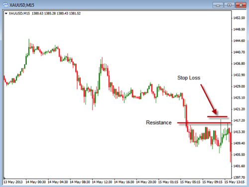
1. Support and resistance – Knowing where the support and resistance areas are located can give us an idea of where the stop losses should be set. These areas are where price will generally experience buying or selling causing the price to resist continued movement. Take a look at this chart below as it shows where we might place stop loss.

In this example you can see the resistance line that is drawn with the stop loss placed just above this area. This is where you might decide to place your stop if you shorted gold at this point. If you took a long trade and bought gold you would identify the area of support and place your stop just below that area.

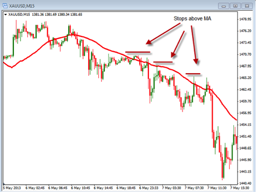
2. Moving Average – Moving averages give us an idea of the direction the price has been moving but can also be used to identify where our stops should be placed. Take a look at the chart below to see how this might work.

In this example you can see that we have placed a 40 period simple moving average on the chart of gold. As the trend is being established as up or down you can look to place your stop loss above or below the moving average. In this chart you can see that the trend is moving down and we have identified places where we might consider place our stop loss.

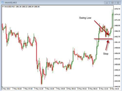
3. Prior Swings – When looking to place stop losses we can use the prior swing high or low as a point of reference. The goal would be to exit the trade if it takes out these prior areas. Take a look at the chart below.

In this chart you can see we pointed out the last swing low and where we might place the stop loss below it.

Regardless of how you place a stop loss you should know what you are going to do before you place the trade. In addition to placing the initial stop you should know how you are going to adjust your stops as the price moves in a favorable direction. Of course we should never move our stops further away from our trade but it is ok to tighten them up in order to lower the amount of risk we have in the trade. Using a trailing stop can help us in our overall risk control.

Take some time to review what you are doing and where you are placing your stop losses. Make sure you are comfortable with how you decide where to place them.

Common Mistakes or Pitfalls Traders Must Avoid!

Traders are always looking for the “one” perfect system or the “Holy Grail” of trading systems. However, I believe that success has much less to do with the system a trader uses and more to do with the implementation of good trading habits and proper risk management. In fact, there are many good systems that you can use depending on what type of trader you are: long-term position trader, medium-term swing trader or short-term scalping. Following are three key mistakes that traders make that, if we can avoid, will dramatically help out trading. In fact, avoiding these mistakes can be the main difference between being a successful trader or quitting after all our money is gone or simple quitting out of frustration.

Here are the three common mistakes:

        1. Overtrading – too much risk: The first common mistake that many traders make is they take risk too much per trade. A good rule of thumb is to trade between 1%-2% risk per trade maximum. The first thing to do is to determine what that risk per trade is in dollars. If we have a $10K account we can then risk up to $200 per trade ($10K account x 2%). The next thing to determine would be the total share to trade, or the position size, based on the $200 maximum risk. The way to calculate the position size is to calculate the risk per share. To determine the risk per share we calculate the difference between the entry price and the initial stop-loss level. For example, if our entry price is $25 per share and our initial stop-loss is set at $24 (and I believe that a stop-loss level based on support or resistance is better than a predetermined set stop-loss level.), the risk per share would be $1 per share. So we could trade up to 200 shares and limit our risk to a 2% maximum. This will help us limit our risk and not accept more risk than is prudent per trade. Remember, the key is proper position size.
        2. Trading against the trend: The second common mistake is trading against the trend, going ‘countertrend’. While this may present some good trading opportunities, trading with the trend is actually much easier and much more forgiving than trading against the trend. The key is to have a system that just goes for the middle of the trend. Again, the reason is because it is hard to pick the top and bottom, and impossible to do on a consistent basis. The key is to follow the market, not force the market. Traders must to be patient with what the market gives us and it is important to not try to “make things happen”, which is the surest way to frustration and failure. Use a system that identifies and follows the trend so that you can “jump on that trend”. Trying to trade against the trend or go countertrend may cause you to overtrade and, potentially, lose when the trend “catches up” with you.
        3. Chasing Trades: The third common mistake traders make is to enter a trade late. If we pass up or miss a setup and the market moves in the direction of the potential trade, a trader often has the inclination to enter the trade late. Fear of missing a big move plays an emotional role on our trading. We must avoid this mistake to enter a trade late because, often when we enter a trade late, we have already missed some of or perhaps even the entire move. So the rule is: Don’t enter a trade late!

These three common mistakes are not complex or difficult to understand. But avoiding them is often times difficult to implement. If they are consistently avoided, they can give you a much higher probability of success and lead to much lower stress trading.

Swing Trading

There are various types of trading styles out there that traders will use depending upon their availability to trade and their trading personalities. Traders will day trade, scalp, swing trade and position trade in order to enter into positions. These types can be defined as shown below:

Day Trade: a trade that is held only during the day and closed out before the close of the market.

Scalp trade: a trader who trade multiple times during the day targeting only a few pips of movements.

Swing trade: a trader that looks to catch movements over a bit longer time frame taking advantage of the swings that occur in the market.

Position trade: a trader that hold onto a trade for days or weeks in order to take advantage of the full trend of the movement.

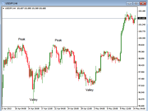
Today we are going to look a bit closer at the swing trading style. In order to better understand the swing trader we first need to define what a swing looks like. Generally the market will move in patterns of swinging from highs to lows. As these highs and lows are put in it will form peaks and valleys that can be used to look for swing entries. Take a look at the chart below as an example of how these swing look.

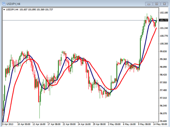
Once you identify peaks and valleys you can begin to look for areas to enter long or short trades. These peaks and valleys can also be areas of support and resistance. In addition, you can use different indicators the might indicate when to enter into a trade. Take a look at the chart below with the 10 period and 20 period simple moving averages. When these moving averages cross you might have an indication that the price is ready to move either up or down.


Although there is not a guarantee that the price will move just because the two moving averages cross, it is a good indication especially if the price has made a peak or valley. It is even more likely of a move if the price is coming off of the support or resistance area.

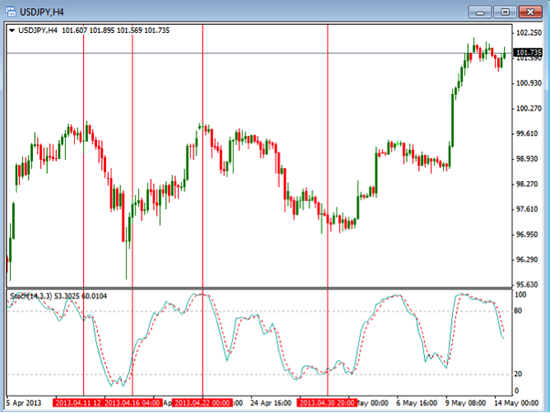
In addition to the moving averages, we can you indicators like stochastic, rsi or cci to show similar information. Take a look at the chart below which is using the stochastic 14,3,3.


Here you can also see where these peak and valleys line up with the highs and lows on the stochastic indicator. When looking to trade these swings, if the stochastic is in the upper or lower areas it can add strength to the entry point. The key is to look for opportunities to enter theses swings as the price begins to reverse direction.

Swing trading is simply looking to take advantage of the price swings that occur in the market. This happens in all markets and we can swing trade on any time frame. These swings will occur on a daily all the way down to a one minute chart. Knowing what to look for in these swings will help you know when to enter the trades. Focus on identifying price action first, then look to use some additional indicator to help you know when to enter the trade as the price swing back up or down.

Identify Potential Retracements

The last couple of weeks we discussed how to use Indicators to help determine a confirmed trend either bullish or bearish, and then we discussed the use of the ADX indicator to help determine the strength of the bullish or bearish trend. Even during a strong bullish or bearish trend, there are periods of retracements or pullbacks. This week, I would like to discuss the use of the Fibonacci Indicator to help determine the possible retracements levels within the trend, whether trading Forex, Stocks, or Futures. Looking at stocks, for example, once they have moved up or down in a trend, they have a great tendency to move back or retrace a certain amount, rather than to move in a completely straight line or direction up or down. Because of this common retracement pattern, stock traders can use the Fibonacci Indicators as reference points to predict certain retracements levels as the stock moves back and forth in a trend during a retracement or “pullback”. Traders can find Fibonacci levels to be very accurate when analyzing chart pattern reversals. Fibonacci indicators also provide an excellent visual map and identify very accurate support and resistance levels. Some Stock traders will also combine Fibonacci Retracement levels with common candlestick patterns to identify optimum entry and exit points.

An effective candlestick pattern trading method is to look for small double bottoms or double tops and individual doji or shooting star or hanging man type reversal candle patterns within these Fibonacci levels to identify trading opportunities.

Fibonacci levels are where price retracements or “congestion” often form. Just like moving averages, the Fibonacci levels work like price magnets to old highs or lows and can also form good support and resistance levels. For an even greater degree of accuracy, they can be combined with the major candlestick patterns

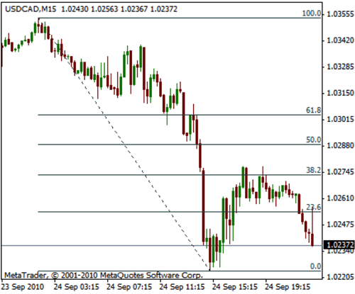
The most common Fibonacci levels used in technical analysis for drawing Fibonacci lines are 100%, 61.8%, 50.0, 38.2%, and 23.6%. For existing trends, the 23.6% level should be the minimum retracement but can go down as low as the 61.8% level. As price retraces, support and resistance occurs at a high rate near these Fibonacci levels. In an existing rising trend, the retracement lines move down or “retrace” from 100% to 0%. In an existing downtrend, the retracement lines move up or “retrace” from 0% to 100%.

You can see in the USD/CAD chart above that the retracement retraced to the 38.2% level before continuing the downward trend.

Technical Traders use these Fibonacci Indicators (Fib-lines or Fib-levels) to predict Price Targets and Support/Resistance Targets. To accurately draw the lines to identify these patterns you begin drawing from the lowest point (which equals your 0 percent line) to the highest point (which equals your 100% line). The 38%, 50%, and 62% lines will provide your reference point for targets.

While there is no “crystal ball” and nothing can predict the future with 100% accuracy, but using the Fib-levels can greatly enhance your ability to identify potential retracement levels. In addition, looking at the candlestick patterns can provide a great advantage for being able to immediately recognize what is going on with investor sentiment at these levels.

News is Open to Interpretation

Earlier this week the Congressional Budget Office made the announcement that for the first 7 months of this fiscal year, October 1 through April 30, the US deficit was 32% less than it was over the same timeframe in 2012. They stated that this was due to two major factors – more revenue from payroll taxes and a reduction in spending. On the surface, this does sound pretty good, it sounds as though the government may be getting their spending in order and that they may be moving in the right direction. This news helped to continue the rally in the stock market; it may not have been responsible for propelling the market averages forward, but it certainly did not stop the rally or hinder it in any way.

I’m definitely up for deficit reduction and I think it’s about time; however, before the euphoria starts about how the government is getting its financial house in order, we need to be clear on a few issues. The first, of course, is that just because the current deficit has reduced does not mean that the US debt has reduced. In fact, it is still going up. The government states that they are spending less but this doesn’t mean that we will see any reduction in the country’s long term debt any time soon. It is actually projected to continue on its torrid pace for the foreseeable future. This may not be that impactful right now, but, at some point, interest rates will have to rise and when they do, the interest on that debt will rise along with it making it very difficult, at best, to reduce the debt in the future.

Increased revenue is always a great way to for any organization to get an infusion of new cash but remember that new cash is coming directly out of the pockets of the country’s work force. For doing the same exact job you did last year, you are now getting taxed more to do it. Taking a small additional amount in the form of taxes from each working person doesn’t sound like that much to give if it helps the country’s financial situation, but it isn’t like our taxes were necessarily low to begin with. So now we get to pay more to the government to have a job so we can help support the people that do not have a job more comfortably.

It’s really just a matter of semantics in a way, like the concept of a glass is half full or it is half empty. Because, although the 32% reduction in the deficit sounds good, the root problem is still that the government is operating on a deficit basis. Stating that the deficit is less by 32% means that they are still overspending by 68%, which I believe is the real problem. It is true that the country’s debt cannot be reduced until the deficit goes away and the budget is balanced, but this doesn’t appear to be possible any time soon. The government is buying $85 Billion each month of new debt by creating new money which increases the national debt. While some would say that this is misleading because some of the debt is between government agencies, the fact still remains that the debt is increasing. Others also make the argument that the US has the largest economy in the world and that every other country has too much at stake to let us fall down because of our heavy debt load. This may or may not be true, I’m not sure that letting the government run rampant with their spending practices and expecting other countries of the world to help us out because we are “too important to them” is really the best way to run the government or to handle the deficit and the debt problems that we are facing.

What Happened to Gold?

Today we are going to look at the direction Gold and Silver are currently moving. As you know, the metals experienced a dramatic drop in price about a month ago. Often times you will see that a sharp drop is followed by a rebound in price action. The length of time and the amount of rebound is variable but still fairly predictable. This means that we do not know the size of move that will occur after the initial sharp drop in price but we do know there will be some rebound.

Some traders will try to trade this rebound in order to profit from the move back up or down. They will sometimes look for a specific indicator to show them when to get in or they will just look at the price to show them when the rebound is starting. One down side to this is that if the initial move is not finished you can get caught in a bit of a draw down or stopped out pretty quick. One commonly used indicator is called the ‘Fibonacci Retracement‘. This measures, based on the Fibonacci sequence, where the price is likely to stop its rebound. The Fibonacci retracement levels are typically at the 23.6, 38.2, 50, and 61.8 levels. Of course these are not all the levels and, technically, 50 is not a fib level but is a common place to see the price begin to slow down.

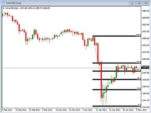
Take a look at the chart of Gold shown below. Notice that we began our Fibonacci line at the beginning of this most recent down move. We ended it at the bottom of this move in order to get our retracement levels. Notice that the price is currently sitting between the levels of 50 and 61.8. You can see that the price retraced right back to this 61.8 level where it encountered some resistance.

If you look, you will see a similar type of retracement on the Silver chart but the 38.2 level is where it first met some resistance.

Currently, with Gold and Silver sitting in this sideways area of consolidation, we will want to be looking for the price to breakout to take our next trade. A simple way to take a trade on this is to place a buy stop entry or a sell stop entry just outside the 61.8 and 50 fib levels. This is a type of breakout trade, where we don’t really care the direction it is going to move, we just want it to move one way or the other in a large amount.

When placing an entry like this, make sure you know where to place your initial stop loss in case the breakout fails and the price move back into the channel. A good rule of thumb is to place the stop just below the breakout points but not below the half-way point between the two fib levels.

Take some time to look at where you might place a trade on the daily charts of both Gold and Silver. Anticipate a nice move once it is able to break through these retracement levels.

How to Determine the Strength of a Trend

Last week we discussed the importance of identifying the trend and then trading with the trend. One other consideration once we have identified what the trend is, up or down, how strong is the trend? One thing we can look at to help is to use the ADX indicator. The ADX indicator stands for ‘Average Directional Index’ and it measures the strength of a trend and can be useful to determine if a trend is strong enough to trade. If there are high numbers, it indicates a stronger trend, and low numbers indicate a weaker trend, regardless of the direction of the trend.

When this indicator is showing a lower number, the trend is weaker or sideways and a range or channel is likely to develop. Since we are always looking for good trends to trade, it is best to avoid trading stock, ETFs or Forex pairs with low ADX numbers. You would rather look for investments that have higher readings, thus indicating a stronger trend.

It should be noted that the ADX indicator measures the strength of a trend, not the direction of the trend, either bullish or bearish. The direction may determined by using the +DI or – DI lines which I am not going to discuss today. A high ADX number could indicate either a strong uptrend or a strong downtrend. It does not tell you if the trend is up or down, it just indicates to you how strong the current trend is.

How to interpret the ADX Scale:

If the ADX indicator is below 20 then the stock is generally in a trading range. It is likely just chopping around sideways.

Once the ADX indicator gets above 25 then you will often to see the beginning of a good trend. Big moves tend to start at about 25.

When the ADX indicator gets above 30 then you have at a fairly strong trend (either up or down).

Occasionally, but not often, will you see stocks with the ADX above 50. If it does get that high, you start to see the trend coming to an end and trading ranges developing. If you have lower numbers, you have a trading range or the beginning of a trend.

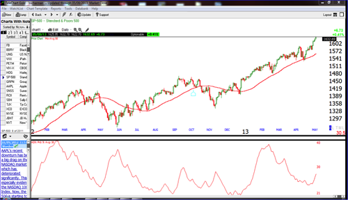
Here is an example of the ADX indicator on the Daily S&P 500 chart:

In the chart above, notice the ADX indicator is the red line at the bottom of the chart. Notice when the ADX is showing a low reading the price is moving more in a sideways pattern. Notice what happens when the indicator gets into higher territory (above 30), the chart is in a stronger trend. These are the trends that are the best to trade!

So how do most traders use the ADX indicator? Traders often will look for ADX values of 25 or greater to help determine a strong trend for trading. The ADX indicator is not used to give buy or sell signals. Therefore, it is generally used along with other indicators for entry and exit signals. It does, however, give a good perspective on the strength of the trend.

Price Action Breakouts

Today we are going to discuss a bit more about topic of breakouts. Breakouts are specific price action moves that take the price out of a consolidation area. Prices will tend to move in cycles from consolidating to trending. When a breakout occurs the price will begin to move in the trending phase. Trading breakouts uses some of the basic rules of trading. They include determining the trend along with identifying the areas of support and resistance.

When prices begin to move in a specific direction it will be considered as moving in a trend. The price action that is going down would be considered a down trend while the price action that is going up is an uptrend. Know this trend can help you determine the direction you want to be trading. As these trends begin to slow down the price action will begin to move in a sideways direction. This sideways direction will be lined by an upper area of resistance and a lower area of support. The concept of a price breakout is that these areas of support and resistance are currently holding the price in a certain range which once they are broken will lead to another trending phase.

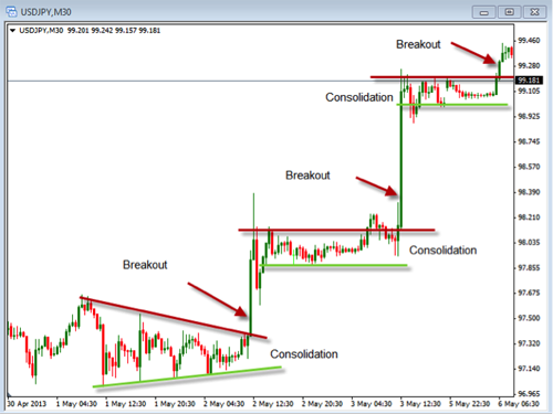
Take a look at the chart below to see how these phases work.


Although this chart does not show long trending phases it does show how the price will consolidate prior to a move higher on a breakout.

In order to make this information useful you will want to have a way to implement it into your trading. If we know that breakouts follow consolidations we can begin to look for the opportunity to buy or sell when they occur. In the past we have discussed the use of entry stop orders. This would be an example of when to use these types of orders.

As we look at charts for opportunities to trade breakouts we will begin by identifying the times when the price moves in a sideways pattern. We will then identify the area of resistance and support during these times of sideways movements. Once these areas are identified we will wait for the price to show a move above or below these support and resistance areas. Once the breakout occurs we will enter a trade by using a buy or sell stop.

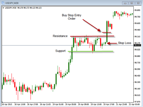
Take a look at the chart below to see where we might place an entry order.


On this chart you can see the Resistance and Support areas on a chart that was moving in a sideways pattern. You can also see that we could have place an entry buy stop order to buy the pair as it breaks out of the resistance area. This would allow you to enter as the price begins to move in an upward direction. We have also identified an area where we might consider placing a stop loss in case the breakout failed to move in a strong upward direction.

Take some time to look at the charts to see if these breakouts might be helpful in your own trading, either as a way to place trades or simply to identify when the trend might be starting once again.

How Can We Determine the Market Trend?

One of the most important things a trader can do is to determine the trend, whether Bullish (uptrend) or Bearish (downtrend). Everybody who has been around the markets for very long has heard the phrase: “The trend is your friend!” This is a true statement because trading with the trend may be easier to execute and a lot more forgiving if your entry is not perfectly timed.

First of all, determining the trend (either up, down, or sideways) is the key to successful trend trading. The trend is generally divided into three different classifications: long-term (weeks to months), medium-term (days to weeks) and short-term (hours to days). There is also very short-term (minutes to hours), but this is generally reserved for and looked at by very short-term traders or scalpers, which I won’t really cover today.

What is a trend? Generally the trend is defined as the price moving higher in a Bull Market and downward price movement is a Bear Market.

Determining a Bullish Trend

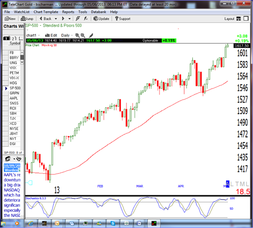
A Bull Market as defined above as the price action moving higher by connecting higher high and higher lows is associated with increasing investor confidence, and increased investing in anticipation of future price increases. A bullish trend in the stock market often begins before the general economy shows clear signs of recovery. For an example of a Bull Market, we can look at the current price action on the Standard and Poors market index below and can easily identify the current trend as “Bullish” as determined by the higher highs and higher lows as the price action has been moving higher. Note: as with any trend, the price does not just move higher, but moving up and then down and then back up again, and this price movement is what we string together to identify a general direction of the market. Also note that in a strong uptrend over the last several months, the price is generally above the 50 period moving average and the 50 period moving average is also moving up at the same time. These conditions make for an easy way to identify or confirm a bullish trend.

Determining a Bearish Trend

A Bear Market, or a bearish trend, is a general decline in the stock market in general or a specific stock with lower highs and lower lows over a period of time depending on the length of the trend. A bearish market is generally associated with a transition from high investor optimism to widespread investor fear and pessimism. In addition to the price action moving lower, you can also notice if the price action is moving below the 50 period Moving Average and Moving average is moving lower, as well as a good indication that we have a bearish trend. Note in the Chart of the Standard and Poor’s index daily chart from late 2008 to early 2009 below to see how to identify periods with a bearish trend.

In conclusion, trend trading is one of the easiest and best methods to trade. So being able to determine a confirmed bullish or bearish trend could greatly improve our success. Practice looking at different market charts and determining whether we it is in a confirmed bullish trend, confirmed bearish trend, or neither.

Happy Trading!

Stock Market Welfare

I have to admit that I have been somewhat stock market negative for quite some time now because there are so many factors that make it seem as though the market as a whole should be going down and if not down then minimally flat but almost definitely not up. I have been seeing corporate earnings reports come out that overall are very average; some earnings announcements have been good and some have been bad but overall they are just okay. The economic news that has been coming out is about the same, there isn’t any news that I have seen that makes it really exciting to enter the market right now in fact there is some evidence that some areas of the economy are backsliding with slower growth and less expansion. The latest report from the Federal Reserve was very neutral stating that there are some bright spots in the economy and some less than bright spots but overall their stance is basically unchanged with the exception being their willingness to be flexible with their quantitative easing. They state that interest rates will stay where they are until unemployment drops below 6.5% which will not happen quickly. News that is coming out from other parts of the world is even far less encouraging than the US news.

My belief up until now is that the smart money had left the market and the dumb money is what is fueling it but I’m beginning to believe that I may have made an error in my thinking. Since there really isn’t any reason for the stock market to go up, especially to record levels, the main driving force right now to the markets increase is the Fed’s Quantitative Easing which is about $85 billion per month. Many market experts have stated that though this has been the case at some point the market will correct in spite of the Feds actions. The Fed’s action is clearly not something that can be ignored or minimized but I believe that many people may have underestimated its impact including me. With weak to average economic news and very average corporate earnings I made the assumption that experienced investors would shy away from the stock market until there is a correction which seems imminent however we have not seen one even though the economy has been slowing down.

I have changed my viewpoint and have come to realize that what the Fed is actually doing with their economic policy is akin to stock market welfare, they are providing investors with the opportunity to make money with no actual reason for the increase in the asset base. This really isn’t much different than the government writing an entitlement check to someone with the exception of course that the investors must use their own money to collect the dollars that the government is making it possible for them to get. If this sounds familiar it should because they are creating another bubble that will have to burst at some point just like the housing market etc.

If my new logic or train of thought is correct and there does seem to be strong evidence to support it, it seems to me that everyone should be jumping into the stock market to profit from the government handout for as long as it lasts which will fuel the market even higher meaning even more profits. Jump in with the intention of being very cautious knowing that the free ride won’t last forever having your finger on the liquidation trigger just waiting to get out and book a profit. Of course nothing is free but from an investment standpoint this may be as free as it gets.

This also sets up a potentially lucrative situation in the future because even though the Fed states that it is controlling inflation and they are not concerned with its long term rise basic economics presents the law of supply and demand which states that inflation occurs when too much money is chasing too few goods causing prices to rise which in this case seems inevitable at some point. When that does happen the way they will combat inflation is to increase interest rates which is very good for the strength of the dollar and typically bad for the stock market so we will have what should be a very obvious chance to change the weighting of our portfolios from stock based holdings to interest sensitive holdings which could see a big jump in value in the future.