Charts – Lesson #4: Patterns & Market Reversals


Last time we discussed some chart continuation patterns, such as flag and pennant price patterns to identify the continuation of a trend in the market after a minor reversal or pullback. Today l will discuss price patterns that can help you identify a potential change in direction from the current trend. These patterns are often referred to as market reversal patterns. While these patterns do not always show up in every market reversal, when they do show up, they can be very powerful indicators of a weakening trend and the strong potential for a market reversal.

Double Top and Bottom Reversal Patterns

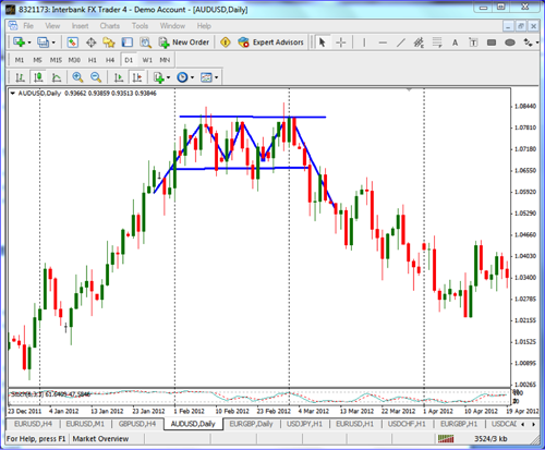
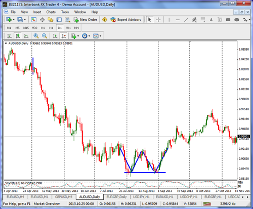
Double tops and double bottoms are fairly common reversal patterns. These are also commonly referred to as an “M” pattern, for the double top, and a “W” pattern, for the double bottom. A good example of a double bottom, or “W” pattern, can be found in the chart below of the AUD/USD forex pair.

Figure 1: Double bottom or “W” pattern on the daily AUD/USD forex pair.

Triple Top and Bottom Reversal Patterns

In addition to the double tops and double bottoms, we have a similar pattern that, when it sets up, can be a very strong indication, and even stronger than the double tops or double bottoms. A good example of a triple top is also found on the AUD/USD forex pair in the following chart. Note that once the support level at the bottom is broken, after three attempts of the price action to move higher, and it just doesn’t have enough momentum to move higher, it will often reverse and move lower. Also note, in the chart below, that as the market breaks the support level at the bottom of the pattern, the market will retest that old support, which now turns into new resistance before it reverses and moves on lower.

Figure 2: Triple top with price breaking below support.

Head and Shoulder Reversal Patterns

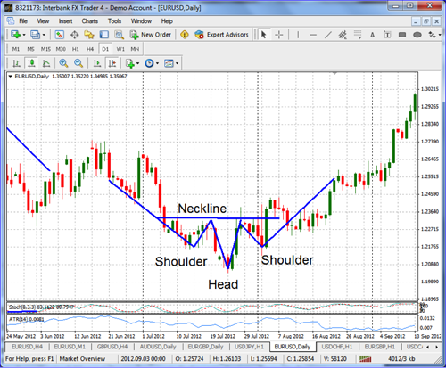
The market is in a strong uptrend if you can see a head and shoulders pattern set up with two shoulders and a head, with a support line called a neckline, like the chart below on the EUR/USD. In a downtrend, the head and shoulders is generally referred to as an “inverted head and shoulders”. For example, the pattern found in Figure 3 below is an inverted head and shoulders pattern and is found at the bottom of a market, in a downtrend, and is opposite of the regular head and shoulders pattern, found at the top of a market. With an inverted pattern, the neckline is at the resistance level, at the top of the pattern. The head and shoulders pattern is similar to a triple top or triple bottom, but the middle peak is higher or lower than the shoulders level, setting up the head, the two shoulders and the neckline, as illustrated.

Figure 3: Inverted head and shoulders.

Conclusion

These reversal price patterns, including head and shoulder patterns, double top and bottom patterns, and triple top and bottom patterns, are useful to identify the possibility of a market reversal or, at least, a momentum shift. It is important to understand how these patterns rely on established principles of support and resistance. As illustrated in the charts, for the pattern to be complete, the price action completed and confirmed the pattern by breaking up or down through support at the top of the market or up through resistance at the bottom of the market. Watch for these patterns on the charts and use them to help indicate changes in momentum.
Deliberate Movements

Today we are going to talk about an important concept in our trading – deliberate movements. This can be a bit confusing when first looked at because we sometimes try to equate deliberate movements with “perfect” movements. Like most things in trading, it is hard to find perfection, so we really need to look at deliberate movements as more of a consistent way that the price action is forming, instead of a perfect way it is forming. The fact is that if we were waiting for perfectly deliberate movements, we would likely never take a trade.

To begin, let’s talk a bit about non-deliberate movements. There are really two types of non-deliberate moves that we generally identify. The first is when there may be lots of movements that don’t follow any specific pattern, and the second is where there are very little movements happening. In the first case, you will see the price moving quickly and without any real pattern. You may see it move up sharply, followed by a sharp move down, then a small move, followed by a large move. The pattern is just not very discernable. This type of movement causes our trading to be more erratic and less consistent. If we can avoid these types of movements, we will be avoiding the times when the market is less predictable. The second case is where the movements are not so volatile, but are just the opposite. They move a little here, and then they move a little there, again, without any real definable movements.

Either one of these non-deliberate price actions is difficult to trade and should be avoided. This might mean that we have to stop trading for a time and wait until the movements become more deliberate.

As we look at deliberate moving markets, we will find the best opportunities to take our trades. This type of movement is where the price has a definable pattern of either higher highs and lows or lower lows and highs. As we identify this type of price action, we will begin to see the areas where we should be looking to buy or sell. As the price swings in a deliberate fashion, we will better spot where we should be trading. The question we should ask ourselves is, “Can we identify when the price is deliberate?” If you can’t, you need to be looking at charts to practice identifying the times when they are deliberate.

Here are a couple things you can look for:

  1. Identify the trend by using a 40-period SMA. If it is moving up, then the trend is bullish, and if it is down, then the trend is bearish. This will give you an idea of the deliberateness of the movement. If you cannot identify the trend as up or down, it is likely not deliberate enough.
  2. Draw lines connecting highs and low. If you can draw lines and they form a channel moving up or down, then you are likely seeing a more deliberate price action.

By looking at these two things, you should have a better idea that the movement is deliberate or not. Take some time to practice deciding if the trend is deliberate or not.

Charts – Lesson #3: Flag Price Patterns

Last week I started a ‘Charts’ series covering the basics of chart reading. We started with identifying the trend and then discussed support and resistance levels. Today I am going to discuss a common price pattern that shows up on a chart that can help us identify good entry points in a strong trending market. We have covered why trading with the trend is one of the best ways to succeed. However, identifying a trend in the markets can be a bit tricky. Once a trend starts, it doesn’t go straight up or down, but will have times where the market moves back against the trend or pulls back. Often times, because the market forces of supply and demand, the market finds natural levels of profit, taking in most market moves. One of the most important elements of trading is identifying these natural pullbacks and how to use them to identify potential trades. We can use certain price patterns, based on this price action, to help determine if these pullbacks are possible setups for an entry.

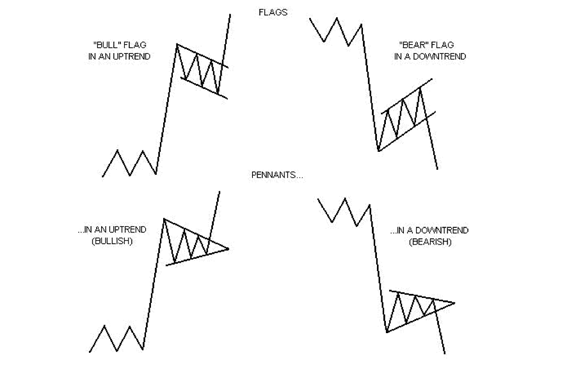
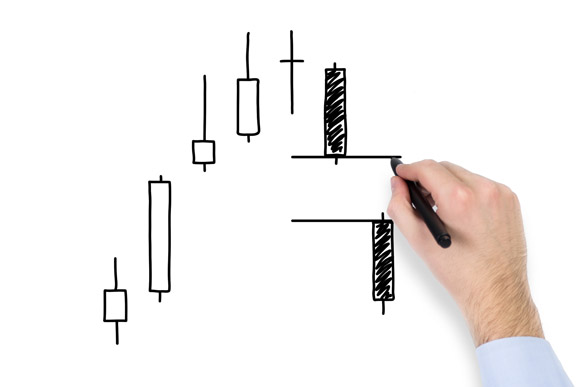
One category of price patterns we can use to identify a trend continuation is referred to as flag or pennant pattern. In an uptrend, these are a ‘bull flags’ or ‘bull pennants’ and, in a downtrending market, these are ‘bear flags’ or ‘bear pennants’. These patterns can help us identify areas of continuation, looking at a pullback or a consolidation, and then a resumption of the previous trend after the pullback. Here are some examples of what these flag/pennant continuation patterns look like:

Flags and pennants are categorized as continuation patterns because, after they form, there is often strong momentum back in the direction of the trend. They are often seen right after a larger, quick move. The market will often pick up again in the same direction. These continuation patterns are very good at identifying potential entry points.

As illustrated in the figure above, bull flags are characterized by lower tops and lower bottoms, with the pattern slanting against the trend. But unlike wedges of a bull pennant, their support and resistance lines run parallel. Bear flags are comprised of higher tops and higher bottoms. Bear flags generally slope against a strong, down-sloping trend.

Pennants are similar to flags, but are not parallel, and look very much like symmetrical triangles or “wedges”.

Typically, these flag/pennant reversals are about 5 – 7 bars deep.

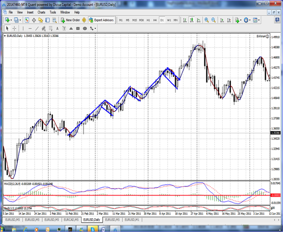
Here is an example of several bull flags on the EUR/USD daily chart:

Note in the graph above that, after a move up, the bull flag is formed by the lower highs and lower lows in a pullback. Once it broke above the flag, it resumed the bullish uptrend and, once the pullback is “broken”, the price breaks out and continues the previous uptrend for a very positive gain. The best way to take advantage of this pattern is to set a buy stop entry order close to the top of the pullback so that if the trend resumes to that level, you would be triggered into the trade to take advantage of the continuation. The same rules apply to a bearish downtrend, but in the reverse pattern, and with a sell stop order at the bottom of the flag pattern.

Look for these flag and pennant patterns to help identify good entry points as the current trend resumes. Then use your pending stop entries to set up good entry points, a buy stop for uptrends, and a sell stop order for downtrends. Next time I will discuss some trend reversal price patterns to look for.

High-Frequency Trading

One of the newer debates in the trading world that has surfaced over the past few months centers around High-Frequency Trading (HFT). These are computer-generated trades that are designed to scalp a very small amount of money from millions of trades. This has been going for the past several years; the question is, “How does this affect the average trader?” I have heard some traders recently expressing their concern about HFTs, stating that they believe that the HFTs take money from them and that the HFTs also trigger their stops. Many of the traders that now have concerns about HFTs did not have these concerns about them until they recently attended a webinar. The webinar presented all of the horrible things that HFTs do to individual traders and what traders can do about it. They may have also seen or read a recent negative article concerning HFTs. The people that are running the HFT webinars are employing basic marketing 101 – create a need or a problem for people and then show them how to solve it by buying a specific product. This is a classic case of a few individuals seeing a way to take advantage of a lot of people by creating fear from a problem that isn’t likely a problem all. While you’ve got to give them credit for their creativity, they are selling information that most traders probably don’t need and many don’t care about.

With regard to HFTs and stop hunting – if you are an experienced stock trader, have you ever had a problem with stop hunting from HFTs in the past that you have noticed? I obviously can’t say for certain, but I would bet that the answer is ‘no’. I’m not sure of the correlation between HFTs and stop hunting because the HFTs don’t typically move the market that much. If you have a stop that is $1.00 away from the current market price, HFTs wouldn’t move the market enough to stop you out; they may be able to make a trade in front of your stop, just before it is reached, but HFTs would not typically cause the stop out. One concern is that HFTs occur just as fund managers are rebalancing the portfolios of index funds, but the HFTs still shouldn’t account for that much movement in the price action. If stop hunting is a problem for you, use contingent orders so no one will see your stops.

While the HFTs may be skimming a fraction of a cent on their trades, that really is not material to the retail trading world. For a position trader or a swing trader, as long you’re entering and exiting at the prices that you want to trade at, why would any of this matter to you? We all know that the markets are manipulated, as blatantly evidenced by the Fed’s quantitative easing. If a trader is going to stop trading due to market manipulation, I believe that there are a lot better reasons to stop trading than HFTs. Regardless of HFTs, we can still identify probable emerging trends, we can get on board with them, and, with sound risk management, ride them and get off before the inevitable reversal occurs. The reason that HFTs work is because of the speed and the number of times that trades can be made. But how do HFTs affect an individual trader? My opinion is that they really don’t. If you place an entry order and a protective stop at given price levels, as long as you get in and out at those levels or better, what does it matter what anyone else does? If you place a market order, as long as you weren’t filled at a price that was significantly different than what you saw the current market price was at that time, there was still little or no effect if a HFT got ahead of you.

On the plus side for HFTs, there is the argument that HFTs add liquidity to the market, they reduce spreads and transaction costs and they increase overall market efficiency. An unintended result of HFTs over the past few years is that they have caused the major exchanges to increase their computer speed, which also leads to reduced transaction fees and is an overall benefit to the market.

Candlestick Charts

Today we are going to look at the formation of a candlestick and how we can use these to help us better understand the price action of the chart. There are many different types of charts we can look at, including line charts, bar charts and the candlestick charts. What you choose to use is completely up to you. The important thing is to figure out what works best for you and then begin to use these charts to decide what the price action is doing.

The candlestick charts are some of the more commonly used charts and ones that can give you a strong visual on what the price is doing. We will begin by looking at the anatomy of the candlestick.

The Body
The body of the candlestick is the part that gives us an idea of how strong the price has moved. This will show us the difference between the open price and the close price. If the price closes higher than the open, then the price action is bullish. If the price closes lower than the open, then the price action is bearish. In addition, the size of the candle body is important to understanding the strength of the move. A larger body will suggest that there is lots of buying or selling during the time of the candle. A small, or no, body will suggest that there is minimal buying or selling during the time of the candle.

The Wick or Shadow
The wick, or shadow, of the candlestick is the extensions above and below the body of the candle. Just like the body, these can be large are small depending upon the volatility on the chart. Generally, a small wick or shadow would indicate less volatility as the price is not moving much beyond the body, but this may not always be the case if the body of the candle is large. If you see a small body with a large wick, this is more likely to indicate large volatility, as the price is unable to identify a clear direction.

Candlestick charts have a great visual aspect to them as it is fairly easy to identify their direction by looking at the color of the body. Although the color can be changed, many use a green color for a bullish candle and a red color for a bearish candle. As the candles are created, you will see patterns develop, just like on any other chart types. In a bullish trend, these candles will form a pattern of multiple large green candles, while a bearish trend will from multiple large red candles, creating a way to quickly identify the direction the price is moving.

Regardless of what type of chart you use, you should, at least, consider the candlestick chart to analyze what you are trading. The clean and easily readable look of them makes them appealing to many traders. Now take some time to review these by placing them on your charts and begin seeing how they can improve your chart reading ability.

Charts – Lesson #2: Support and Resistance

In Charts – Lesson #1 was learning to identify the current trend. Today, Lesson #2 in our Charts series is about Support and Resistance, which is a critical concept to understand. The reason Support and Resistance is so important is because identifying these levels can help us to better identifying good entries. Newer traders, who are following the markets, will generally start by noticing tops and bottoms to the markets. These tops and bottoms are the basis of Support and Resistance levels, or zones.

Definition of Support and Resistance
Support level is a price level where the price tends to find support, or a market floor, as it is going down. It is where demand is strong enough to prevent the price from declining further. The idea is – as the price gets cheaper, investors become more interested in buying and are less interested in selling – an oversold situation.

Resistance level is the opposite of support. It is where the price tends to find resistance, or a market ceiling, as it is going up. It is where demand weakens enough to prevent the price from increasing further. The idea is that as the price gets more expensive, buyers become less interested in buying and sellers are more interested in selling – an overbought situation.

How to Identify Support and Resistance
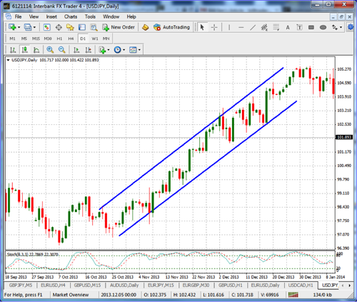
The first step to identifying support and resistance levels is to go ahead on a chart to connect the recent significant highs using a trendline at the top of the market. The next thing to do would then be to connect the lows using a different trendline at the bottom of the market. Once the tops and bottoms are connected, this will show the support and resistance levels and help identify the support and resistance levels with a channel forming the outsides of the market. This is illustrated in the chart below. Notice the trendline is supporting the market price action as a floor and the market is moving up and down between the support at the bottom and the resistance at the top.

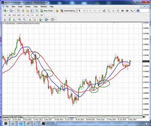
In addition to trendlines to identify Support and Resistance levels, you can also use Moving Averages to identify good Support and Resistance. You can use a 50-period SMA and a 20-period SMA. In an uptrend, when the price action moves down, between the 20 SMA and 50 SMA, the price is in a good general support zone. If the price action moves back above the 20 SMA, this may be a good time to enter the market long. The same is true in a downtrend – if the price action moves up to the top between the 20 SMA, and not above the 50 SMA, and if the price moves back down below the 20 SMA, this may be a good short entry. Note in the chart below that when the market moves between the 20 SMA (blue line) and the 40 SMA (red line), you are in a good support level at the bottom, or a good resistance level at the top.

Conclusion
Support and resistance levels are critical to trading and are used by traders every single day, whether they realize it or not. Identifying support and resistance zones can help you to identify the areas where the market may turn or bounce, and are some of the best places to enter the market as the market trades between these channel floors and ceilings in an uptrend, and ceilings down to floor in a downtrend. If you are new to trading, draw these channels using trend lines and watch how often the market bounces off these levels.

Trading Indicators

Today we are going to discuss some of the issues that happen when we use indicators on our charts. Indicators are often looked at as the most important thing when it comes to our trading. Although they can be important, if we do not look out, they can cause us problems. As we have said in the past, price action is the most important thing we can analyze when we are trading.

One of the biggest problems with indicators is that they are generally lagging in telling us what to do. Often times, they look very accurate when looking at the past history of a chart. But, when we try to use them in real time, they become a bit harder to use. The fact is, whenever we use or look at an indicator, it is only showing us what happened in the past. Some people will talk about indicators as being predictive or leading indicators, when, in fact, they are only representing what has happened in the past.

For example, if we are looking at a simple moving average that is set to 20 and we are using the close price, we are just looking at what the average closing price was over the last 20 candles. It just takes the last 20 closes, adds them together and then divides by 20 to get the price of the current moving average line. The same thing is true with indicators such as the stochastic, RSI, and CCI. The question we should ask ourselves is, “What does the past history of a chart have to do with the future price movement?”

If we don’t know the answer to this, we should be careful in putting much weight on the indicator. Luckily, price action tends to follow certain patterns. These patterns are based off of the price action of the instrument we are trading. This price action is what is predictive, so as we add an indicator to the price charts, they can help us to better visualize where the price may be ready to move. The key is that it is not the past price that tells us where the price is going, but, rather, the pattern that the price is making that can give us insight into what might happen.

Trading indicators are great tools as long as we understand their proper place in our chart evaluation. By using an indicator, like the moving average, stochastic, RSI or CCI, we can increase our ability to understand what might happen. The key is to let the price action confirm what the indicators are showing you. If you do this, you will be happier with the results that the indicators give you.

Take some time to review the indicators that you are currently using to see if you can improve their outcome. Consider how the indicator responds to the price movement and practice looking for entry points using both price and the indicators. By using price, along with the indicators, you will find that these tools can be stronger and more useful.

Charts – Lesson #1: Identifying the Current Trend

I would like to go over several topics to help you use the charts to improve your technical trading skills. In this lesson, we will cover identifying the market trend on the charts. The market is either in an uptrend, downtrend or sideways trend (no significant trend at all). While this is the most basic part of trading with charts, it is very important that every technical trader really understands the market and the current trend that’s being traded.

The first thing that every trader should do before placing a trade is to identify whether the trend is up, down, or sideways. If you’ve been around the markets for awhile, you have probably heard the phrase: “The trend is your friend.” Why is this important? Because if you trade with the trend, you will find it to be easier to execute profitable trades and the market will be more forgiving if your entry is not perfectly timed.

What is a market trend? Generally, the trend is defined as the price moving higher in a bull market and downward price movement in a bearish market. You can do this by mapping the direction of the market or the trend on the charts. First you need to look at, or determine, the market trend.

How can you determine the trend direction?

In a confirmed uptrend, the 50 SMA will be moving up and the price action will have crossed above the 50-period SMA. In a confirmed downtrend, the 50 SMA will be moving down and the price action will also have crossed below the moving average line in a downtrend. When the moving average is moving up and the price action is moving down, or is below the moving average, we would call this a neutral, or non-confirmed, trend until both the above conditions are met. Note in the chart below that the 50 SMA is generally moving up and, when the price action is moving higher above the 50 SMA, there is a significant up, or bullish, trend present.

Now that we have determined the direction of the trend, we also should have an idea of how strong the trend is. A good way to determine the strength of the trend is to use the Average Directional Movement Index (ADX). The ADX line helps determine whether a market is in a strong or weak trend, or no trend at all, but simply trading sideways; it measures the degree of trend or direction in the market. A rising ADX line suggests the presence of a strong trend, while a falling ADX line suggests the presence of a weaker trend or the absence of a trend. Note in the chart above when the ADX line is above the 20, the trend is much stronger than when the ADX line is lower than 20, which shows the trend is much weaker.

Understanding the direction and strength of the trend are critical elements to successful trading. Use these rules to identify whether you are in an uptrend or downtrend and if the trend is very strong or weak, then only trade in the direction of a stronger trend, up or down.

Will It Go Up Or Will It Go Down?

The Fed announced this week that they will continue to decrease the Quantitative Easing that went into effect as the result of the financial crisis a few years ago, stating that they are bullish on US economic growth, even though some sectors of the economy have clearly slowed down. Even with the first quarter GDP growing at a surprisingly slow rate, they believe that specific areas of the economy will begin to grow this spring. They have reduced their monthly bond buying to $45 Billion. Most of their decision is based on the employment situation, which has picked up recently. Adverse weather this past winter hindered employment growth so this is an area that is expected to improve.

With the slow growing economy, and mixed results with regard to its improvement, what does all of this mean to us as individuals? Though it may be somewhat aggravating and even a little boring to listen to the economists pontificate and predict what will happen with the economy, while being right only a fraction of the time and also hearing the stock market analysts’ predictions about the future direction of the stock market, one thing I do know is that about half of them will be right at some point. The reason I know this is because there seems to be a pretty good split about what will happen going forward in these two areas. Some say that the economy will continue to expand and the stock market is healthy because the recent bull market is based on corporate earnings, not the Fed’s intervention. Others say that the economy is doomed for a repeat of the recession and the stock market is in for, minimally, a 20% correction because the basis of the bull market is directly related to the Fed’s intervention.

Many of the recent opinions that I have seen that have been published by the self-professed experts are about 180 degrees away from each other; they are about as far apart as the predictions were a few months ago about the gold market by the so-called gold experts. Since there seems to be two very clearly divided and opposite thought processes presented, the most likely outcome is that one thought process will be right, or, at least, less wrong than the other. That all being said, the best strategy for the average trader or investor may be to ignore them altogether and go about your trading and investing in the way that works the best for you, regardless of what is said in the media. If the prognosticators predictions were even somewhat close, I would believe that they may at least have a partial grasp on what may happen. But, since they are so far apart, there’s really no way to know who actually knows what they‘re talking about and who is just guessing.

I believe that the only thing that is really true, when it comes to the stock market, is the price action itself. I see the price action as being true because, regardless of the reason that it is at the level, it is telling us everything we need to know about what is happening right now with security. You can listen to, and read all about, the experts’ predictions around the stock market and the economy and, when they’re right, they won’t stop reminding you of it. But when they’re wrong, they never mention it again, they just move on to the next bad prediction as if the last bad prediction never happened. Make sure that you have a good solid method that has worked well for you in the past or that you firmly believe will work well for you going forward. Then follow it with no regard to what anyone else says. Based on the past failures of the expert’s predictions, I believe that the average astute trader or investor knows about as much as the experts do and the average person is just as likely to be able to predict which direction the market will go in. Don’t pay any attention to them, do what works for you and make some money.

Review of Gold

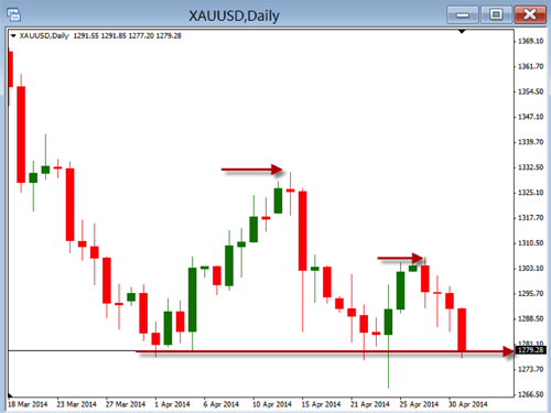
Today we are going to take a look at the daily chart of Gold. In this chart we will look at identifying some of the most important aspects of technical analysis. In the order of importance with technical analysis or the hierarchy of importance, we will look at our evaluation in the following way:

  1. Price action
  2. Trend
  3. Support and Resistance
  4. Other

Let’s begin with the first item on the list – price action. This is the most important thing we can look at when we begin our evaluation of a chart. Price is king, and, if we do not place the right emphasis on it, we are likely to misunderstand what everything else it trying to tell us. It really does not matter what indicators tell us if the price does not confirm what the indicator is saying. Knowing what the price is doing will put us in the correct mindset for the direction we should be trading.

When we are evaluating the chart for price action, we will want to take everything else off the chart. This will allow us to only look at price, without the distraction of something else. In this chart above you can see that the price action on it has been mostly bearish. The longer-term direction, as well as the current momentum, has been going down.

Once we have seen the bigger picture by looking at price action, we will then want to get some confirmation of the trend. This can be done by simply looking at the highs and lows and determining if they are making lows or highs. This price pattern is the most important way to identify trends, but we can use other indicators that might make the trend more visual for us. An example of this would be to use a moving average, such as the 40-period SMA. This is an easy way to see what the trend is doing. If the 40-period SMA is going up, the trend is bullish, and, if it is going down, then the trend is bearish.

Next, we will want to identify the key levels of support and resistance. This, in combination with the trend, will help us identify where the best areas are to enter a trade. If the trend is up, and we are near support, you would be looking to buy. If the trend is down, and we are near resistance, you would be looking to short.

Finally, after we have identified these things, we can look to apply other indicators that might help us in our determination of when we will be pulling the trigger to buy or sell.

So, as we look at the chart of gold, we should see that the overall price action, as well as the trend, is bearish, but that we are sitting near the area of support. This would give us the impression that we may see the price slow at this area, then begin to move as it bounces up, or breaks through this area of support. Once it confirms the direction, we can then make our decision as to how we are going to enter the trade.

Take some time to review how you evaluate your chart to make sure you are focusing in on the most important things.