The Less You Think, The More You Know

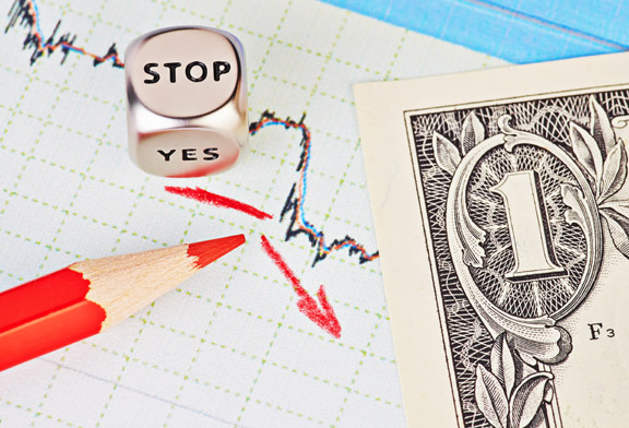
One of my biggest problems with being a successful trader and investor is getting me out of my own way; over the years, many other traders have told me that they have the exact same problem. Based on conversations that I have had with other traders and investors, both experienced and inexperienced, one common theme that seems to repeat itself is that a lot of trades are losers because the trader makes them losers. It isn’t necessarily that the trade setups are bad or not valid, and it isn’t that the market is doing anything to us, though sometimes it does seem as though it is against us. Often times, trades lose because the trader interferes with a good method and makes decisions around trades based on what they think they know, versus what they actually know. What traders typically find is that what they actually know is usually very little. So when trade management decisions are made, they aren’t always the best decisions and, in some cases, they can be very detrimental.

If we have a good, solid method for trading or investing, and we know that the method works a high percentage of the time, anything that we do that is outside of the parameters of that method is the same as saying that we know something about the market. We are essentially saying that we are smarter than our successful method, that we know something that the method doesn’t, and that we must be some kind of prognosticator that can predict what the market will do because our decisions in the moment are clearly better than what our proven method tells us to do.

If we are so smart and if the market’s direction is so easy to predict, there would be no reason at all for having a method or any kind of strategy or trading plan; we could simply enter and exit the market at will, pulling money out of it like it is the biggest ATM machine in the world. Since it does not appear as though that is the case for any of the, literally, thousands of investors and traders that I have spoken with over the past several years, it may make sense for us to reign in our egos and realize that we actually know very little about anything with regard to what direction the market will take. Internationally recognized economists, so-called market gurus, and professional traders, some of whom are on TV, some with their own shows, can’t get this stuff right. You can find just as many of these people that state that the market in general, a specific segment of the market, or a specific company’s stock is going to go up, as you can find that say the same thing is going to go down. Clearly, these experienced and well-educated people don’t have a clue as to what is going to happen, so what would make us, the average or typical trader, think that we have any better insight? Do we have a crystal ball? Is there anything in our past history of trading that makes us think that we are smarter than everyone else? In most cases, the answer to these questions will be an emphatic ‘NO’ or, at least, it should be a ‘no’. If any of us were so great at predicting where the market is headed, we wouldn’t be looking at this website or reading this article.

Once you have a method that has a high degree of accuracy or, at least, a level of accuracy that is acceptable to you, stick with whatever the rules of the method are, regardless of what you think may or may not happen. More times than not, trying to outthink an otherwise successful method will lead directly to losing trades. If most of us could be successful without a good method, we wouldn’t create trading methods. So if you have a good method, don’t go around it; be disciplined and follow it exactly as it was created until you see some flaws or that it doesn’t work as well as it did in the past, at which time, make the necessary adjustments to get back on track. Either find or create a good trading method and stick with it or abandon any thought of a trading method and just jump in an out of the market making random decisions, but don’t do both. You probably have a much greater chance for success by employing a proven method, so if that is what you decide to do, don’t ruin it by being undisciplined and going against what you know to be successful.

Stop Loss Placement

In our article today we are going to look at some of the things we can do to help know where to place our stop loss orders. As you know, having a stop loss in place is what can keep us from losing too much in a trade. Placing this order too close can cause us to get stopped out too soon, while placing it too far away can keep us in a trade too long.

The first thing that we need to understand is that where we place our stop loss does not dictate how much risk we are taking in a trade. The amount we risk in a trade is dependent upon how much we choose to risk and then determining how big our position size will be based off of our chosen risk.

Generally, if we risk more, our position size will be larger, and if we risk less, our position size will be smaller. In addition, if our stop loss is larger, our position size will be smaller, and if our stop loss is smaller, our position size will be bigger. So in the end, it really doesn’t matter where we place our stop; what matters is how much we are willing to risk in our trade.

The key is to know where to place our stop loss based off of what the chart is showing us. We do not want to just place a stop loss really close just because we think it will be less risky. In fact, sometimes having our stop loss close is more risky because we have a higher probability of getting stopped out. If we get stopped out too soon, we may miss the price actually moving in the direction we thought it would.

So how do we know the best place to put our stops? Well, we can use some simple tools to help us identify these areas. The first thing we need to do is to place areas of support and resistance on the chart. This is where the price will try to bounce off of. If it doesn’t bounce off, then the price will break through and likely continue to move. By placing our stop loss just beyond the support or resistance, we can make sure we don’t get stopped out prior to the price bouncing back. By waiting until the support or resistance is broken, we know that we are not likely to get the bounce back and the price will continue to move opposite the direction of the trade. If this happens, we will want to be out of the trade and look for another opportunity.

So in the end, we need to place our stop loss based off of what we see on the charts, not just throwing it in at some arbitrary point that we think is good. A tight stop loss is good as long as it makes sense based off of what we see happening on the charts, otherwise it can be more risky for us. Take some time to review how you place your stop losses.

Should You Follow Specific Trading Rules?

The key to being a successful trader over time is to have a good set of trading rules. These rules don’t need to be overly complicated, but should be easy to follow. Often traders can get into trouble when they trade based on their emotions instead of a consistent set of rules. Trading without specific rules can help to create bad trading habits.

Any successful trader is going to have a written trading plan, which should include clear entry and exit rules for the markets to be traded, for example: stocks, options, or Forex. Each market has things in common with the other markets, but also has its own individual characteristics, which will require its own set of rules, depending on the market. Any successful system should have a set of well-defined set-up conditions, entry rules, trade management and exit rules. In other words, whatever system you trade, the rules should be clear enough to identify setups and be simple enough to execute quickly. You should clearly be able to identify, clarify and justify your trades according to your system. No matter what type of trader you are, a short-term scalper, a medium-term swing trader, or a longer-term position trader, without clear rules to follow, you will find it very difficult to have long-term success.

The rules you follow to trade should be fairly easy to understand and should also be tested. Now this will not guarantee the same success into the future, but backtesting over a period of time will allow you to become more confident in how the system has worked in a variety of different market conditions. For example, how does your system perform in different situations when the market is trending up, trending down, or if the market is moving sideways? The more we can test the system, the more confident we will become, and the more we can rely on certain outcomes.

If you have clear rules that you can follow and test, you will be able to be very systematic in following the market, better control you emotions when getting into a trade and be more patient when you are already in a trade in order to give it enough time for the trade to develop and get to the specified target. Without good rules, we can let our emotions get the better of us and we can start to make unwise decisions. It will also be easier for you to recognize when a trade has failed and, therefore, may be easier to cut your losses by getting out of a trade. In other words you will become significantly less fearful about your trading in general and, hopefully, you can become a much more successful, systematic, and less emotional trader.

In conclusion, having a clear set of rules to follow will lead you to be a more confident trader and will allow you to have more discipline in your trading. When traders don’t follow their rules, they can get fearful and can often find themselves trading on what generally will lead to weaker results. So it is important to define your rules, write them down, test them, and then use them!

Major Pair Review

Today we are going to look at the daily charts of three major currency pairs. We are going to be looking for several things on each chart. As we identify these things, we are going to better see the direction of the longer-term trend, where the current momentum is moving, and where we might see the price having a difficult time moving beyond. Looking for trends, momentum, and support or resistance will give us a better view of how, where, and when we might be looking to trade these pairs.

EUR/USD

This chart of the EUR/USD shows us several things. First of all, we are using the 40-period simple moving average to help us visualize the longer-term trend. In this case, we are using the direction of this line to indicate the trend, which is down. We are using the price to confirm that by making sure the price is below the 40 SMA. If the price were above it, we would not have as strong of a trend. The next thing to notice is that the momentum is moving down also. In this chart, you can see where we place the red arrow. Finally, the support and resistance lines are drawn to show where the price may encounter a slowdown in price movements.

Anytime we look at a chart, especially looking at a longer-term chart, we want to see if the price action has been supporting the ideas to go long or short. If we are following some basic rules, they should show us the following.

Long trades:

  1. Bullish trend – 40 SMA pointing up and price above it.
  2. Price sitting near the area of support.

Short Trades:

  1. Bearish trend – 40 SMA pointing down and price below it.
  2. Price sitting near the area of resistance.

In addition, we want momentum to be supporting the idea of a bullish or bearish trade. Sometimes this is hard to identify because, often times, it looks like the momentum may be opposite of what we would want to trade. In the example of the EUR/USD above, before we would enter into a short trade, we may want to see the price momentum reverse back up to the resistance line. Regardless of what or how you trade, knowing these things can help you identify better places to enter your trades.

Now, for the rest of the charts…

GBP/USD

This chart shows that the overall trend is up but the 40 SMA is beginning to flatten. Momentum has been down and we are sitting right on the support area. This chart is possibly at a point of change, as the price is sitting right below the SMA.

AUD/USD

The AUD/USD is showing a bullish uptrend with bullish momentum, which has just bounced up off of the support area.

As you begin to look at these longer-term charts and identify the trend, momentum and support/resistance areas, you will be better able to see when and where you might be entering a trade. Take some time to review how you evaluate your charts for these things so you can take advantage of the proper price action.

Simple Trading System Using Moving Averages

Today I would like to discuss a simple, but effective, trading system using simple moving averages. The key to good trades is getting into the market going the “right” direction and then getting in at the “best” level. We will look at how to identify the direction of a significant trend and the best potential entry levels based on using the moving average indicator.

First of all, let’s look at some background on moving averages. There are different moving average periods, for example: 5, 10, 20, 50, 100 or 200. The larger the moving average number, the more bars the moving average calculation takes into account. The first decision to make is what time frame chart you would like to use – a shorter time frame, like an hourly or 4-hour chart, or a longer time frame chart, like daily or weekly. This will depend on what type of trader you are more of, a short-term swing trader or a longer-term position trader. This simple moving average system works fine with both types of traders and different time frames, but you will use different period moving averages depending on the long or short time frames. We will use two different moving averages. For an hourly chart, I would look at 10 and 20 moving averages, and for longer charts, such as daily or weekly, I would use a 20 and 50 period simple moving averages.

To determine the general trend, you will look for a cross of the smaller time frame to cross above the longer time frame, like the 10 crossing above the 20, or the 20 crossing above the 50 on a daily chart, would indicate a bias to the upside. Also, the steepness of the slope can also help determine the strength of the trend. Conversely, if the smaller time frame moving average moves below the longer time frame, you may have a downtrend developing. Once the prices close above or below the larger moving average, you can consider this a good trend direction to trade.

Now that we have a direction to trade, either up or down, we need to use the moving averages to help identify good entry points. We can do this by waiting for the price action to move into the area between the two moving averages and then wait for the price action to “bounce” above the higher moving average in an uptrend or below the lower moving average in a downtrend. Let me show you an example on a SPY weekly chart with a 20 and 50 period simple moving average.

 As you’ll see in the chart above, the best trades are when the moving averages are showing a clear uptrend as determined by the 20 SMA (blue line) above the 50 SMA (red line), while the price action is clearly above the 50 SMA and the best entries are when the price moves between the 20 SMA and the 50 SMA and then “bounces” or closes above the 20 SMA (blue line).

In conclusion, by following these simple rules to identify the trend and the best entries by using these two moving averages, you should be able to find very good, high probability trades.

Is Your Pension Safe? What If It Goes Away?

Many retired people across the U.S. are receiving pension benefits from company-sponsored pension plans, which typically are the largest portion of the money that they have to live on each month. This is a great system and the retirees were guaranteed these payments. But what happens if the pension goes away and the payments stop? While it is true that some retirees could find other sources of income through investments or through the liquidation of assets, most retirees are not likely to be in the position to do this. If their pension payments suddenly stop, most retirees have no backup plan and would suddenly be living off of a fraction of what they have lived off of in the past. Many would need assistance from the government or relatives.

The reason this came up for me is because I have a very close friend who is a public high school teacher in Chicago with about 10 years to go before he retires; I believe that the Chicago public school district is the largest public school district in the country. I have been listening to the struggles around their contract negotiations, the strike of 2012, and the upcoming battle when the current contract ends in the summer of 2015. He was in town a few weeks ago and he made a passing comment that he hoped his pension will be there when he retires. The thing that struck me about this is that he has been employed with the school district for around 20 years, with the expectation that the pension will be there. It isn’t that he hasn’t been contributing to his 403(b) and possibly other retirement accounts, but this has not been his main focus because of the anticipation of a pension. He has some time to prepare himself for the worst-case scenario, but it will be a struggle, he has three small children, etc. This got me thinking about teachers who are closer to retirement than he is, that have saved even less, what happens to them? Then I made the leap in my thought process to my own hometown of Detroit, where retired City of Detroit retirees recently had to negotiate to keep their pension intact while making concessions. Unfortunately, these are not atypical situations and, in fact, they are becoming much more common.

Many large corporations that have offered pensions to their employees in the past no longer have a pension plan for newer employees, leaving the employee in the position to create their own retirement income. Many companies do offer 401(k) plans, or some other type of retirement savings system, but the employees need to see the benefit of participating in the plan, which is not always obvious, especially to younger employees.

I believe that when it comes to our overall financial plan, especially where retirement is involved, it is mandatory to have a ‘Plan A’, but it is also a good idea to always have a ‘Plan B’ and, maybe even, a ‘Plan C’. One of the scary things about pensions and retirement incomes is that they are largely out of our control. We do not control the dollars when they are with the company that is administering them; we simply have to trust that they will do the right things with it to make it last and that there are no crimes committed against it and no malpractice that could deplete or empty the account. We also have to trust that the sponsoring company will properly fund the plan so existing retirees, as well as new retirees, can get the benefits. When this system breaks down is when an alternate plan becomes important. Save as much as you can afford to save while you are working, without dramatically and adversely affecting your life style. While you are working, save as if there is no pension plan when you retire, just in case there isn’t. And for those who already know that they will not receive any pension benefits, saving as much as possible should be an obvious thing to do.

Looking for Support and Resistance

Today we are going to discuss a specific way that we can look for areas of support and resistance. As you know, we need to be able to identify these areas so we can better know where we may want to place our stops and our targets. The problem that many traders run into is that they often times do not know where to place them. In fact, if we asked 10 traders to draw support and resistance on a chart, we would likely have 10 different places where they are drawn. If we can use a tool to help us clarify where these areas are, it can make the process a bit easier.

The tool that we are going to be discussing is the Fibonacci retracement tool. This is an indicator that is based off of the Fibonacci sequence of numbers and will show the areas of possible retracement of price. The numbers have been predetermined to correspond with the Fibonacci ratios and are followed by many traders. The most commonly used numbers for the retracement areas are 23.6%, 38.2%, 50% and 61.8%. As these areas are approached, you will often times notice that the price action will begin to slow down. As the price slows, it will then have to decide what it is going to do next. There are three possibilities that can happen. First, the price can continue and break through the Fibonacci level on its way to the next level. Second, it will take some time at the level before it moves through it or bounce off of it. Third, the price will reject the level and bounce off of it. Regardless of what happens, these areas are points of decision where the price will likely slow a bit.
In the chart above, you can see that the Fibonacci retracement lines have been drawn on the 5 min. chart. As you look at each of these levels, you can see how they react with the price. In this chart you can see that each one of the Fibonacci levels reacted with the price at some point. As you look at price approaching these levels, you can use them to help you identify when to consider closing out of a trade.
Just like any other indicator, you will want to make sure that the price action confirms what you are thinking might happen. Just because the price touches a specific Fibonacci level, it does not mean that the price has to respect that level. There are times when the levels mean nothing, so we need to make sure we see the price respecting the level before taking action on the trade.

Take some time to see how this tool can help you in identifying areas of support and resistance on a chart. Sometimes having a visual like this can make our jobs a bit easier by seeing the lines drawn. Practice with this and take some time to see how it works.

Parabolic Stop and Reverse Technical Indicator

Today let’s discuss the parabolic stop and reverse indicator, often referred to as the ‘Parabolic SAR’. The parabolic SAR is a technical indicator found in most charting software. I would like to discuss this because it is a great indicator that many traders do not know much about, or have never used.

Most traders who use the parabolic SAR use it to help determine the direction and strength of a market’s momentum, as well as when that momentum may be weakening and, therefore, when the market may change direction.

One key to successful trading is to understand which way the market momentum is going, either long or short, and is the key to the parabolic SAR indicator.

The parabolic SAR is graphically displayed on the chart as a series of dots that are above or below the market’s price action. If a dot is displayed on the chart below the market, the market is understood to be in an uptrend, with bullish momentum. On the other hand, if a parabolic dot is displayed on the chart above the market, it is understood to be a bearish signal, or an indication that the market is going lower.

See the AUS/USD chart below and note the line of dots and how they indicate the momentum of the market and then note the switches of momentum as the dots change from above to below the market or below to above the market.

How is the Parabolic SAR used to determine potential entry signals?

For a long entry, you can look for a parabolic dot showing up at the most recent low once the market has bounced and has started to move upward; for an entry to go short, once the parabolic SAR has placed a dot above the market at the most recent high. As the trend develops, the parabolic will continue in with a line of dots going up or going down, as the momentum builds in that direction. The parabolic SAR works best in a market that is trending and not as good in a ranging market.

How is the Parabolic SAR used to determine potential exit signals? (Stop and Reverse)

Parabolic SAR is also a good indicator to help identify a change in direction and when to exit or get out of a trade. If the momentum shifts to the other side of the market, as indicated by the parabolic SAR, it is time to close a trade. If in a long trade and the parabolic dots shift to the top of the market, close the trade and look to enter the market short. If in a short trade and the parabolic shifts to the bottom of the market, close the trade and look for bullish momentum to start.

In summary, one of the best things about the parabolic SAR is that it is a very systematic way to follow the market. It can help you understand the market momentum, when to stay in good trades to maximize profits, and when to get out of trades once the momentum has shifted. So put this indicator on your chart and see if it helps your momentum trading!

Stops and Targets

In today’s article we are going to talk a bit about using stops and targets in our trading. As you may know, these types of orders are set to get us out of our trades. Stops will get us out when we have suffered a pre-determined loss amount, while our target will get us out at a pre-determined profit amount. One of the more important things in our trading is to know where we should be placing both of these exit points.

As we identify problems with our trading, often times, one of the issues that we see is that we get stopped out of our trade prematurely. This early exit of our trade can be frustrating, especially if we see the price move in the direction we wanted, shortly after our stop was hit. Having a stop that is too tight can initially seem like a good thing because it feels like we are risking less, but if we are always getting stopped out, it doesn’t do us any good. When placing our stops, we don’t need to think about placing them tight, we need to think about placing them properly.

Secondly, and equally as problematic, is the exiting of our profits too soon. This usually happens because when we get a little profit, our natural tendency is to take it quickly. Just like exiting from a stop too soon can be bad, exiting from our target too soon can also be bad. Again, the goal should be to find the appropriate level to place our target.

If we place both of these in the appropriate areas, we will have more confidence and more successful trades. So the question should be, “What is the appropriate place to enter a stop and target?” Well the answer to that is it all depends upon the type of trader you are. Your strategy may deserve a larger or smaller placement based off of your rules. There are a couple of things to consider that may help.

First, make sure you take into consideration where the next level of support or resistance is located. By simply making sure that your stop is beyond these points can help us avoid getting stopped out too early. Likewise, knowing where the support and resistance is located, we can see where a target may be too much or too little.

Second, look at the ATR, or Average True Range, to make sure you are giving your trade enough “wiggle” room. If, for example, your ATR is 30 pips on the chart you are using, but you place your stop at 10 pips, you may find that in just the normal movements in price, you will get stopped out. You can avoid this by checking the ATR. This will also help to make sure you are not exiting out of a trade too early if it is becoming profitable.

Take some time to review these things to make sure you minimize the times you get stopped out early in a trade or the times where you close out your profit too soon.

THE IMPORTANCE OF THE NONFARM PAYROLL REPORT

The monthly employment report gives the market an idea of the strength of the U.S. Labor Market. The Nonfarm Payroll, or NFP report, as it is commonly called, is generally released on the first Friday of each month, which is this Friday, June 6th. Incidentally, next month July, 1014, the first Friday of the month falls on the 4th of July holiday, so the NFP report is scheduled to be released on Thursday the 3rd, the day before the normal release date.

The nonfarm payroll employment report is the monthly report released by the United States Department of Labor as part of a comprehensive, monthly report on the state of the labor market. It is a report that covers the employment numbers for goods-producing, construction, and manufacturing companies for the previous month. Typically, the Bureau of Labor Statistics releases the report at 8:30 a.m. Eastern Time on the first Friday of each month and covers the numbers for the previous month. The U.S. nonfarm payroll number is an important factor, which can affect the U.S. dollar, the foreign exchange market, the bond market, and the stock market.

The data released includes the change in nonfarm payrolls (NFP), as compared to the previous month. The NFP number is meant to represent the number of jobs added or lost in the economy over the last month, not including jobs relating to the farming industry. In general, increases in employment means, both, that businesses are hiring, which means they are growing, and that those newly employed people have money to spend on goods and services, further fueling growth. The opposite of this is true for decreases in employment.

While the overall number of jobs added or lost in the economy is obviously an important indicator of what the current economic situation is, the report also includes additional data that can move financial markets.

This additional information includes:

The Unemployment Rate – The unemployment rate in the economy is reported as a percentage of the overall workforce. This is an important part of the report as the amount of people out of work is a good indication of the overall health of the economy. This is a critical number that is used by the Fed when determining any action that might be needed in the economy.

Average Hourly Earnings – This is an important component to know because if the same number of people are employed, but are earning more or less money for that work, this has, basically, the same effect as if people had been added or subtracted from the labor force.

Revisions from Previous Month’s Report – An important component of the report which can move markets as traders re-price growth expectations based on the revision to the previous number.

Why is this report important? Employment is one of the most important and most watched economic indicators because it drives many aspects of the economy. If the NFP comes out better or worse than expected, the markets can react greatly, especially as the Fed has been using employment as a barometer of how well the economy is doing and how the economy is reacting to the current Fed’s stimulus “tapering”.

So look for the release of the NFP report this coming Friday morning, June 6th, at 8:30 a.m. ET and see how the markets react to the release.